Website Footer Design: Best Practices and What to Include
The footer is one of the most overlooked parts of a website. Most design time goes into the top of the page: the hero, the navigation, and the first thing visitors see. That makes sense, since people spend more of their time near the top of a page. But according to Nielsen Norman Group (NN/g), footers still get plenty of use. Visitors go there to find contact details, check policies, or look for something they couldn't find anywhere else.
A well-designed website footer helps people get around your site, builds trust, and gives visitors one more reason to take action. In this guide, we cover what to put in a website footer, footer design best practices, how to handle mobile and accessibility, what to include for different types of websites, and real website footer examples you can learn from.
What is a website footer?
A website footer is the section at the bottom of a web page, below the main content. On most sites, it stays the same across every page, which makes it a reliable place for visitors to find key information.
In HTML, the footer is usually built with the <footer> element. According to MDN Web Docs, a footer typically contains information about the author, copyright data, or links to related documents. When it sits directly inside the page body, it applies to the whole page.
NN/g describes two main reasons people use footers:
- They didn't find what they needed. Visitors reach the bottom of the page and use the footer as a last resort for hard-to-find content, or as a second chance to be convinced.
- They expect to find something there. Many people scroll straight to the footer for contact information, company details, or social links. Some even use it to navigate instead of scrolling back to the top.
Why footer design matters
A footer won't make or break your website on its own, but a good one quietly does a lot of work:
- It improves navigation. Visitors who reach the bottom of a long page can move to another section without scrolling back up.
- It builds trust. Clear contact details, legal links, and credibility signals like awards or reviews show there's a real, established business behind the site.
- It gives visitors one more chance to act. A newsletter signup or a final call to action (CTA) can catch visitors who have read everything and are ready for the next step.
- It gives search engines a consistent path to key pages. Because the footer appears on every page, its links point visitors and crawlers to the same important pages sitewide.
NN/g makes a good point about footers: they don't get in the way of visitors who already found what they needed higher up. Unless a footer is so bloated that it slows the page down, a good footer can help and rarely hurts.
What to put in a website footer
Every footer should be built around what your visitors actually need. That said, some elements belong on almost every website.
Must-have footer elements
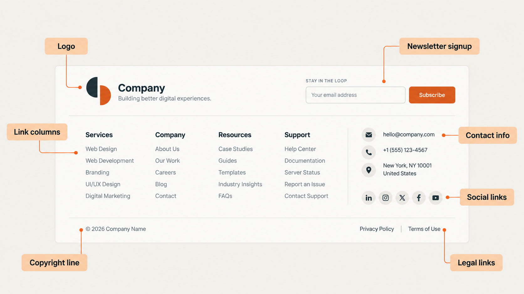
- Contact information: An email address, phone number, contact page link, or live chat link. NN/g notes that users often go directly to the footer for contact information.
- Main navigation links: Links to your most important pages, like services, about, and contact.
- Privacy policy and terms of use: NN/g recommends including utility links like these on all sites, even if they also appear at the top of the page.
- Copyright line: A short line that shows who owns the site's content (see below).
Common additions
- Social media links: Only include platforms where you're active. As Squarespace points out, if you haven't built a presence on a platform yet, there's no reason to link to it.
- Newsletter signup: A simple email field is a low-pressure way to keep visitors engaged.
- A final CTA: For example, "Book a call," "Start a free trial," or "Donate."
- Address and map link: Essential for businesses with a physical location. Squarespace notes that an address can also support local SEO for small business websites.
- Awards, certifications, or reviews: NN/g suggests these are especially useful for startups and companies with less brand awareness.
- Secondary links: Careers, press, investor information, or partner programs. These are tasks some visitors need but that don't belong in the main navigation.
- Accessibility statement: A link that explains your commitment to accessibility and how to get help.
How to format the copyright line
According to the U.S. Copyright Office, a copyright notice has three elements:
- The © symbol, the word "Copyright," or the abbreviation "Copr."
- The year of first publication
- The name of the copyright owner
For example: © 2026 Your Company Name
The Copyright Office notes that a copyright notice is optional for works published on or after March 1, 1989, but using one has benefits, such as letting people know you claim ownership of the content. Phrases like "All rights reserved" are common in website footers, but they aren't one of the three elements of a notice.
Many websites show a range of years or the current year. NN/g's footer, for example, reads "© 1998-2026." Whichever format you use, keep it up to date. A copyright year that's several years old can make a site look unmaintained.
Footer design best practices
Knowing what to include is only half the job. These footer design best practices will help you organize it so people can actually use it.
Group links into clear columns
Organize links into labeled groups, such as "Services," "Company," and "Support," so visitors can scan them quickly. NN/g recommends showing no more than two levels of your site's hierarchy in the footer. Link to your first- and second-level pages, not every page on the site.
Use clear, familiar labels
Vague labels make footers harder to use. NN/g specifically calls out labels like "Company Info" or "Help" when "Contact Us" is what people are looking for, and warns against the catchall "Resources" link. Use the words your visitors would use. When your team can't agree on the clearest terms, NN/g suggests running a card sort or usability test, the same kind of research that's part of most UI UX design services.
Don't turn your footer into a dumping ground
It's tempting to put every link that doesn't fit elsewhere into the footer. NN/g warns that a footer with no clear structure either overwhelms visitors or gets ignored. If a link doesn't clearly belong in one of your groups, reconsider whether it needs to be there.
Keep text legible
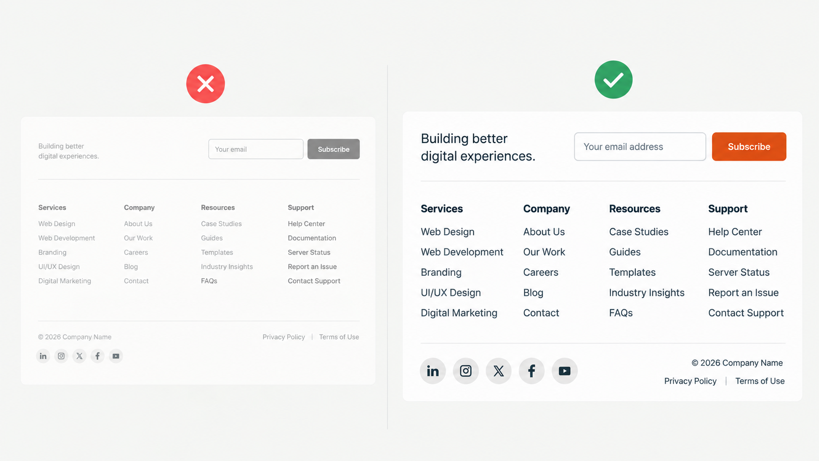
Footer text is often made small and light so it doesn't compete with the rest of the page. NN/g advises against tiny font sizes, low contrast, and decorative fonts in footers. People rely on the footer, so it needs to be easy to read.
Match your brand
Your footer should feel like part of the same website. Use your logo, brand colors, and typography consistently. A footer can also be a place to show a bit of personality, as long as the essential information stays easy to find.
Keep it consistent across pages
Visitors expect the footer to look and work the same on every page. NN/g notes that there are exceptions. Sites with different types of users, such as members and nonmembers, can use contextual footers that change based on who's viewing the page. Pages with infinite scroll can move footer content into a "mini footer" in a sidebar, since a traditional footer keeps getting pushed down as new content loads.
How to design a footer for mobile
On a phone, a four-column desktop footer turns into one long stack of links. If your site follows mobile-first design, plan the footer for small screens from the start instead of squeezing the desktop version down. A few principles keep it usable:
- Put the most important links first. Contact information and your key pages should come before secondary links.
- Cut what mobile visitors don't need. A long footer is even harder to scan on a small screen.
- Be careful with collapsed sections. NN/g warns against hiding the footer behind accordions that are collapsed by default, since people expect to see footer content. If you use expandable sections to save space, keep essential items like contact details visible. Google's spam policies confirm that accordions and tabs don't violate its guidelines, so this is a usability decision, not an SEO risk.
- Make links easy to tap. Give links enough size and spacing that visitors don't hit the wrong one (see the accessibility section below).
Footer accessibility tips
An accessible footer is easier for everyone to use. These are the main things to check:
- Text contrast: The Web Content Accessibility Guidelines (WCAG) require a contrast ratio of at least 4.5:1 for normal text and 3:1 for large text. Light gray footer text on a white background often fails this.
- Link size and spacing: WCAG 2.2 requires interactive targets to be at least 24 by 24 CSS pixels, or spaced far enough apart that they're hard to tap by mistake. This matters for tightly packed footer links and small social icons.
- Descriptive link text: Every link should make sense on its own. Social icons in particular need accessible labels, like "Company name on LinkedIn," so screen reader users know where they lead.
- Proper markup: Use the HTML <footer> element for your site footer. According to MDN, a footer that isn't nested inside elements like <article> or <main> is exposed to assistive technology as the page's "contentinfo" landmark, which helps screen reader users jump straight to it.
What to include in a footer by type of website
The right footer depends on what your visitors come to do. Here's a starting point for common types of websites:
Treat this as a starting point, not a rule. The best footer for your site comes from understanding what your visitors most often look for.
Common footer design mistakes
These are some of the most common footer problems and how to fix them:
- Too many links. Trying to fit your entire site into the footer makes it overwhelming. Fix: Show only your first- and second-level pages. NN/g suggests a full site map in the footer only works for small sites of about 25 pages or fewer. For larger sites, link to a separate sitemap page instead.
- Vague labels. Links like "Info" or "Resources" make visitors guess. Fix: Use clear, conventional terms like "Contact Us" and "Shipping & Returns."
- Tiny or low-contrast text. Small, light gray text is hard to read for many visitors. Fix: Use a readable font size and meet WCAG contrast requirements.
- Hidden or collapsed footers. Hiding the footer entirely makes it hard to find. Fix: Keep the footer visible, and keep essential links visible on mobile.
- Outdated or broken details. An old copyright year, social icons that lead nowhere, and legal links that don't open a page all hurt trust. Fix: Review your footer regularly, especially after a redesign or rebrand.
- Keyword stuffing. Some sites pack footers with long lists of cities or keywords. Google's spam policies list blocks of text naming cities and regions a page is trying to rank for as an example of keyword stuffing. Fix: Only include locations you actually serve, in a format that's useful to visitors.
Conclusion
A great website footer doesn't need to be complicated. It needs to be useful, clear, and consistent with the rest of your site. Include what your visitors actually look for, organize it into simple groups with familiar labels, and make sure it's readable and easy to use on every device. Then check it regularly, since outdated details in the footer are easy to miss and hard for visitors to ignore.
Take a few minutes today to scroll to the bottom of your own site. If the footer is cluttered, outdated, or missing key information, other parts of the site probably need attention too. Striped Horse designs every part of a website, from the homepage to the footer, around what your visitors need and the actions you want them to take. If you're ready for a site that works from top to bottom, explore our website redesign services.