.svg)


Mobile-First Design: What It Is and How to Do It Right
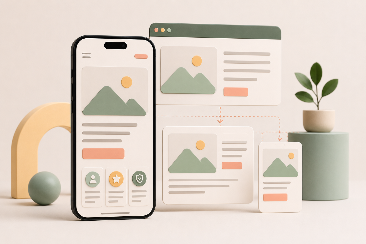
You tap a link on your phone, and the site loads slowly. The text is tiny, the menu will not open, and the button you need sits half hidden behind a cookie banner. You leave. Every business loses visitors this way, and most never see it happen.
Mobile devices generate more than 60% of global web traffic, yet many websites are still designed on a large desktop monitor and squeezed down to fit a phone as an afterthought. Mobile-first design flips that order. In this article, we will cover what mobile-first design means, how it differs from responsive design, why it directly affects your search rankings, and a step-by-step process for getting it right.
What is mobile-first design?
Mobile-first design is the practice of designing a website for the smallest screen first, then progressively enhancing the layout, content, and features for larger screens like tablets and desktops. Instead of treating the mobile version as a stripped-down copy of the "real" website, mobile-first treats the phone screen as the primary experience.
The term was popularized by designer Luke Wroblewski in his 2011 book Mobile First, and the approach has since become the standard for modern web projects. The logic is simple: it is far easier to expand a focused mobile layout into a rich desktop experience than it is to cram a complex desktop layout onto a 375-pixel-wide screen.
Progressive enhancement vs graceful degradation
These two philosophies sit behind the mobile-first debate.
Progressive enhancement starts with the essentials on the most constrained device and adds complexity as screen size and capability grow. A product page might begin as a single column with an image, a price, and a buy button, then gain a sticky sidebar, comparison tables, and video on desktop. This same “start with the essentials” mindset can also apply to branding, where tools like an AI logo generator help teams quickly create a simple visual identity before expanding it across a full website or campaign.
Graceful degradation works in reverse. You design the full desktop experience first, then remove or shrink elements until the page technically works on a phone. The result often feels like exactly what it is: a desktop site forced through a mobile-shaped tube.
Mobile-first design is progressive enhancement in practice, and it is the approach we recommend for almost every new website project.
Mobile-first vs responsive web design
Mobile-first and responsive design are often used interchangeably, but they are not the same thing, and they are not competitors either. Responsive web design is a technique. It uses flexible grids, fluid images, and CSS media queries so that one website adapts its layout to any screen size. Mobile-first design is a strategy. It determines where the design process starts and which experience gets prioritized.
In practice, the two work together. A well-built modern website is responsive by default, and the best responsive sites are designed mobile-first. You can have a responsive site that was designed desktop-first, and it usually shows: cramped navigation, oversized images, and content that reads like it was written for a bigger canvas.
Why mobile-first design matters
The case for mobile-first is not about following a trend. It comes down to three practical realities: where your visitors are, how Google evaluates your site, and what constraints do for design quality.
Most of your visitors are on mobile
Mobile devices account for over 60% of global web traffic, and a significant share of users browse on their phones exclusively. If your site is designed desktop-first, you are optimizing for the minority of your audience and hoping the majority tolerates the compromise. They usually do not. Slow, awkward mobile experiences drive visitors back to the search results, and often straight to a competitor.
Google ranks your mobile site, not your desktop site
Google uses mobile-first indexing, which means it crawls and evaluates the mobile version of your website to determine rankings. If content, internal links, or structured data exist on your desktop pages but are hidden or missing on mobile, they do not count. For a business owner, the takeaway is blunt: your mobile site is your site as far as Google is concerned. Designing mobile-first ensures the version Google sees is the complete one.
Constraints produce better design
A phone screen forces decisions. You cannot fit a hero banner, a sidebar, three feature grids, and a testimonial carousel above the fold, so you have to decide what actually earns the space. That discipline carries upward: sites designed mobile-first tend to be cleaner, faster, and more focused on every screen size. The constraint is a feature, not a limitation, and it is one of the core traits of what makes a good website in the first place.
How to approach mobile-first design step by step
Here is the process we follow as a web design company when building sites mobile-first.
1. Start with a content inventory
List everything a page needs to communicate: headlines, copy, images, forms, trust signals, and calls to action. You cannot prioritize content you have not identified. This inventory becomes the raw material for every layout decision that follows.
2. Prioritize what mobile users actually need
Rank the inventory by importance to the user, not by internal politics. A visitor on a phone typically wants the core answer fast: what you offer, why it is credible, and what to do next. Everything else is secondary and can appear further down the page or only at larger breakpoints.
3. Design for thumbs, not cursors
Mobile users tap, swipe, and scroll with their thumbs, often one-handed. Interactive elements need generous touch targets, with Apple recommending at least 44x44 points and Google's Material Design guidelines suggesting 48x48 density-independent pixels. Place primary actions within comfortable thumb reach, and never rely on hover effects, because there is no hover on a touchscreen. This is where thoughtful UI/UX design services earn their keep, since small interaction details decide whether a mobile experience feels effortless or exhausting.
4. Simplify navigation
Mobile navigation should surface only the destinations that matter most. A hamburger menu saves space but hides options behind a tap, while a bottom tab bar keeps key sections visible but only fits four or five items. Choose based on how your visitors actually move through the site, and resist the urge to migrate every desktop menu item into the mobile nav.
5. Set performance budgets early
Mobile users are frequently on slower connections, and every image, font, and script has a cost. Decide on page weight and load time targets before design begins, compress and lazy-load images, and question every third-party script. Speed is a design decision, not a development afterthought.
6. Scale up to tablet and desktop breakpoints
Once the mobile experience works, expand it. In CSS, this typically means writing base styles for mobile and adding min-width media queries for larger screens. As space grows, introduce enhancements like multi-column layouts, richer imagery, and secondary content, always building on the prioritized foundation rather than rethinking it.
Mobile-first design examples
Some of the most-used products in the world show what mobile-first thinking looks like in practice.
Spotify treats the phone as its primary product. The mobile app centers on thumb-friendly navigation and a focused now-playing screen, while the desktop app layers on sidebar navigation and a more detailed library view. The core experience was designed for the small screen and enhanced upward.
BBC News delivers a clean single-column article layout on mobile that puts the story first. The desktop version adds trending stories, topic navigation, and regional sections around the same core content. Nothing essential is missing on mobile; the desktop simply gets more.
Ecommerce leaders follow the same pattern. Product pages lead with the image, the price, and the add-to-cart button on mobile, then expand into comparison content, reviews, and cross-sells on desktop. The buying path stays intact at every size.
The common thread: each product decided what its core experience is, made that experience excellent on mobile, and treated desktop as the enhanced version rather than the default.
When mobile-first is not the right call
Mobile-first is the right default for most websites, but honesty matters more than dogma, and there are cases where it does not fit.
Data-heavy dashboards, analytics platforms, and enterprise tools are often used almost entirely on desktop, where users need large screens, precise cursor control, and multiple data views side by side. Forcing these products through a mobile-first process can hurt usability for the people who rely on them most.
The same logic applies to some B2B software and internal tools where usage data shows the audience works at a desk. The principle to keep is prioritization: know your users, check your analytics, and design first for the context where your product actually gets used. For most marketing websites, ecommerce stores, and content sites, that context is mobile. For a financial modeling tool, it probably is not.
Common mobile-first design mistakes
Hiding content instead of prioritizing it. Using display:none to hide desktop content on mobile does not solve the prioritization problem, and content missing from the mobile version does not help your rankings under mobile-first indexing.
Relying on hover states. Tooltips, dropdown menus, and reveal effects that depend on hover simply do not work on touchscreens. Every interaction needs a tap-friendly equivalent.
Cramming every desktop feature into mobile. Feature parity is not the goal. A mobile experience packed with rarely used options loses the focused simplicity that makes mobile-first valuable.
Ignoring load speed. A beautiful mobile layout that takes six seconds to load is a failed mobile layout. Performance is part of the design.
Skipping real-device testing. Simulators and browser resizing miss real-world issues like touch accuracy, font rendering, and network conditions. Test on actual phones before launch.
Design for the screen your visitors actually use
Mobile-first design is not a trend, and it is not a technical checkbox. It is a recognition that most of your visitors will meet your brand on a phone, and that their experience in those first few seconds shapes everything that follows, from engagement to rankings to revenue.
Start small, prioritize ruthlessly, and enhance upward. If you would rather have a team handle it, Striped Horse designs and builds mobile-first websites that perform on every screen. Get in touch and let's talk about yours.
FAQ