.svg)


Mobile SEO Checklist: 40 Steps That Get Sites Ranked
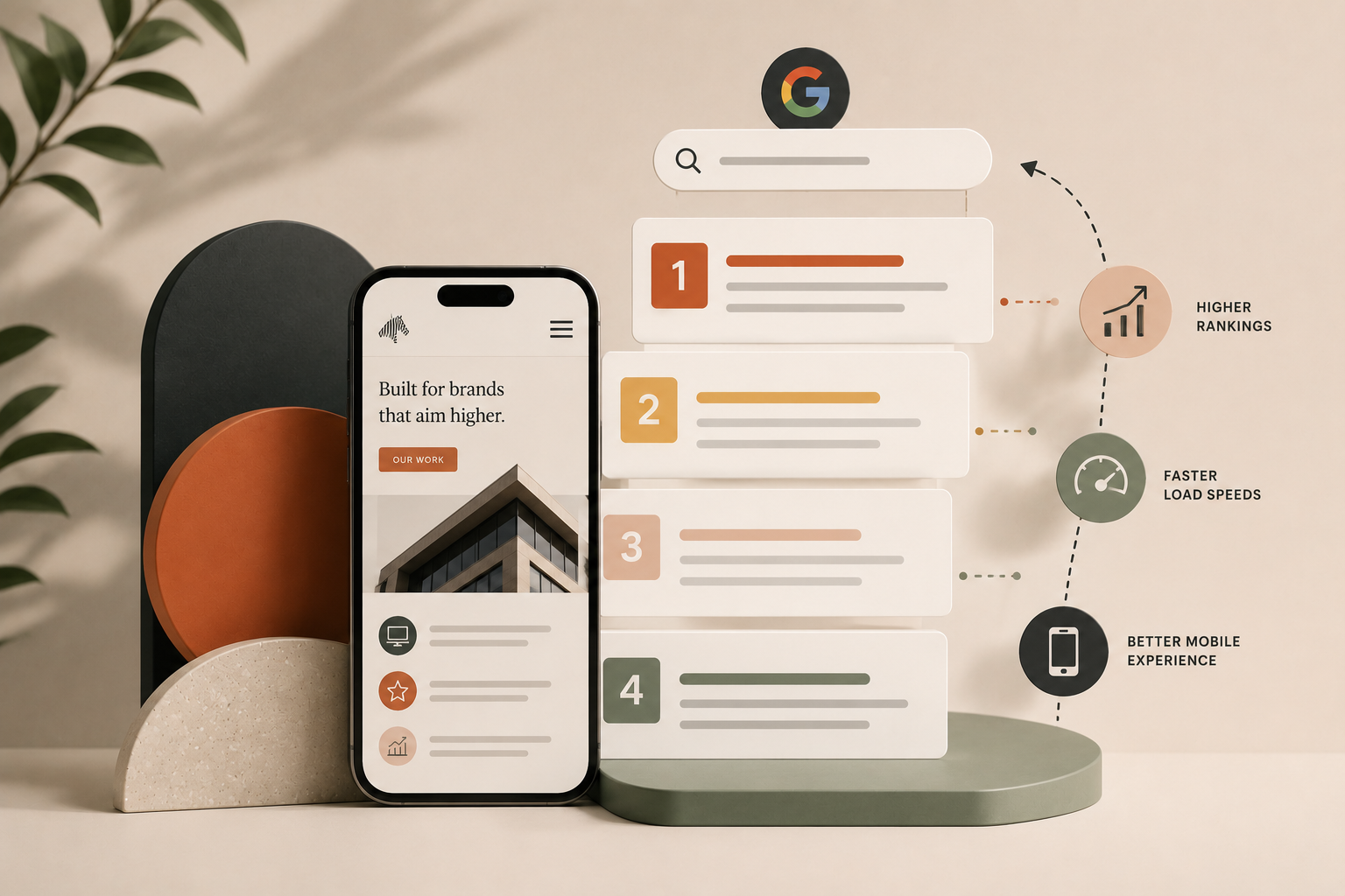
Mobile SEO is the practice of optimizing a website so it ranks and converts on mobile devices. Since Google switched to mobile-first indexing in 2019, the mobile version of your site is the version that gets ranked and evaluated. This checklist covers the 40 steps that actually move mobile rankings, organized across the 5 layers of mobile SEO: technical foundation, page speed, content and UX, local, and conversion.
Roughly 63% of Google searches now happen on mobile. Yet most sites we audit still treat mobile as an adaptation of the desktop experience rather than the primary layout. That distinction is the reason so many sites pass Google's mobile-friendly test and still fail to rank on mobile.
There are three common failure modes. Sites built desktop-first and adapted, sites that are technically responsive but painfully slow, and sites that pass mobile-friendly testing but have mobile UX so poor that dwell time and conversions collapse. All three lose rankings even when the SEO on paper looks fine.
This is not a mobile SEO 101 guide. It is a tactical audit tool. Run any site through the 40 items below and you will surface every issue that is actually holding mobile rankings back. Save it, come back to it during redesigns, or use it as a QA checklist before launching a new site.
What mobile SEO is
Mobile SEO is the practice of optimizing a website's structure, speed, content, and user experience so that it ranks well in mobile search results and converts the visitors it attracts. What separates it from general SEO is that mobile is not a version of your site. Since Google's mobile-first indexing shift, mobile IS your site as far as Google is concerned.
The mobile-first indexing shift matters more than most agencies acknowledge. Google uses the mobile version of your site to evaluate content quality, structured data, page experience, and rankings. If your mobile site has less content than desktop, is missing schema markup that desktop includes, or loads more slowly than desktop, that is what Google measures against you.
Four reasons mobile SEO matters more than most guides suggest:
- Roughly 63% of Google searches now happen on mobile. For local, retail, and consumer-facing industries, that figure is higher. Losing mobile rankings is losing the majority of your traffic.
- Mobile conversion rates lag desktop by a factor of 2 to 3 by default. Every friction point in the mobile experience costs money in a way that desktop friction does not.
- Local search is roughly 90% mobile. If your business depends on nearby customers, mobile SEO and local SEO are the same conversation.
- Core Web Vitals penalize mobile more strictly than desktop. Google evaluates mobile performance against tighter thresholds because mobile users are on slower connections and less powerful devices.
The mistake most sites make is treating mobile as a shrunk-down version of desktop rather than the primary layout that everything else adapts from. The sites that consistently outperform on both mobile and desktop are the ones designed for mobile first.
The 5 layers of mobile SEO
Everything in the checklist below fits into one of five layers. The order matters because each layer sits on top of the one below it. Brilliant mobile content on a technically broken site will not rank. A perfectly fast site with poor mobile UX will not convert.
- Layer 1: Technical mobile foundation
- Layer 2: Mobile page speed and Core Web Vitals
- Layer 3: Mobile content and UX
- Layer 4: Mobile local SEO
- Layer 5: Mobile conversion optimization
The checklist walks through all 5 layers with 40 specific items.
The mobile SEO checklist
40 items across the 5 layers. Each one covers what to check, why it matters, and how to verify. If you only read one section of this article, this is the one.
Technical mobile foundation (8 items)
1. Viewport meta tag set correctly. Every page needs <meta name="viewport" content="width=device-width, initial-scale=1"> in the head. Missing or misconfigured viewport tags break mobile rendering entirely. Check with view-source on any page.
2. Responsive design (not adaptive, not separate mobile URLs). Responsive wins for SEO because it serves one URL and one HTML across all devices, which avoids the duplicate content and canonical issues that come with separate mobile URLs like m.example.com. Adaptive design (serving different HTML per device) is acceptable but harder to maintain. If you are choosing a build approach, responsive web design services are what you want. Separate mobile URLs are a deprecated pattern.
3. Mobile-friendly test passes without errors. Run every important page through Google's Mobile-Friendly Test. It flags text too small, tap targets too close together, content wider than screen, and viewport configuration issues. Fix everything it flags before moving on.
4. Search Console Mobile Usability report clean. The site-wide report catches errors the individual test misses because it looks at every indexed URL. Zero errors is the target. Recurring errors usually trace back to template or CMS-level issues.
5. Structured data present on mobile. Schema needs to render on the mobile version, not just desktop. Google indexes what mobile sees, and missing mobile schema means missing rich results.
6. Same content on mobile as desktop. No content hidden behind "read more" toggles on mobile only. Google indexes visible mobile content, and hiding paragraphs to make mobile feel cleaner is a ranking loss. Show everything on both versions.
7. Same meta tags on mobile. Title tags, meta descriptions, and canonical tags must match across mobile and desktop. Any mismatch confuses Google's evaluation of which version is authoritative.
8. Robots.txt does not block mobile CSS or JS. Google needs to render your mobile site to evaluate it. Blocked resources produce a broken mobile render in Google's eyes and hurt rankings even when the site works fine for users.
Page speed and Core Web Vitals
9. LCP under 2.5 seconds on mobile. Largest Contentful Paint measures the time until the main content becomes visible. It is the single most important speed metric. Anything over 4 seconds is classified as "poor" and hurts rankings.
10. INP under 200 milliseconds. Interaction to Next Paint measures how quickly the page responds to user input. INP replaced FID in March 2024 and is the most commonly failed Core Web Vital across the web. Heavy JavaScript is usually the culprit.
11. CLS under 0.1. Cumulative Layout Shift measures how much the page jumps around during load. Fonts loading late, images without dimension attributes, and injected ads or banners are the top causes.
12. Images in WebP or AVIF format. Modern formats are 25 to 50% smaller than JPEG and PNG at the same visual quality. On mobile, every kilobyte matters.
13. Images sized correctly for mobile viewports. Serving a 2000-pixel-wide hero image to a 375-pixel phone screen wastes bandwidth and destroys LCP. Use srcset or a CMS that serves responsive image variants.
14. Lazy loading on below-fold images. Add loading="lazy" to <img> tags for anything below the fold. It defers off-screen images until the user scrolls to them and materially improves initial load time.
15. Fonts preloaded with font-display: swap. Preloading critical fonts and using font-display: swap prevents invisible-text periods during load and reduces CLS from font swaps.
16. JavaScript deferred where possible. Non-critical scripts should use defer or async to avoid blocking initial render. Third-party scripts especially benefit from this.
17. Render-blocking CSS minimized. Inline critical CSS in the head, defer everything else. Every render-blocking stylesheet delays LCP.
18. Third-party scripts audited quarterly. Chat widgets, analytics tags, ad networks, and social embeds compound quickly. Every third-party script should justify its performance cost. If it does not, cut it.
Content and UX
19. Body text at 16 pixels minimum. Anything smaller is unreadable on phones and triggers mobile usability warnings in Search Console. This is the single most common mobile content issue.
20. Line height at 1.5 times or greater. Cramped text kills readability. Loose spacing gives the eye room to move and directly improves dwell time on mobile.
21. Tap targets at 48 by 48 pixels minimum with adequate spacing. Buttons and links that are too small or too close together produce misclicks. Google explicitly penalizes small or crowded tap targets in the Mobile Usability report.
22. Short paragraphs (2 to 3 sentences maximum). Long paragraphs scan poorly on small screens. Break them up ruthlessly.
23. Descriptive H2s and H3s that answer questions. Question-format headings earn AI Overview citations and align with how mobile users actually search. "What is X" beats "About X" every time.
24. Direct-answer first sentences in each section. State the answer, then explain. This structure earns AIO citations and improves mobile scanning since readers can grasp the point without reading full paragraphs.
25. Bulleted and numbered lists for scannability. Prose walls of text kill mobile engagement. Break information into lists where the content allows.
26. Sticky header with search and primary CTA. Persistent navigation reduces friction on long mobile pages and gives users a consistent path forward.
27. Navigation reachable within 3 taps. Deep, hidden navigation loses mobile users fast. The most important pages should be one or two taps away, never three or more. This is one of the reasons mobile UX and SEO are inseparable, and it is exactly what our UI/UX design services treat as the primary constraint rather than an afterthought.
28. Forms optimized for mobile keyboards. Use type="email", type="tel", and inputmode="numeric" where applicable to trigger the correct keyboard. Autofill and appropriate autocomplete attributes cut form abandonment significantly.
Local mobile SEO
29. Google Business Profile complete and optimized. Category, services, hours, photos, and service area all filled in. GBP drives disproportionate mobile visibility for any business with a physical location or service area. For the local ranking factors that sit alongside mobile, our guide on local SEO for small business covers GBP setup, citations, and reviews in depth.
30. Click-to-call button visible in mobile header. Use <a href="tel:..."> for one-tap dialing. For any business that closes sales over the phone, this is the single most important mobile conversion element.
31. Driving directions button prominent. One tap should open Google Maps with directions to your location. Required for any brick-and-mortar business.
32. NAP consistent across the web. Name, address, and phone must match across your site, GBP, and every directory. Inconsistencies create doubt in Google's local algorithm and hurt rankings.
33. LocalBusiness schema on location pages. Structured data feeds local knowledge panels, mobile map results, and AI Overviews. Without it, you are competing with one hand tied.
34. Business hours in structured format. In the LocalBusiness schema and visible on the page in plain HTML, not just in an image or PDF. Google needs to parse them.
Mobile conversion optimization
35. Sticky CTA bar on scroll. Keeps the primary action visible without forcing a scroll back to the top. Small change, disproportionate impact on mobile conversion.
36. Above-the-fold value proposition. Mobile users decide in seconds whether to stay. Your headline and value prop must be visible before the first scroll.
37. Trust signals visible without scrolling. Star ratings, review counts, client logos, and security badges belong above the fold on landing pages.
38. Mobile payment methods enabled. Apple Pay, Google Pay, and PayPal reduce mobile checkout friction significantly. Ecommerce sites without them lose sales measurably.
39. One-page checkout for ecommerce. Multi-step mobile checkouts abandon at 2 to 3 times the rate of single-page equivalents. Consolidate wherever possible.
40. No intrusive interstitials on landing pages. Google explicitly penalizes pop-ups that block content on mobile landings. Full-screen mobile pop-ups on arrival are a direct ranking hit.
Mobile SEO tools worth using
- Google PageSpeed Insights for Core Web Vitals and real-user data via CrUX
- Google Search Console for the Mobile Usability report, Core Web Vitals report, and Coverage report
- Chrome DevTools Lighthouse for comprehensive on-demand mobile audits
- Chrome User Experience Report (CrUX) for real-user performance data from actual Chrome users
- Screaming Frog for mobile-specific crawl configurations and viewport audits
- Ahrefs and SEMrush for mobile keyword tracking and mobile SERP monitoring
- BrowserStack for real device testing across manufacturers and operating system versions
The temptation is to use only PageSpeed Insights and call it done. Real audits use at least 3 of these, because each tool catches issues the others miss.
What sets a mobile-first strategy apart
Most agencies still talk about "mobile-friendly." That is a 2015 concept. It means the site technically works on a phone. It does not mean the site was designed for how people actually use phones.
A mobile-first SEO strategy in 2026 means every content, design, and technical decision starts with the mobile experience and then adapts for larger screens. That is a fundamentally different mindset from "make sure the desktop site works on mobile." Content structure, page speed budgets, navigation patterns, and conversion elements all get designed for the smallest screen first, then scaled up.
The businesses that treat mobile as the primary layout consistently outperform on both mobile and desktop. Not because desktop suffers, but because mobile-first constraints force clearer thinking about hierarchy, priority, and user flow. Those benefits transfer up.
Mobile SEO is also one layer of a broader growth strategy. Rankings mean nothing if the mobile traffic does not convert, and mobile conversion depends on the marketing engine behind the site as much as on the site itself. Our digital marketing services connect SEO to paid, email, and conversion optimization so mobile traffic actually turns into revenue.
Frequently asked questions