
Dark Mode Design: A Practical Guide for Websites and Apps
Dark mode has gone from a developer preference to a design expectation. iOS, Android, macOS, and most major browsers now support it natively, and users increasingly set it as their default. For designers and developers, that means dark mode is no longer something you bolt on after launch.
Done poorly, dark mode hurts readability, breaks visual hierarchy, and makes your UI look unfinished. Done well, it creates a polished, high-contrast experience that holds up across every screen and device.
This guide covers everything that goes into designing for dark mode properly: color palettes, typography, UI components, accessibility, and implementation.
What is dark mode design?
Dark mode design is the practice of building user interfaces that use light-colored text and UI elements on dark backgrounds, rather than the traditional dark-on-light approach. It is not simply an inverted color scheme. It is a full parallel design system that requires its own decisions around color, contrast, typography, and component behavior.
Where it came from
The concept is older than it looks. The very first computer monitors displayed light text on black screens because that was how cathode ray tube displays worked. When graphical interfaces arrived in the 1980s, the shift to light backgrounds mimicked the look of printed paper, and light mode became the default for decades.
Dark mode came back into mainstream use around 2019, when Apple and Google introduced system-level support in their operating systems. The conversation shifted from "should we do this?" to "how do we do this well?"
Why it matters now
Today, dark mode is standard across operating systems, browsers, and apps. Many users run it full-time. A dark mode experience that feels like an afterthought will be noticed immediately by a significant portion of your audience.
When does dark mode make sense for your brand?
Not every brand needs dark mode, and not every product benefits from defaulting to it. The right answer depends on your users, your content type, and your visual identity.
Industries where dark mode works well
Dark mode tends to perform best for:
- Products where users spend long periods on screen, particularly in low-light environments
- Developer tools, productivity apps, creative software, and media platforms
- Brands where a darker aesthetic reinforces identity: fintech, SaaS, entertainment, and agencies
If you look at some of the best SaaS website designs today, dark mode is almost a default expectation in the category, with many products using it to signal sophistication and technical credibility.
Industries that typically stay with light mode
- Healthcare and education, where trust and legibility take priority
- E-commerce, where accurate product photography is central to conversions
- Consumer goods brands that rely on warm, approachable aesthetics
Should you offer both?
The most flexible approach is to support both and let the user decide. Implementing a toggle alongside prefers-color-scheme support means your site respects the user's system preference by default while still giving them manual control. It is a small implementation lift for a significant experience improvement.
The key question is not "does dark mode look cool?" but "does dark mode serve our users in the context they are actually in?"
How to build a dark mode color palette
A dark mode color palette is not your light mode palette inverted. Colors that work on white backgrounds behave differently on dark surfaces, and getting this wrong is the most common reason dark mode designs feel off.
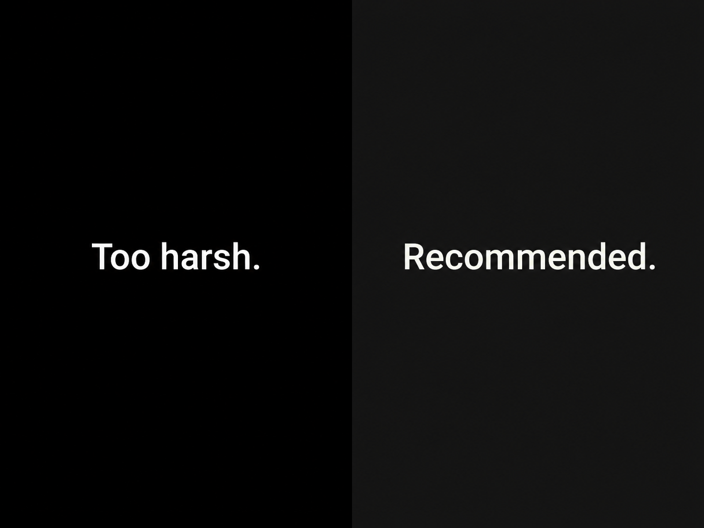
Avoid pure black backgrounds
Pure black (#000000) creates extreme contrast that is just as hard on the eyes as too little contrast. The harshness causes text to appear to bleed or vibrate, a phenomenon called halation, which is especially noticeable on OLED screens.
Most well-executed dark interfaces use a base background in the #0F0F0F to #1E1E1E range. Google's Material Design guidelines recommend #121212 as a starting point.
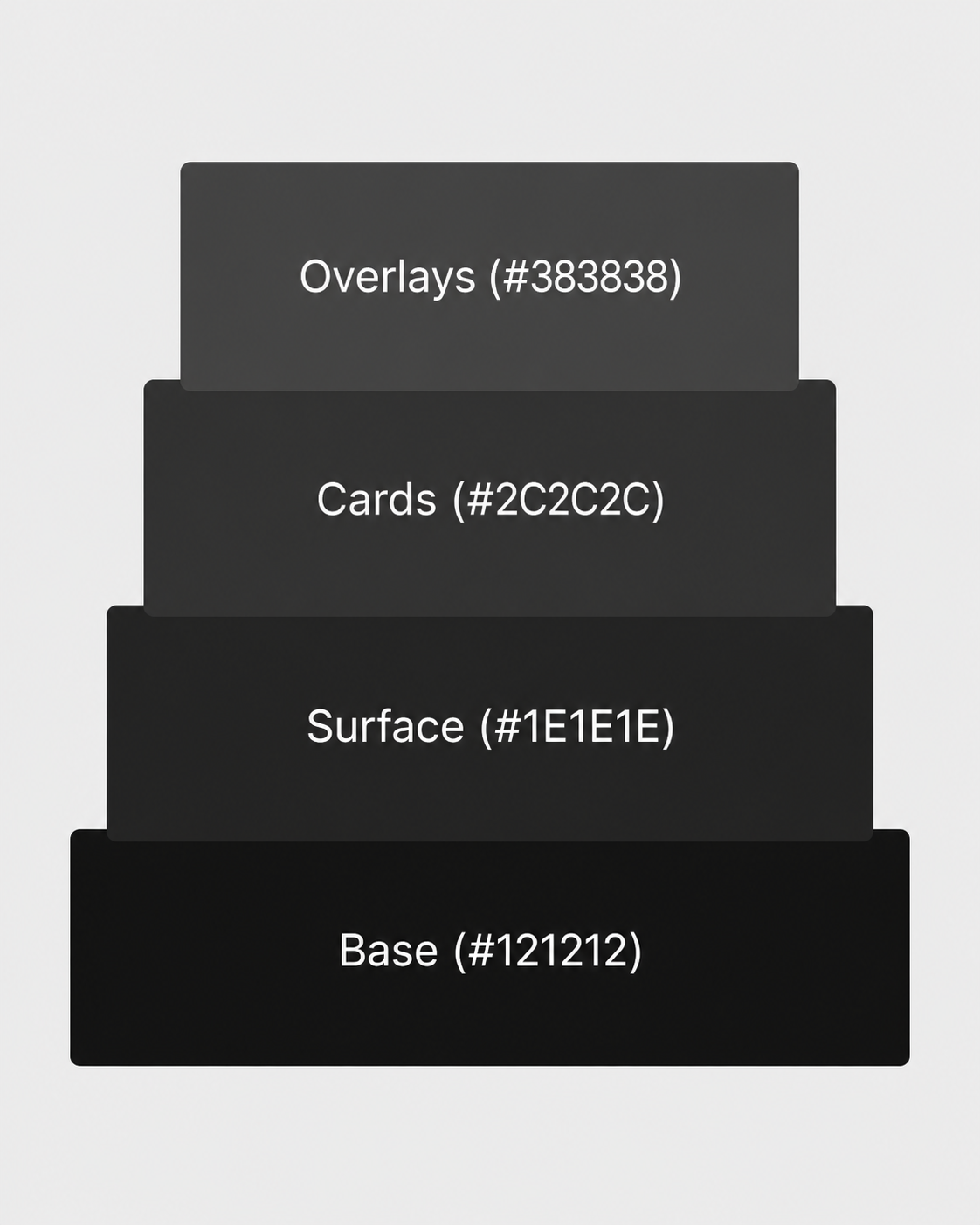
Build a layered surface system
Rather than using a single dark background, build a surface hierarchy where slightly lighter values indicate elevation:
- Base background: darkest value (e.g. #121212)
- Cards and panels: one step lighter (e.g. #1E1E1E)
- Modals and overlays: lighter still (e.g. #2C2C2C)
This gives users a clear sense of what is clickable, what is content, and what is contextual, without relying on shadow alone.
Adjust accent and brand colors
Colors that look confident on white often look aggressive or neon on dark backgrounds. When adapting your palette:
- Pull saturation down slightly
- Shift brightness up
- Pay extra attention to CTAs, links, and interactive elements where color carries meaning
You are not abandoning your brand palette. You are calibrating it for a different environment.
Rethink shadows
Dark shadows on dark surfaces are invisible. Instead:
- Use tinted or colored shadows that relate to the surface beneath them
- Rely primarily on the layered surface system for elevation
- When shadows are used, reduce opacity and shift the hue slightly toward the surface color
Prepare logo variants for dark backgrounds
Logos designed for light backgrounds often have dark outlines or detail elements that disappear on dark surfaces. Review how your mark holds up and produce a dark mode variant if needed. This also connects to broader logo design trends around simplification and adaptability, where marks that work across surfaces are increasingly standard.
Typography best practices for dark mode
Typography in dark mode is one of the most overlooked considerations. Text behavior changes significantly on dark backgrounds, and ignoring it causes readability problems that color alone cannot fix.
Use off-white instead of pure white
Pure white (#FFFFFF) text on dark backgrounds creates the same halation problem as pure black backgrounds. Use:
- Primary text: #E8E8E8 or #F0F0F0
- Secondary text and labels: a mid-gray stepped down from primary
- Captions and metadata: lower still, but always above 4.5:1 contrast ratio
Meet WCAG contrast requirements
The Web Content Accessibility Guidelines require:
- 4.5:1 minimum contrast ratio for normal body text
- 3:1 minimum for large text (18pt or 14pt bold)
Contrast ratios that pass in light mode do not automatically pass in dark mode. Run every text and background combination through a contrast checker before launch, not as an afterthought.
Adjust font weight
Thin and light font weights that look elegant on white become difficult to read on dark surfaces. The lower luminosity environment reduces perceived stroke width.
- Step up one weight for body text (regular to medium, for example)
- Avoid ultralight or thin weights for any readable body content
- This is one of the reasons font selection matters so much in dark UI work, and why certain typefaces that look refined in light mode can become a liability in dark interfaces, a problem that mirrors the broader issue of worst fonts in web design causing readability issues regardless of color scheme
Increase line height slightly
Dark backgrounds make long text feel denser and harder to scan. Increasing line height from 1.5 to 1.6 creates breathing room without requiring any structural layout changes.
How to handle images, icons, and logos in dark mode
Assets built for light mode can break in dark mode in ways that are easy to miss until the design is in a browser.
Transparent PNGs
Any transparent asset will show your dark background through it. Common problems include:
- Light halos around logos and illustrations
- Invisible detail elements designed for white backgrounds
- Washed-out graphics that assumed a light canvas
Fix this by exporting dark mode specific asset versions, or adding a controlled background treatment behind affected assets.
Icons
Icon sets designed for light mode use dark strokes that disappear on dark surfaces. Check whether your icon library includes a light variant or supports CSS color customization. For custom icons, slightly heavier strokes improve legibility at small sizes in dark mode.
Photography
Photos generally hold up well in dark mode, but images with large light areas can feel disconnected from a dark interface. A subtle dark overlay or slight desaturation applied in dark mode keeps photography feeling integrated. This matters most for hero images and photography within cards or feature sections.
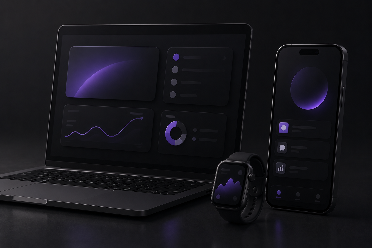
Dark mode UI design: components and patterns
Once color and typography are established, the work moves to individual components. This is where most of the edge cases live.
Buttons
- Primary buttons need strong contrast without oversaturation
- Outlined or ghost buttons need clearly visible borders against the surface they sit on
- Hover and active states need to be redesigned, not just adjusted. The logic of lightening vs darkening reverses in a dark context
Cards
- Card backgrounds need to be noticeably lighter than the page background, typically two to four steps in your surface scale
- Shadows should use reduced opacity rather than hard dark values
- The goal is a clear sense of elevation without stark contrast between layers
Form inputs
Form inputs are a common failure point in dark mode. Watch for:
- Borders that blend into the background and make the input invisible
- Placeholder text that was already low-contrast and becomes illegible
- Focus states that need a clearly visible brand accent color
- Error and success colors (particularly red and green) that behave poorly on dark surfaces at their standard light-mode values
Modals, tooltips, and overlays
- Use a middle-ground surface color: lighter than your base but still clearly dark
- Replace semi-transparent black scrims with a slightly lighter or tinted overlay
- The goal is communicating depth without creating an unnaturally dark stacking effect
Dark mode best practices for implementation
The visual design is only part of the work. How you implement dark mode technically determines how well it actually performs for users.
Support prefers-color-scheme
The CSS media query prefers-color-scheme reads the user's operating system preference and applies your styles accordingly. Users with dark mode set at the system level will see your dark mode automatically on arrival. This is baseline expected behavior in 2026.
Use CSS custom properties
CSS custom properties are the most practical way to manage a dual color system. Define your color tokens as variables at root level, then override them for dark mode:
- --color-background
- --color-surface
- --color-text-primary
- --color-text-secondary
- --color-accent
Every component referencing those tokens updates automatically when the mode switches, making the system easy to maintain as it grows.
Always include a manual toggle
Many users want to override their system preference on a per-site basis. A clearly accessible toggle in the header gives them that control. Keep in mind:
- Store the preference in localStorage so it persists across sessions
- Make sure the toggle is styled and visible in both modes
- Place it somewhere consistent — header navigation is the most common convention
Test on real devices
OLED screens render true blacks with no backlight, which makes contrast feel more extreme than it looks on an LCD monitor. A dark mode that looks balanced on your design machine can feel harsh on a current iPhone. Test on at least one OLED device and one LCD display before launch.
Dark mode design mistakes to avoid
Even with a solid process, certain mistakes come up repeatedly. Knowing what to watch for prevents rework after launch.
- Using pure black or pure white. Both extremes create contrast problems. If you see #000000 backgrounds or #FFFFFF text in a design file, treat them as a sign the dark mode pass has not been done properly.
- Overlooking third-party embeds. Forms, maps, chat widgets, and video players carry their own light mode styling that your CSS cannot override. Either choose tools that support dark mode natively, wrap embeds in a visual treatment, or design around them intentionally.
- Only auditing body text contrast. Icon contrast, placeholder text, disabled states, dividers, and border colors all need to meet WCAG requirements. A thorough pass reviews every visible element, not just paragraphs.
- Not testing with real content. Long-form text, data tables, embedded media, and user-generated content introduce variables that a static design review will not catch. Build in a round of realistic content testing before sign-off.
H2: Conclusion
Dark mode design is not a visual trend you can retrofit at the end of a project. It is a parallel design system that touches color, typography, components, assets, and implementation, and it requires the same level of care as the rest of your design work.
The fundamentals stay consistent across every project: avoid the extremes on both ends of the contrast scale, build a layered surface system, calibrate your brand colors for dark surfaces, and implement with CSS custom properties so the system stays maintainable as it grows.
If you are building a new site and want dark mode handled properly from the ground up, or need a proper dark mode pass on an existing one, our website design and development services cover both. Getting it right from the start is considerably less work than fixing it later.
H2: Frequently asked questions about dark mode design
What colors should I use for a dark mode background?
Avoid pure black. Most dark mode interfaces use a base background between #0F0F0F and #1E1E1E. Google's Material Design guidelines recommend #121212 as a starting point. From there, build lighter surface values for cards, modals, and overlays.
Does dark mode improve accessibility?
It can, but only when implemented correctly. Dark mode reduces eye strain in low-light environments and can benefit users with certain visual sensitivities. However, poorly executed dark mode with insufficient contrast can make accessibility worse. Always meet WCAG contrast ratios regardless of which mode you are in.
Should I use pure white text in dark mode?
No. Pure white (#FFFFFF) against dark backgrounds creates a harshness called halation that causes eye strain over time. Use off-white values like #E8E8E8 or #F0F0F0 for primary text instead.
What is prefers-color-scheme and do I need it?
prefers-color-scheme is a CSS media query that reads the user's operating system dark or light mode preference. Supporting it means your site automatically matches what the user has set at the system level. It is standard practice in 2026 and should be included in any dark mode implementation alongside a manual toggle.
Do I need a separate logo for dark mode?
In most cases, yes. Logos designed for light backgrounds often include dark elements that disappear on dark surfaces. A dark mode logo variant, typically with lighter or white elements, ensures your brand mark is clearly visible across both experiences.