10 Worst Fonts to Avoid in 2026

Back in 2012, scientists at CERN announced one of the most important discoveries in the history of physics: the Higgs boson particle. The presentation slides? Set in Comic Sans. The internet has never quite forgiven them. It's one of the most famous cases of a brilliant message undermined by a terrible font, and it proves a point every designer already knows: the worst fonts don't just look bad, they actively work against you.
Bad fonts cost you trust. They drop your conversions. They make polished brands look amateur and serious messages look like a joke. Whether you're building a website, designing a logo, or just sending a pitch deck, the typeface you choose carries as much weight as the words themselves. Below are 12 of the most hated fonts of all time, why designers can't stand them, and what they signal about your brand the moment someone sees them.
Why bad fonts hurt more than you think
Typography is the first impression your brand makes before anyone reads a single word. Typography is just one piece of the puzzle though, and it only lands when it is part of a coherent digital branding approach that covers every visual and verbal touchpoint your audience encounters. Studies on visual perception consistently show that people form judgments about credibility within milliseconds of seeing a page, and the font carries a disproportionate share of that signal. A poorly chosen typeface tells visitors that your brand is careless, dated, or untrustworthy, even when the actual content is excellent.
Beyond credibility, bad fonts hurt readability, and readability directly affects conversions. If users have to squint, slow down, or re-read sentences because of awkward letterforms, tight spacing, or oddly weighted strokes, they bounce. On a landing page or product page, even a small drop in reading ease can mean a measurable hit to sign-ups, purchases, and form completions. Fonts aren't decoration. They're infrastructure.
And then there's the question of brand age. Some fonts have been so overused, in so many of the wrong places, for so many years that they instantly date your business. Use them and you don't just look unfashionable, you look like you haven't updated anything since the early 2000s. That's a hard perception to recover from once it sets in.
The 10 most hated fonts of all time
These aren't just personal opinions. Each font below appears repeatedly across designer surveys, typography books, and the most-cited "worst fonts" articles on the web, ranked roughly by how universally indefensible they are.
1. Comic Sans
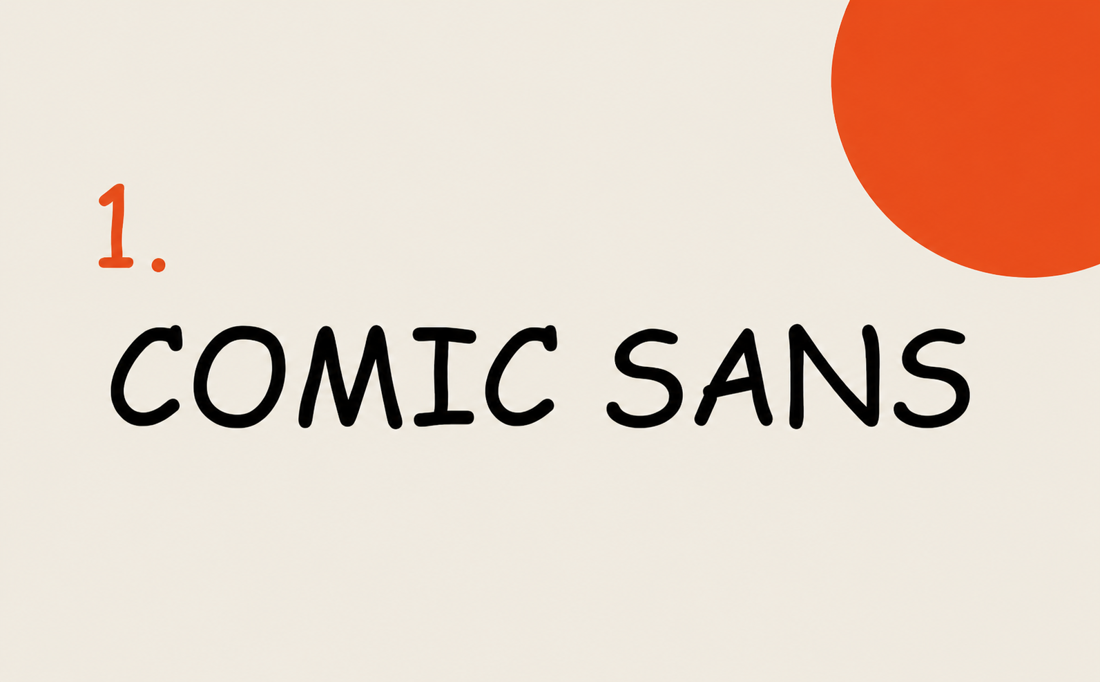
Comic Sans was designed in 1994 by Vincent Connare at Microsoft for the speech bubbles of Microsoft Bob, a children's interface for Windows. It never actually shipped in Bob, but it made its way into Windows 95 and from there into the wild. According to the Institute of Physics, the font's use in the Higgs boson presentation caused "a Twitterstorm and was described by The Guardian newspaper as a misuse and inappropriate." There's even an active Ban Comic Sans movement that's been running since 1999. The font itself isn't structurally broken, and it's actually praised for dyslexia accessibility, but its casual, childlike feel makes it wildly inappropriate for almost every professional context.
2. Papyrus
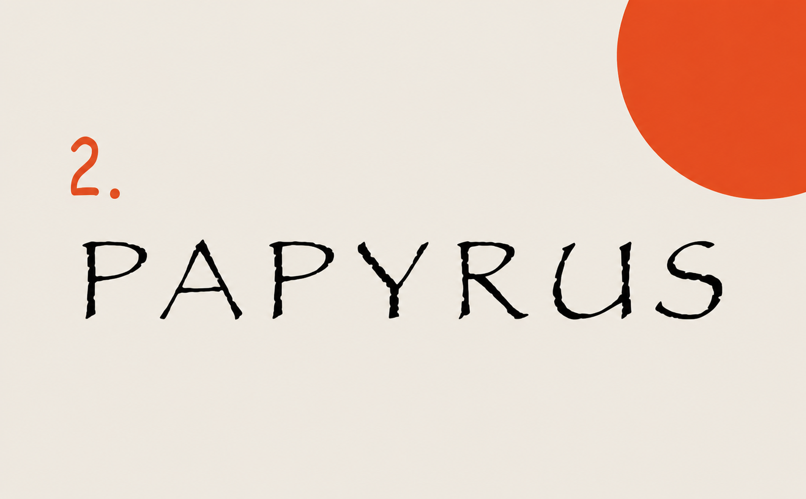
Designed in 1982 by Chris Costello, Papyrus was meant to evoke ancient, weathered handwriting. The problem is it got bundled into Microsoft Office, and from there it spread to every yoga studio, juice bar, Egyptian-themed restaurant, and most famously, the logo of Avatar. Saturday Night Live built an entire sketch around it starring Ryan Gosling in 2017, with his character melting down over how the designer of the Avatar logo simply "highlighted Avatar, clicked the drop-down menu, and randomly selected Papyrus." The sketch was so popular that director James Cameron was asked about the font in interviews, and a sequel sketch aired in 2024. If your brand uses Papyrus, your audience is probably already laughing.
3. Jokerman
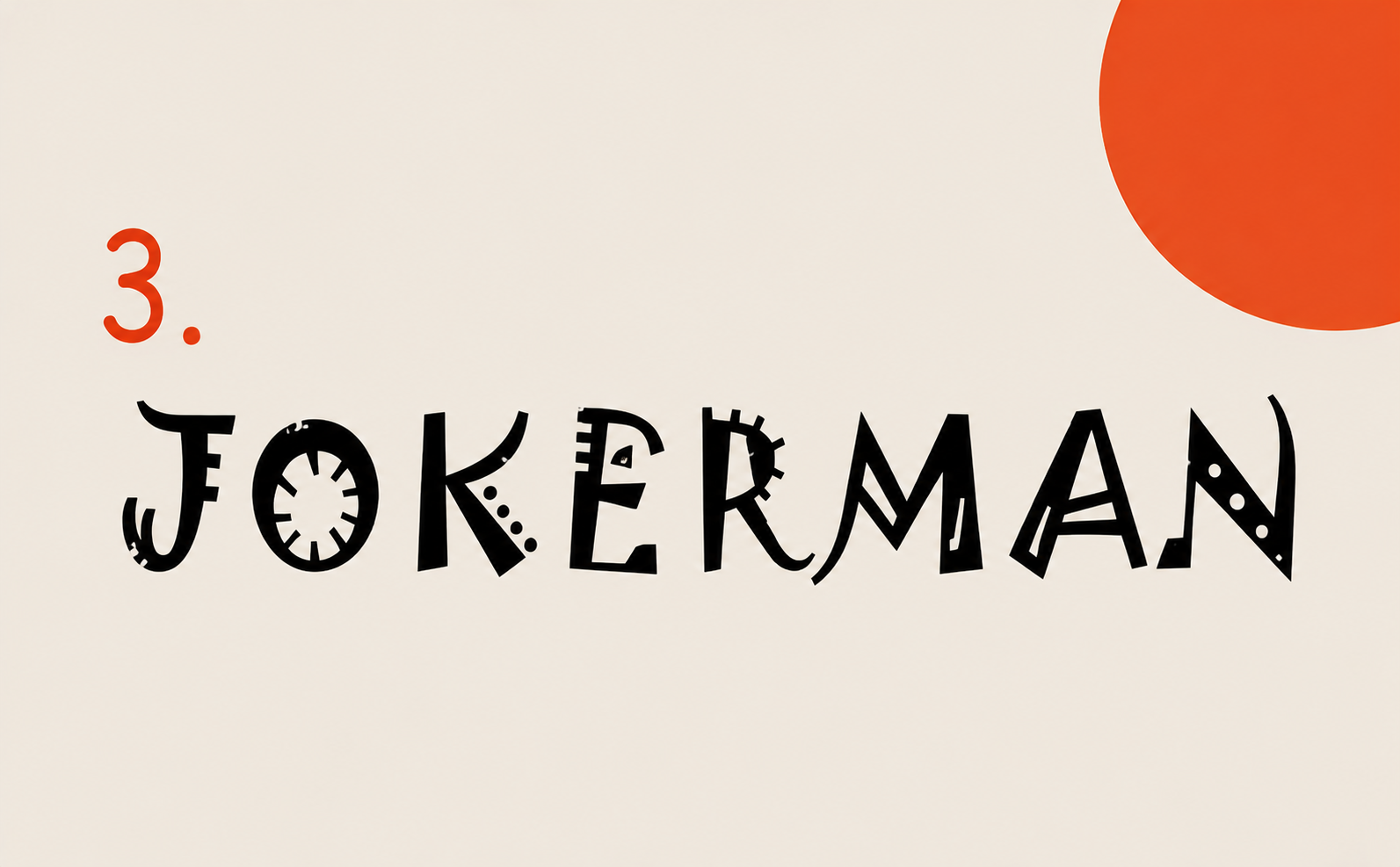
Designed in 1995 by British designer Andrew K. Smith, Jokerman is what happens when a font tries to be playful and ends up looking like a malfunctioning circus. Each letter is loaded with random dots, squiggles, and decorative shapes that shatter readability and break the rhythm of every word. Famed designer Stefan Sagmeister once said Jokerman "excels at being the worst font ever made" and that it should never be used, "not even in the Joker movie." Even Comic Sans defenders draw the line at Jokerman.
4. Curlz MT
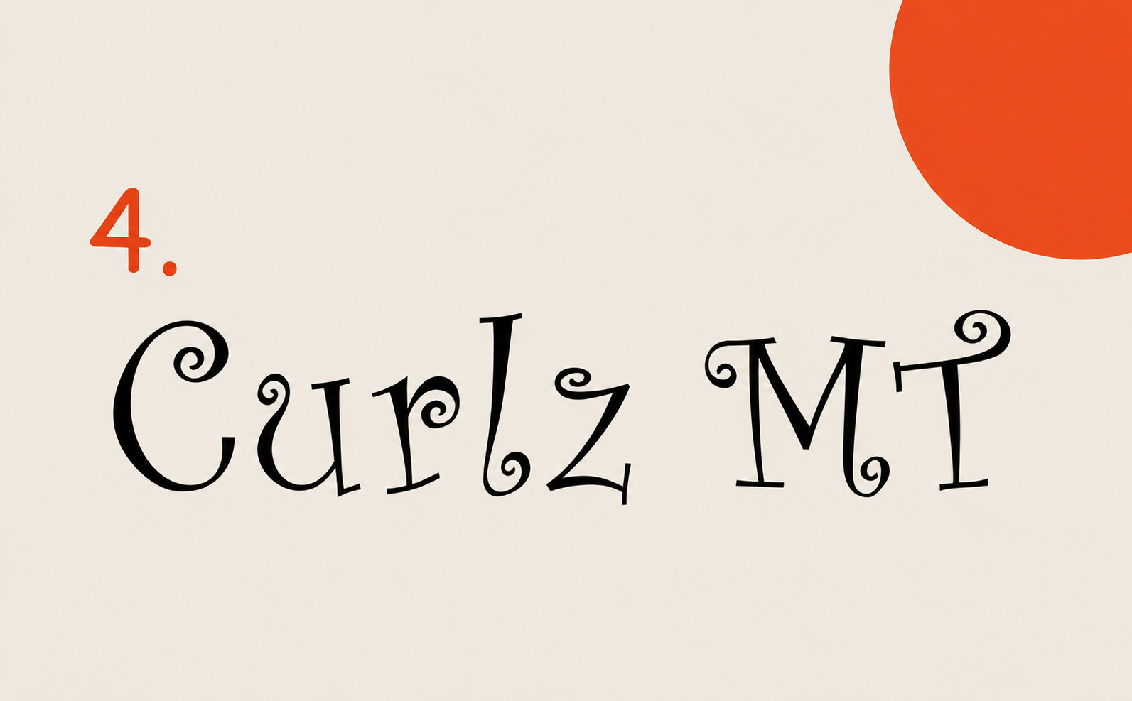
Curlz MT is what happens when a font tries to be playful and ends up looking like a tween's Lisa Frank notebook. Every letter is decorated with curls and flourishes that serve no functional purpose, kill readability, and date the design to the early 2000s. It found a home on bachelorette party invitations, nail salon flyers, and elementary school newsletters, and that's where it should have stayed. The font has no professional context, no scalable use case, and no defense against being one of the most regularly mocked typefaces in design discussions.
5. Algerian
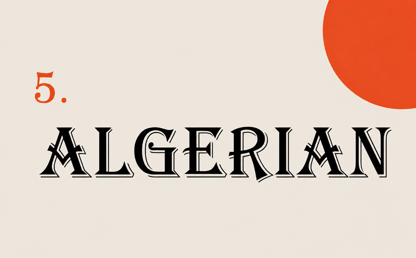
Designed by Phillip Kelly in 1988 to decorate Victorian-era works, Algerian is an all-caps display font with heavy serifs, ornamental details, and zero versatility. It became a default Microsoft Word option, which sealed its fate. It now looks like something pulled from old pub signage or 1990s Microsoft Word clip art, and its ornate detail makes it almost impossible to read at small sizes. There's no modern context where Algerian is the right answer. It's the typographic equivalent of finding a beige floral wallpaper border in a brand new house.
6. Bleeding Cowboys
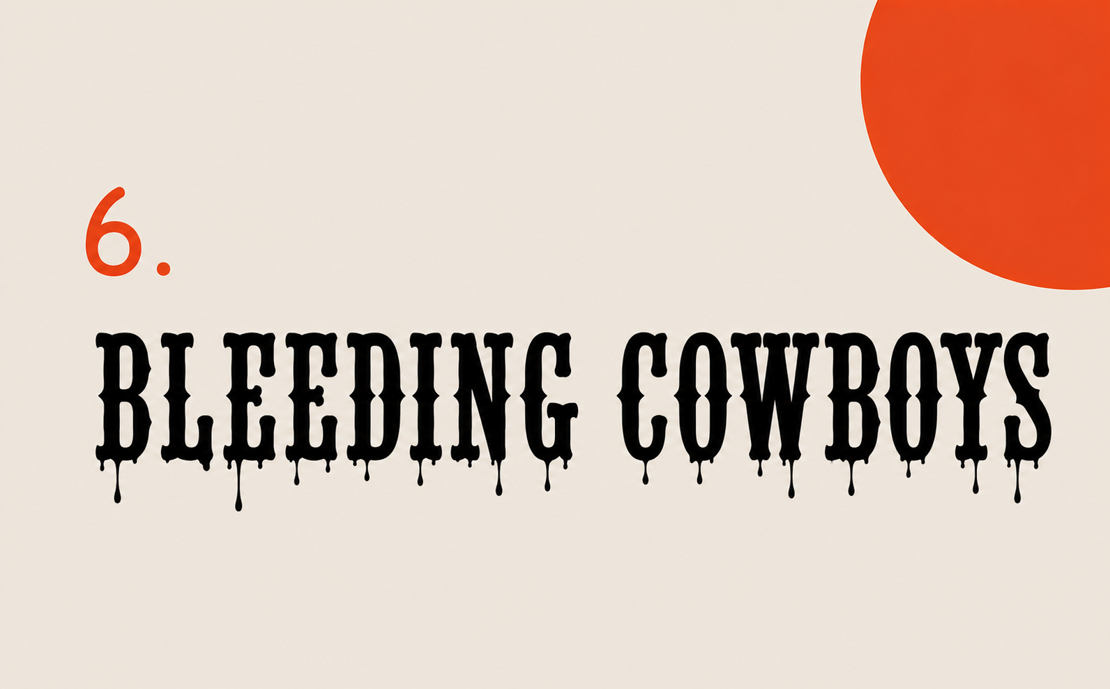
Bleeding Cowboys is a free font that became the most overused display typeface of the late 2000s. Every BBQ restaurant, biker bar, MMA gym, and country music album seemed to use it for about a decade straight. The font is a chaotic mix of distressed serifs, swashes, and Western lettering, with random fading on the letters and unpredictable strokes that aggressively communicate "rugged" while actually communicating "I downloaded a free font in 2008." It's now a designer in-joke, the shorthand for amateur display lettering done badly.
7. Trajan
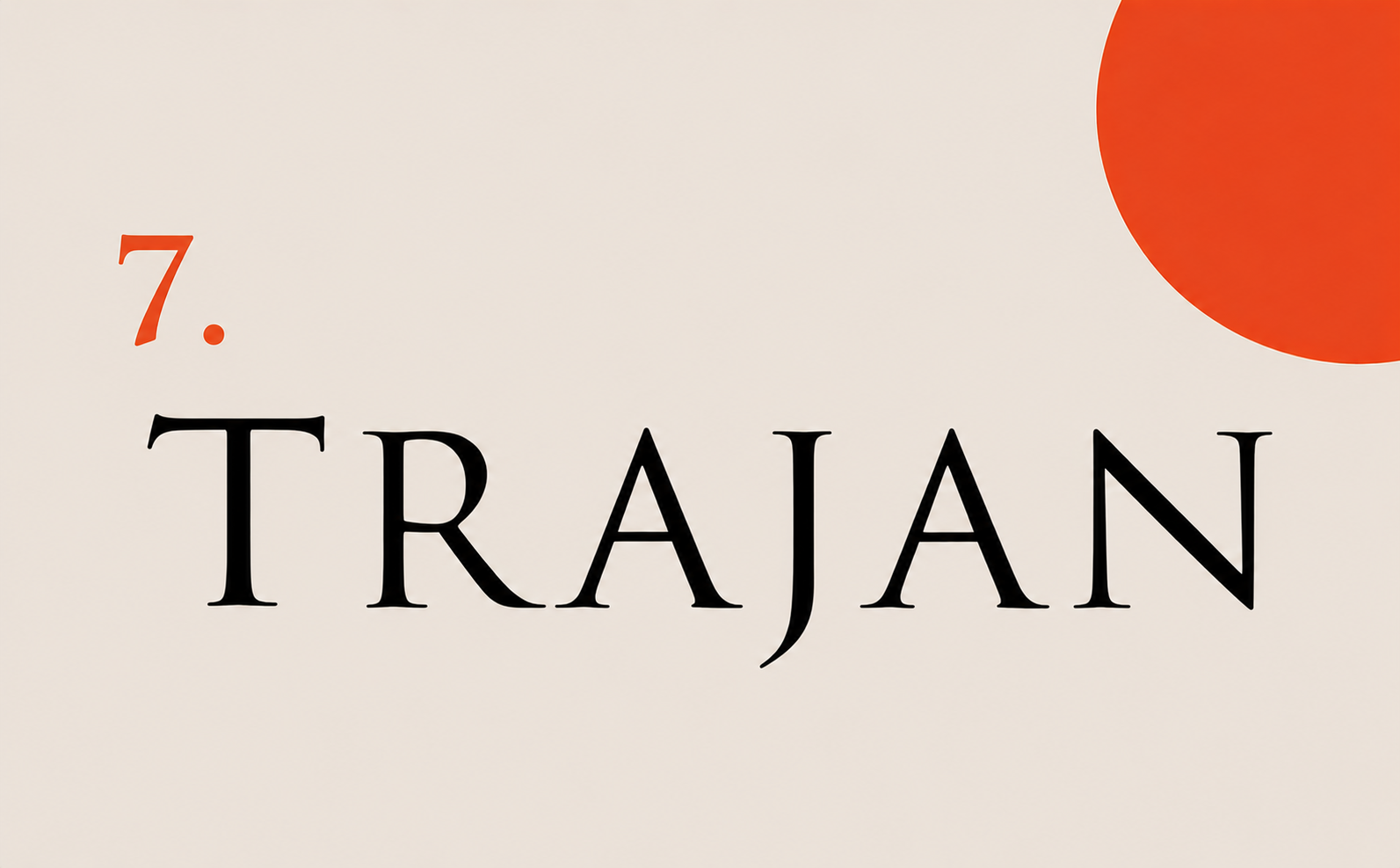
Trajan is a beautiful, classical, all-caps Roman typeface modeled on the inscriptions of Trajan's Column in Rome. Designed by Carol Twombly for Adobe in 1989, it's also the official font of seemingly every prestige movie poster ever made: Titanic, Gladiator, Apollo 13, Minority Report, A Beautiful Mind, and dozens more. Designer Yves Peters famously documented the trend in his "The Trajan Show" catalog of movie posters. Bundled with Adobe Creative Suite, Trajan became the lazy designer's shortcut for "make it look serious and cinematic," and now using it just makes your project look like a film that didn't get made.
8. Lobster
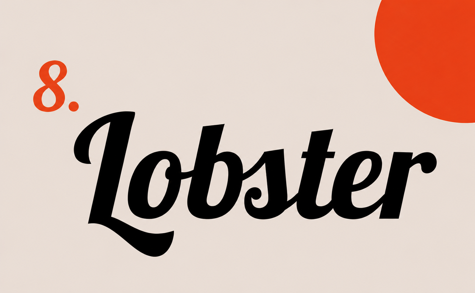
Designed by Pablo Impallari in 2010 and released as a free Google Font, Lobster was genuinely well-made and instantly popular. That popularity killed it. Over 14.9 million people downloaded it, which led Dowitcher Designs to officially declare "Lobster is the new Comic Sans." It plastered itself onto every hipster cafe menu, food truck, Etsy storefront, and influencer logo for most of the 2010s. The font isn't ugly. It's just so completely worn out that using it now signals "I picked the first free script font I could find."
9. Brush Script
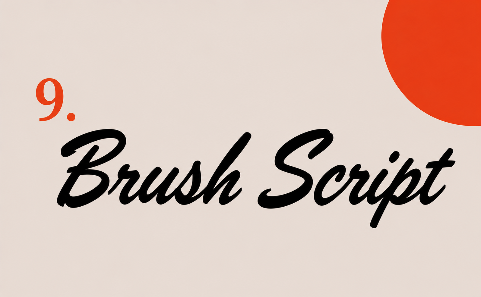
Designed in 1942 by Robert E. Smith to mimic hand-painted signage, Brush Script had its moment. That moment ended around 1965. The font ranked #3 on the "Least Favorite" list in Anthony Cahalan's 2007 designer survey, with respondents calling it "misused or overused," "ugly," and "boring, dated, impractical or clichéd." The font has a heavy, slanted, looping quality that reads as nostalgic at best and cheap at worst, and decades of supermarket sale tags, greeting cards, and church bulletins have stripped it of any charm.
10. Hobo
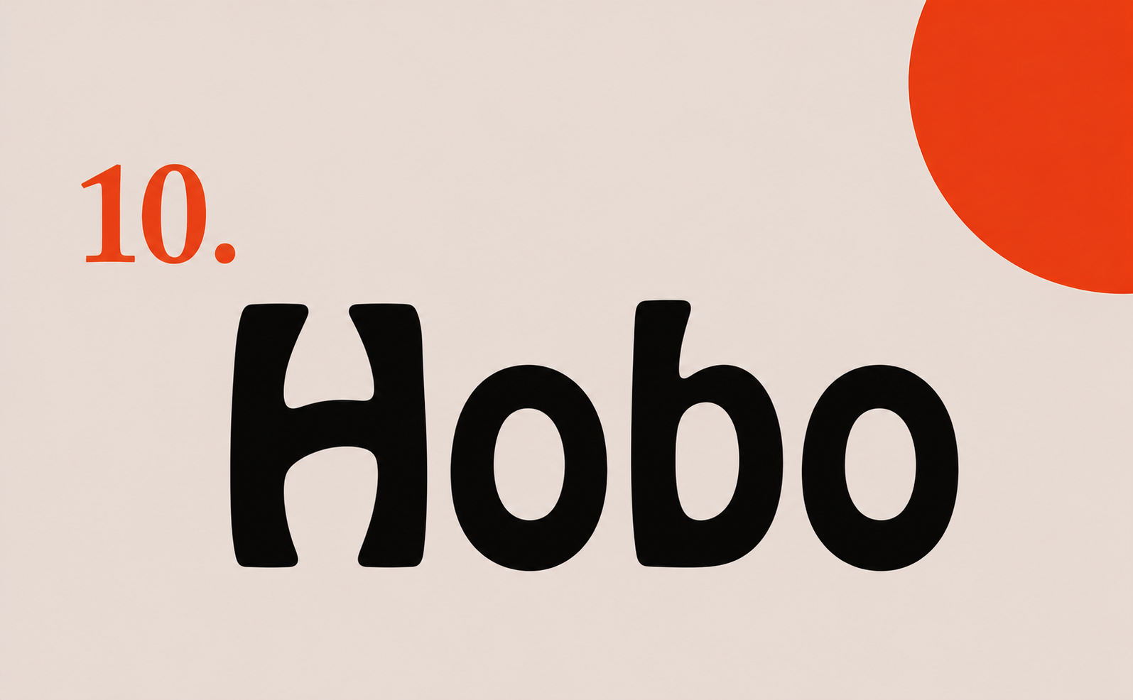
Designed in 1910 by Morris Fuller Benton, Hobo has the distinction of being a font with no straight lines and no descenders. Everything curves. Everything floats above the baseline. The result is a typeface that screams "70s sitcom title card" and absolutely nothing else. Author Simon Garfield included it among the worst fonts in his 2010 typography book Just My Type, and it's been mocked consistently in design communities for decades. The Dukes of Hazzard wants its font back.
Why fonts matter so much in web design
On a website, your font isn't decoration. It's doing the work of selling, explaining, and building trust before the visitor even processes the words on screen. Most of what people interact with online is written language, which means typography is doing the heavy lifting on every page they visit. A single bad font choice affects headlines, body copy, buttons, navigation, and forms all at once. Get it wrong and the entire site feels off, even when visitors can't articulate why.
Beyond aesthetics, fonts directly impact conversion rates. Legibility, line height, and letter spacing materially affect how long visitors stay on a page and how likely they are to complete an action like signing up, buying, or submitting a form. A font that's slightly too thin, slightly too condensed, or slightly too quirky adds cognitive friction, and on the web, friction is the enemy of conversion.
The right font, paired with logo design trends that match your brand direction, signals the right brand attributes instantly. A clean modern sans-serif tells visitors "we're a contemporary tech company." A refined serif tells them "we're established and considered." A poorly chosen display font tells them "we're amateurs," and they leave before reading a single word. Every typeface on a website is a brand decision, a UX decision, and a business decision wrapped into one.
Get the right font for your brand with Striped Horse
Choosing the right typography isn't just about avoiding the fonts on this list. It's about finding the one that fits your brand, works for your audience, performs on web and print, and holds up across every touchpoint your customers see.
That's the kind of work we do at Striped Horse. We're a branding and web design agency building conversion-focused websites and brand identities for growing businesses, with 2,000+ projects under our belt across industries like eCommerce, SaaS, coaching, and higher education. From brand identity and logo design to UI/UX and web development, we make sure every detail of your presence, typography included, actually earns its place.
If your brand is leaning on any of the typefaces above, or you're just not sure your current font is doing you any favors, let's talk.