.svg)


Best SaaS Website Designs in 2026
Most SaaS websites look the same. Dark gradient hero. Floating UI screenshots. A headline that says something like "The platform built for modern teams." If you have been in the industry for more than five minutes, you have seen it a hundred times. The problem is not that these sites look bad. It is that they all look identical, which means none of them stand out.
The best SaaS website designs do something different. They communicate value instantly, build trust before the user has scrolled once, and guide visitors toward a decision without feeling pushy. In this article, we break down the best SaaS websites we have come across and pull out the design decisions that actually make a difference.
What makes a great SaaS website design?
Before getting into the examples, it helps to understand what separates a high-performing SaaS site from one that just looks nice. Understanding what makes a good website in the first place, from purpose to navigation to trust signals, gives you the framework to spot exactly where conversions are being lost.
- A clear value proposition above the fold - Visitors should know exactly what your product does and who it is for within the first three seconds. That means a headline that speaks to an outcome, not a feature. "Manage your entire sales pipeline in one place" beats "A powerful CRM platform" every time.
- Social proof that shows up early - The best SaaS websites do not bury their logos and testimonials at the bottom of the page. They lead with them. Customer logos, usage numbers, review scores. These signals reduce friction and build credibility before the user has any reason to trust you.
- Product visuals that show, not tell - Screenshots, demo previews, and animated UI walkthroughs let visitors experience the product before they sign up. This is especially important in SaaS, where the product itself is often the best sales pitch.
- CTAs that are specific and repeated - Vague calls to action like "Learn more" or "Get started" do not convert as well as specific ones. CTA copy and placement are among the highest-impact changes you can make when you want to improve conversion rate without a full site redesign. "Start your free trial" or "See it in action" tell the visitor exactly what happens next. The best SaaS websites place CTAs at the top, in the middle, and at the bottom, not just once at the end.
- Mobile performance and speed - A significant portion of SaaS website traffic comes from mobile, especially for top-of-funnel visitors. Slow load times and broken layouts on smaller screens lose potential customers before they have read a single word.
The best SaaS website designs
The examples below are some of the most studied and referenced SaaS websites right now. In each case, we focus on the specific design decisions that make them work, not just how they look.
Linear
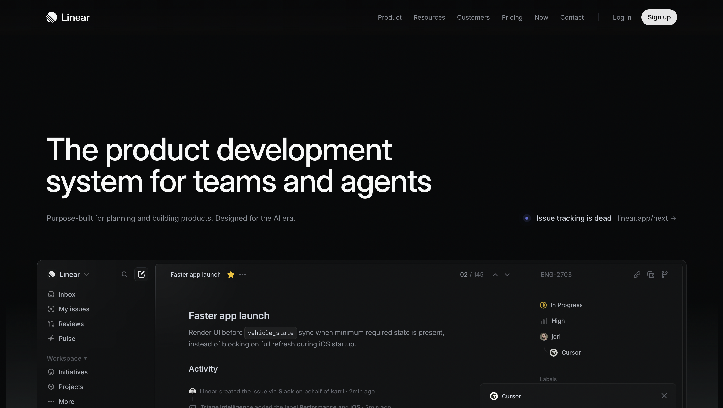
Linear is the most referenced example in SaaS design right now, and it earns that status. The homepage opens with a single line about how the product feels, not what it does. Below that, a real product clip, not a placeholder animation, shows the interface in action. Everything else on the page follows the same logic: tight copy, deliberate sections, nothing that does not serve a purpose. The dark aesthetic is not a stylistic choice. It is a signal to the audience. Engineering teams and product leads who live in dark-mode tools feel at home immediately, before they have read a word.
Takeaway: Open with one sharp positioning line. Your design choices signal who the product is for before anyone reads the copy.
Stripe

Stripe is the benchmark. The homepage achieves something most SaaS companies struggle with: selling to two very different audiences, developers and CFOs, without compromising either. Code samples appear on the homepage itself, signalling technical depth to developers. The language and social proof speak to enterprise decision makers at the same time. The custom illustrations are consistent across every product page. Nothing is borrowed from a template or a stock library, and it shows.
Takeaway: If you serve two distinct audiences, build modular sections for each. Do not average them into one vague message.
Notion

Notion uses its own product's visual language, blocks, drag handles, light pastels, as the design system for the marketing site. By the time you have scrolled the homepage, you understand how the product thinks before you have clicked anything. The site is playful without being childish, and the layout is open enough that the product screenshots breathe. It is a rare example of a website that functions as product onboarding before the user has signed up.
Takeaway: Turn your product's core metaphor into the design system for your marketing site.
Loom

Loom sells async video communication, and the homepage leads with a real product recording in the hero, not a description of what async video is. The CTA is "Get Loom Free," not "Request a Demo," which tells you everything about the go-to-market strategy: trial-led, not sales-led. Social proof lands early, well before the fold break. Loom is a clean example of a website that uses the product format to demonstrate the product itself.
Takeaway: If your product has a 30-second wow moment, lead with it. Do not gate it behind a form.
Webflow

Webflow's marketing site is the most direct argument the company could make for their product. The site uses scroll-driven motion, complex interactions, and custom animations that most SaaS companies would never attempt on a marketing page, because most SaaS companies are not trying to sell a visual development platform. Every interactive element is proof of what Webflow can build. The format of the site is the pitch.
Takeaway: Your marketing site is your single best sales asset. Treat it like a product, not a brochure.
Mercury

Mercury is a banking platform built for startups, and the website looks nothing like a bank. The design is calm, monochromatic, and sharply typeset. Product screenshots are native to the design system, not dropped in as afterthoughts. The copy speaks directly to startup founders, not "small business owners," and that specificity is intentional. In a category where most competitors default to trustworthy-but-bland, Mercury wins by looking like the future of the category.
Takeaway: If your category has a tired visual default, looking different starts with branding services, not just web design.
Figma

Figma's homepage embeds a live, interactive design canvas directly in the hero. Visitors can manipulate it before they have signed up for anything. This is progressive disclosure applied to product marketing: show capability before asking for commitment. The rest of the site follows the same logic, showcasing what real teams have built with the product rather than describing features in the abstract. The visual variety is intentional. Lots of colour, lots of different design styles, all of it reflecting the breadth of what the product enables.
Takeaway: Show your product being used before you ask for anything. Capability demonstrated beats capability described.
Vercel

Vercel is the strongest developer-tool benchmark in SaaS design right now. The dark aesthetic with neon accents signals technical credibility immediately, before a developer has read a word. Real-time deployment previews appear in the hero, which is exactly the right proof for a platform that promises fast, reliable deploys. The copy is dense and specific: no fluffy headlines, no generic benefit statements. It reads like documentation written by someone with taste, which is precisely the trust signal that a technical buyer needs.
Takeaway: For developer audiences, specificity is the design. Generic marketing language loses the sale before the page loads.
Attio

Attio is a next-generation CRM, and the website makes clear from the first scroll that this is not Salesforce. The design uses a dark and light mode toggle, bold geometric illustrations, and a monochromatic palette that feels modern without feeling cold. The value proposition is front and centre, and the product screenshots are integrated into the layout rather than dropped in as afterthoughts. What Attio gets right is category repositioning through design: the site feels nothing like legacy CRM tools, which is the entire point.
Takeaway: If you are displacing an established category, make sure your website looks nothing like the incumbents.
Raycast

Raycast is a productivity tool for developers and power users, and the homepage handles a wide feature set without feeling overwhelming. The trick is a consistent component system: uniform cards, generous spacing, and a single illustration style that lets the page show dozens of features without visual noise. The dark gradient aesthetic, tight typography, and motion cues all signal the product's audience before any copy does. It is a strong example of how to design for feature-rich products without building a feature wall.
Takeaway: When your product does a lot, a consistent component system lets you show depth without creating clutter.
SaaS website design patterns worth using
Across the best SaaS website designs, a handful of patterns show up consistently. These are not trends: they are structural decisions that work because they match how buyers actually behave.
Hero section structure that works
The highest-converting hero sections follow a predictable structure: an outcome-focused headline, a one-sentence supporting statement, a primary CTA, and a trust signal (logo bar or review score) immediately below. That is it. Anything added to this structure usually reduces performance. The temptation to put more above the fold almost always hurts conversion.
How top SaaS sites use animation without hurting performance
Animation on SaaS websites tends to follow two failure modes: no animation at all (feels flat and static) or too much animation (feels slow and distracting). The best sites use animation to direct attention, not decorate. Scroll-triggered reveals, subtle UI interactions, and hover states add life to the page without adding load time. The rule of thumb is simple: if removing the animation would make the page harder to understand, keep it. If not, cut it.
Dark vs light: what your choice signals
This is a design decision that communicates before the visitor reads anything. Getting dark mode design right takes more than picking a black background - the palette, typography, and component states all need to be tuned for a low-light surface. Light designs signal accessibility, approachability, and broad market appeal, common in HR tech, healthcare SaaS, and tools targeting non-technical buyers. Dark designs signal technical depth, performance, and premium positioning, common in developer tools, infrastructure, and design software. Neither is better. Both should be chosen deliberately based on who the buyer is and what they need to feel before they will trust the product.
Pricing page: the most neglected page in SaaS
Most SaaS companies spend 90% of their design budget on the homepage and 10% on everything else. The pricing page is almost always an afterthought, and it is the page that the highest-intent visitors go to. The best pricing pages are transparent, comparison-friendly, and include a proof layer (testimonials, security badges, FAQ) that specifically addresses the objections a buyer has at the moment they are about to hand over money. If your pricing page looks like it was designed in an afternoon, it is probably costing you conversions.
Need a SaaS website that converts?
A great SaaS website is not just a design project. It is a sales tool, a trust-building mechanism, and often the first real impression a potential customer has of your product. Getting it right takes more than a good-looking template.
Striped Horse is a SaaS website design agency that builds websites around how buyers actually think and behave, from the first scroll to the decision to book a demo. If you are building a SaaS product and want a website that does more than look good, we would love to talk. You can also see more of our work in our portfolio.