.svg)


21 Web Design Tips Backed By Data (2026 Guide)

Visitors form an opinion about your website in about 0.05 seconds, and research consistently shows that roughly 94% of that first impression comes down to design, not content. Before anyone reads a single word of your copy, your layout, typography, and imagery have already told them whether you look credible.
That is a lot of pressure on design decisions, and it is why guesswork is a bad strategy. At Striped Horse, we have designed and rebuilt hundreds of websites for organizations from Stanford to early-stage startups, and the website design tips below reflect what actually moves results across those projects. Each one is grounded in published research or in patterns we see repeatedly in client work.
Most tips for designing a website focus on how a site looks. These 21 tips go further and cover structure, readability, visuals, navigation, speed, accessibility, and conversion. Whether you are building a new site or improving an existing one, they apply at every scale.
Start with structure and layout
Good web design principles start with the skeleton of the page. Before colors and imagery, structure decides what visitors see, in what order, and whether they keep scrolling.
1. Build a clear visual hierarchy
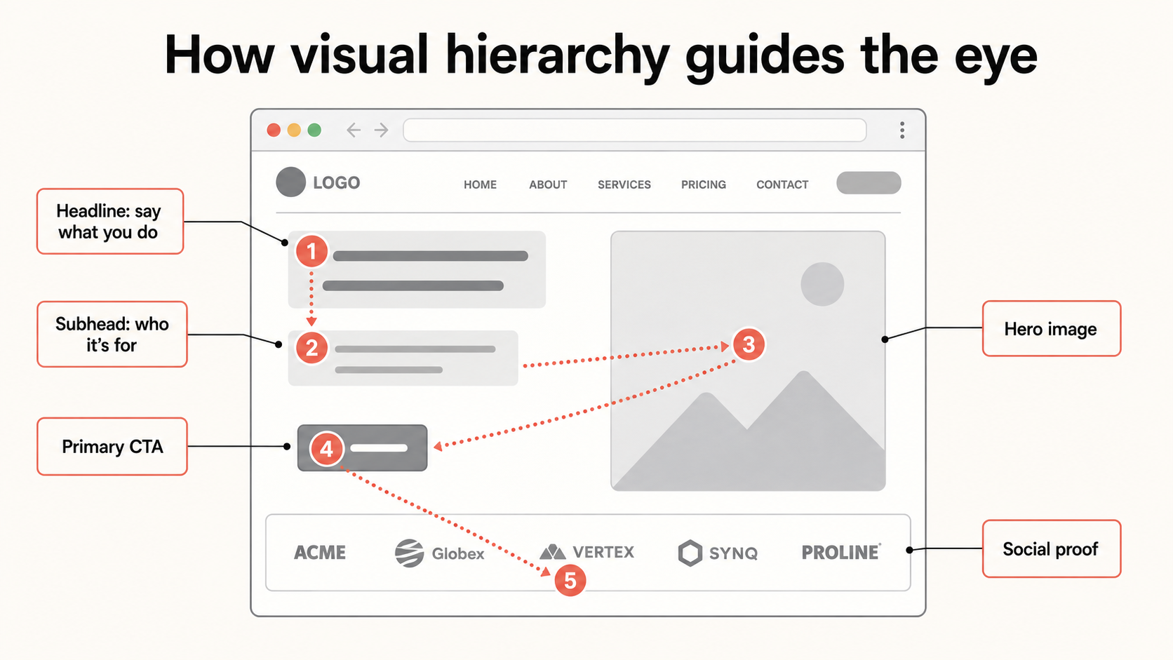
Every page has a visual hierarchy whether you planned one or not. Size, position, contrast, and white space determine what the eye lands on first, second, and third. The goal is to make that sequence intentional: your value proposition first, supporting evidence second, and a call to action at every point where interest peaks. A quick test we run on client pages at our web design agency is the five-second glance. Show the page to someone for five seconds, then ask what the company does and what they were supposed to click. If they cannot answer both, the hierarchy is working against you.
2. Say what you do above the fold
Eye-tracking research from Nielsen Norman Group shows that users still spend the majority of their viewing time in the area visible without scrolling. That space needs to answer the visitor's first question: am I in the right place? Skip the clever tagline and write a descriptive headline that says what you do and for whom, ideally using the language your customers actually search with. Clear beats clever every time, and a keyphrase-focused headline helps your rankings at the same time. In homepage design, that means using the hero section to establish what the business offers, who it is for, and what visitors should do next before introducing secondary messages further down the page.
3. Make pages long enough to answer every question
A common fear is that long pages scare people off. The data says otherwise. In one of the most cited conversion experiments ever run, Crazy Egg rebuilt a sales page to address every question and objection its customers raised in surveys. The new page was roughly 20 times longer, and conversions rose by about 30%. Scrolling is easy; deciding to click somewhere else is not. Treat each page like a sales conversation. Keep answering questions down the page, and place calls to action wherever a visitor is likely to feel ready, not only at the top.
4. Keep it simple and stick to conventions
Google's research on first impressions found two traits that predict whether people perceive a site as beautiful: low visual complexity and high prototypicality, meaning the site looks the way people expect a website to look. In plain terms, simple and familiar wins. Logo in the top left, horizontal navigation, a clear hero section, and one focal point per screen. Differentiate your brand through what you say and show, not by reinventing how a website works. Layout experiments almost always cost more usability than they earn in memorability.
5. Skip carousels, tabs, and accordions
Rotating hero sliders are popular in stakeholder meetings and terrible in analytics. Testing across university and commercial sites has repeatedly shown that only around 1% of visitors click a carousel, and nearly all of those clicks go to the first slide. Content hidden behind tabs and accordions suffers the same fate: if people have to click to reveal it, most never see it. Stack your content down the page instead, and promote your single strongest message to a static hero with one clear call to action.
Design for how people actually read
The next set of tips on website design deals with reading behavior. People do not read web pages the way they read books. They scan, skip, and sample, and pages designed for that behavior consistently outperform pages designed to be read line by line.
6. Design around F and Z scanning patterns
Nielsen Norman Group's eye-tracking studies show that on text-heavy pages, eyes tend to move in an F-shaped pattern: across the top, down the left edge, and across again partway down. On more visual pages like landing pages, attention often follows a Z path from the top left to the bottom right. Neither pattern is a rule to obey blindly, but both tell you the same thing: the top left of the page and the beginnings of lines carry disproportionate weight. Front-load headings and sentences with the words that matter, and place key elements along the paths people naturally follow.

7. Use white space deliberately
White space is not wasted space. It groups related elements, separates unrelated ones, and gives important content room to command attention. Crowded layouts force visitors to work out what belongs together; generous spacing does that work for them. When a page feels cluttered, the instinct is often to shrink things to fit more in. The better fix is usually to remove elements until what remains can breathe.
8. Write meaningful subheads, not labels
Subheadings are large, prominent, and read by nearly every scanner, which makes vague ones a wasted opportunity. "Our services" tells a visitor nothing; "Web design for healthcare organizations" tells them they are in the right place. Descriptive subheads help scanning visitors, screen reader users, and search engines all at once. If a subhead could sit on any website in any industry, rewrite it until it could only sit on yours.
9. Keep paragraphs short and language simple
Long paragraphs get skimmed and dense language gets abandoned. Keep paragraphs to three or four lines, keep sentences short, and use the words your visitors use rather than internal jargon. Research on web readability shows that simplifying language improves task success for all users, including highly educated ones. Nobody has ever left a website because it was too easy to understand.
10. Put key items first and last in lists
The serial position effect is a well-documented memory bias: people recall the first and last items in a sequence far better than the middle. It applies to bullet lists, navigation menus, pricing tables, and feature grids. Whatever you most need a visitor to remember, place it at the start or the end. The middle of any list is where attention goes to rest.
Use visuals that build trust
Images carry a large share of that 94% design-driven first impression, so choose them with the same rigor as your copy.
11. Show real people, not stock photos
Nielsen Norman Group's research on image engagement found that visitors ignore generic stock photos and decorative filler, but actually study photos of real people connected to the business. Polished stock imagery signals effort; real photos of your team, your office, and your customers signal trustworthiness. Authenticity beats polish, even when the lighting is imperfect.
12. Use faces and arrows as directional cues
Eye-tracking studies have repeatedly shown that we look where other people in an image are looking. A portrait gazing toward your headline pulls attention to the headline; the same portrait staring at the camera pulls attention away from it. Simple visual cues like arrows work even more directly. If you want visitors to notice a form, a stat, or a button, point at it, literally or with a line of sight.
13. Pick one action color for every call to action
Buttons do not need to be a specific color; they need to contrast with everything around them. Choose one action color that appears nowhere else in your design and reserve it exclusively for links and buttons. Contrast it against the background, against the button text, and against neighboring elements. When every clickable element shares one distinctive color, visitors learn the rule instantly and never have to hunt for what to do next.
Make navigation effortless
Navigation is where structure meets trust. It is one of the first places visitors look, and it quietly shapes whether they find what they came for or give up trying. Two tips do most of the heavy lifting here.
14. Use descriptive navigation labels
Your navigation is one of the most visually prominent elements on every page, which makes it prime communication real estate. Generic labels like "Solutions" or "What we do" waste it. Descriptive labels like "Web design" or "Healthcare websites" help visitors orient faster and give search engines clearer signals about what your pages cover. Keep the menu short, five to seven items at most, since every added option dilutes attention from the rest.
15. Link away from conversion pages carefully
Every link on a page is an invitation to leave it. On blog posts, that is fine; citing sources and pointing readers to related content is how trust is built. On service pages and landing pages, it is a leak. Before adding any link to a page designed to convert, ask whether the click moves the visitor toward your goal or away from it. The same logic applies to social media icons: keep them in the footer, not the header, so they are findable without being promoted.
Prioritize speed and mobile
Here is where designing a website in 2026 differs most from a decade ago. Performance is no longer a developer afterthought; it is a design decision with direct revenue consequences.
16. Treat Core Web Vitals as a design constraint
Speed research points in one direction. Google found that the probability of a bounce increases 32% as load time grows from one to three seconds, a one second delay is commonly linked to a roughly 7% drop in conversions, and Deloitte found that a 0.1 second speed improvement lifted retail conversions by around 8%. Yet current data suggests only about half of websites pass Google's Core Web Vitals thresholds. The design choices that break these budgets are predictable: oversized hero videos, heavy image assets, and script-laden animations. Set a performance budget at the design stage, not after launch.

17. Design mobile first, not mobile adapted
Mobile devices account for roughly 60% of global web traffic, Google indexes the mobile version of your site first, and mobile-optimized sites have been shown to convert dramatically better than sites that merely shrink to fit. Designing mobile first means starting from the small screen: one column, thumb-sized tap targets, readable type without zooming, and simplified navigation. Whether you build with responsive or adaptive design, the mobile experience has to be designed first and expanded up, not designed for desktop and squeezed down.
18. Optimize every image
Images are usually the heaviest assets on a page and the easiest performance win. Export at the dimensions actually displayed, compress everything, serve modern formats like WebP or AVIF, and lazy-load anything below the fold. This is unglamorous work, and it routinely cuts page weight by more than half. A beautiful image that takes four seconds to appear is not doing its job.
Design for accessibility and AI search
Accessibility and machine readability used to be separate conversations. Today they overlap almost completely, because the same clear structure that helps a screen reader also helps a search engine or an AI assistant understand and cite your page.
19. Make accessibility part of the design brief
Accessible design is often framed as a compliance requirement, but it is really a quality standard that benefits every visitor. Sufficient color contrast helps people reading in sunlight, not only people with low vision. Descriptive alt text serves screen readers and image search alike. Visible focus states, logical heading order, and forms with real labels make sites easier for everyone to use. Building accessibility in from the first wireframe costs little; retrofitting it after launch is expensive.
20. Structure pages so machines can read them too
A growing share of discovery now happens through AI-generated answers, and those systems favor pages with clean structure: a logical heading hierarchy, direct answers near the top of sections, descriptive subheads, and structured data where it fits. Conveniently, this is the same structure that helps human scanners. A page organized clearly enough for a distracted visitor is also organized clearly enough to be cited by a search engine or an AI assistant. Design for clarity and both audiences are served at once.
Add proof everywhere it matters
Design earns attention; proof earns action. The final tip is the one we see skipped most often, and it is usually the cheapest to fix.21. Back every claim with evidence
You can apply these website design tips incrementally, starting with the highest-impact changes: clarify your above-the-fold message, speed up your pages, and put proof next to your calls to action. Or, if your site needs more than incremental fixes, our website redesign services modernize what holds your site back while protecting the SEO you have already earned. Every layout, user flow, and call to action is treated as a conversion decision. Get in touch and let's talk about your project.