Logo Design Trends 2026: What's Actually Worth Following
Logo design trends 2026 aren't about one aesthetic taking over. They're a reaction against a decade of safe, flat, look-alike branding. After years of every new brand reaching for the same minimal sans serif mark, designers and business owners alike are pushing for something that's actually memorable again.
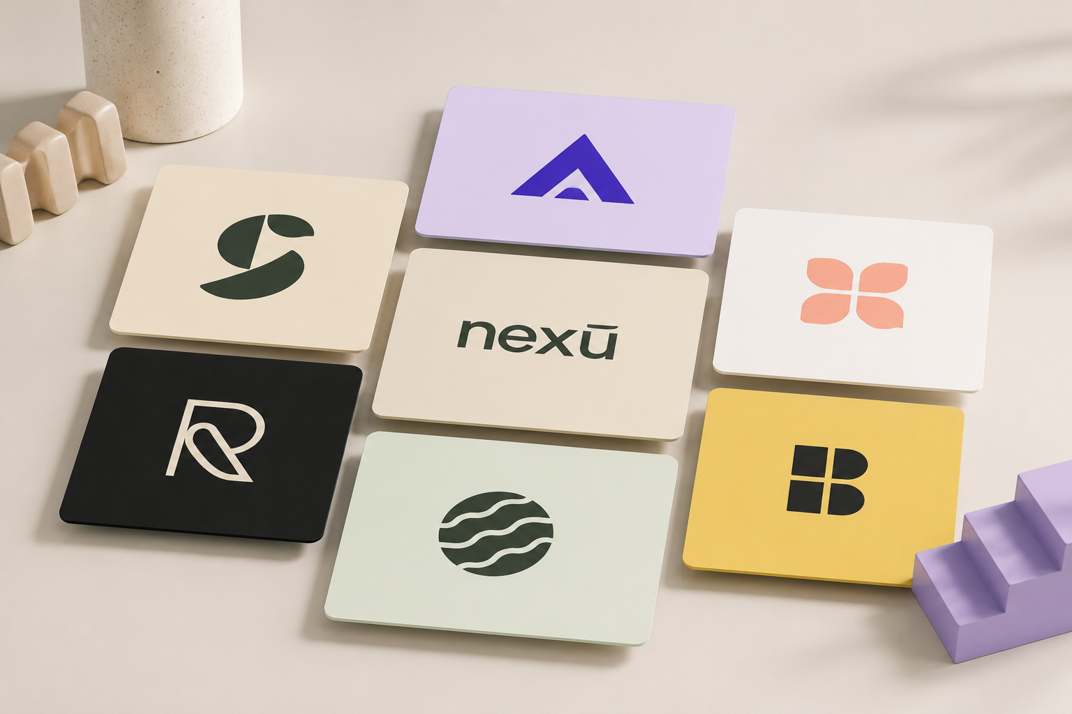
That shift is showing up everywhere this year, in hand-drawn imperfection, nostalgic typography, bolder type, and logo systems built to flex across more platforms than a single static file ever had to handle. Some of it is worth paying attention to no matter what kind of business you run. Some of it is more relevant to digital-first or larger brands with the resources to support it.
This guide breaks down what's behind modern logo design trends right now, walks through the directions actually worth knowing about, and covers how to figure out which one, if any, is right for your brand.
TL;DR: where logo design is headed in 2026
- Hand-drawn, slightly imperfect details are replacing flawless, machine-made polish.
- Nostalgia is back, but reworked through current execution rather than literal throwbacks.
- Type itself is getting bolder, chunkier, and more distinctive.
- Logos are being built as full systems (primary mark, icon, favicon, social version), not one file.
- Motion and context-aware logos are emerging, mostly among larger, digital-first brands.
- Historic and folklore-inspired motifs are showing up in food, beverage, and craft branding.
- The trend itself matters less than whether it fits your brand strategy and will still hold up in five years.
Why 2026's logo trends are reacting against years of sameness
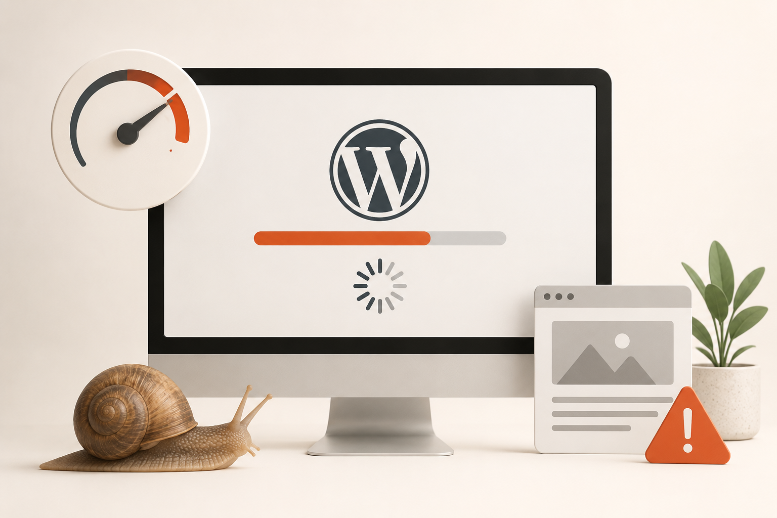
For most of the 2010s and early 2020s, logo design leaned hard into flat, minimal, geometric marks. It was safe, scalable, and largely indistinguishable from one competitor to the next. What's happening in 2026 is a pretty direct response to that. Brands want to be remembered, not just legible. That shift shows up in a few different but related directions, and most of them trace back to the same root cause: when a clean, competent logo takes seconds to generate, looking clean and competent stops being a differentiator.
Hand-drawn details and imperfect typography
The clearest thread running through 2026 logo work is a move away from polish. Slightly uneven lines, hand-drawn touches, asymmetrical details, and typography that looks intentionally imperfect are showing up across categories, from food and beverage brands to lifestyle and creative studios. The logic is straightforward: when any brand can generate a clean, competent logo with an AI tool in seconds, a small human imperfection is what signals there's actually a person and a point of view behind it.
This doesn't mean sloppy. The strongest examples keep one deliberate quirk (a tilted letter, an uneven stroke, a hand-lettered touch) while keeping everything else legible and controlled. The imperfection is the accent, not the whole design.
Nostalgia, but not literal
Nostalgia keeps showing up in modern logo design trends, but it's rarely a literal throwback. Designers are pulling specific textures and shapes from earlier decades and reworking them with current execution. That might mean chunky, rounded 1970s-style serifs, bubbly Y2K-era lettering, or sharp, pixelated marks that nod to early internet graphics.
What ties these together isn't a specific decade, it's the feeling: warmth, playfulness, or a sense of history, without the logo actually looking dated. Brands using this well tend to pick one nostalgic reference point and commit to it, rather than blending several eras into one mark, which tends to read as confused rather than intentional.
Bold, maximalist typography
After years of quiet, uniform wordmarks, type itself is becoming the main event again. Chunky serifs, tapered letterforms, oversized type, and unexpected proportions are replacing the safer lettering that dominated the last decade.
For a brand trying to stand out on a crowded shelf, a busy social feed, or next to a dozen competitors that all look the same, distinctive typography can do more work than an icon ever could. This direction tends to suit brands with a strong point of view and a willingness to look different, more than it suits brands trying to appear conservative or established. A law firm leaning into oversized, quirky type is a harder sell than a coffee roaster doing the same thing.
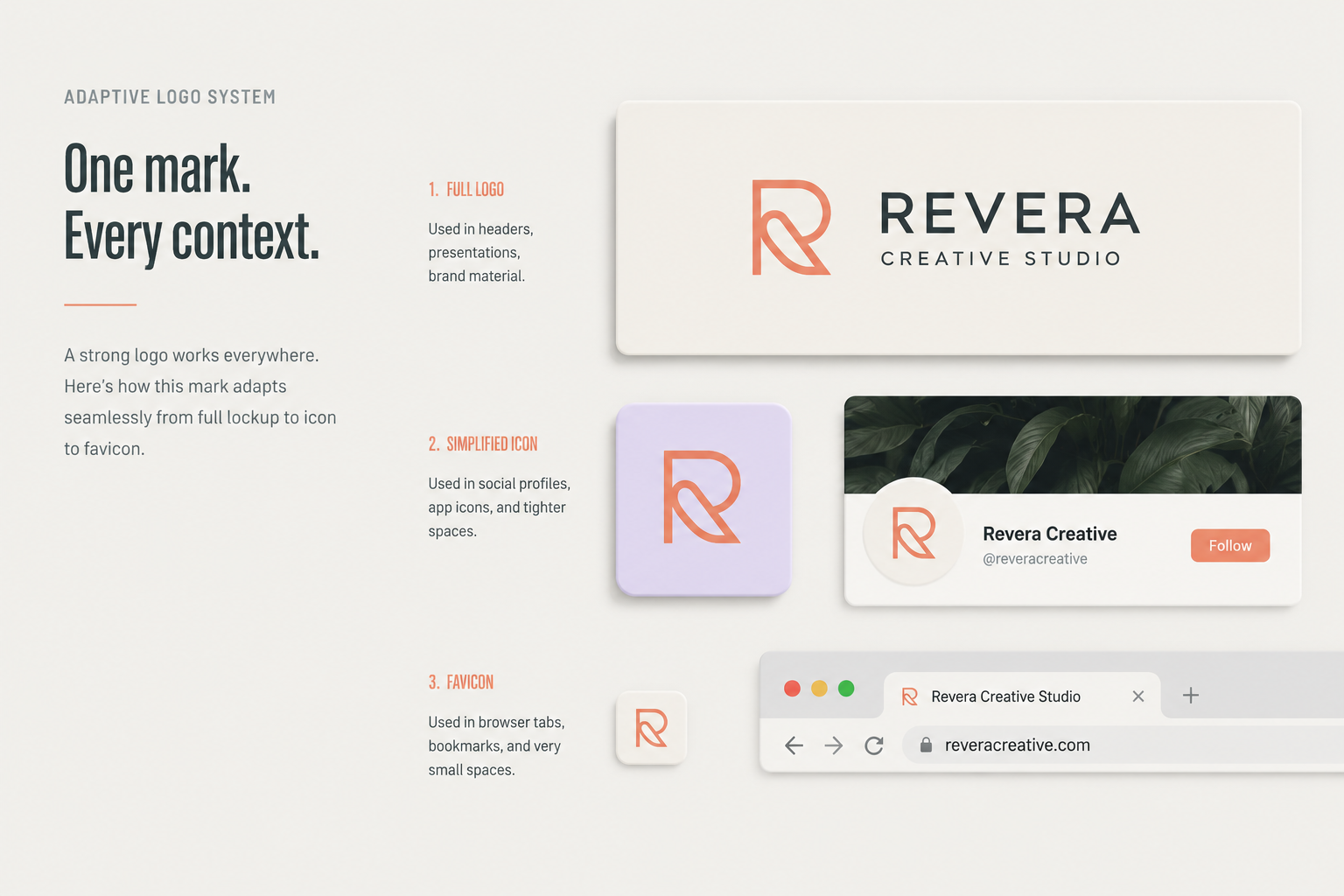
Logo systems that adapt across platforms
A single static logo file isn't enough anymore. Brands today need a full system: a primary mark, a simplified icon, a favicon, and often a separate version built specifically for social platforms, each one legible at its own size and context. It's less a stylistic trend than a practical one, but it's reshaping how logos get designed in 2026.
It's the same logic behind responsive vs adaptive design on a website: the goal isn't one solution that technically works everywhere, it's the right version for each context. A logo system is only as strong as the site that ends up delivering it, so if a redesign is on the table alongside a new logo, it's worth looping in your professional web development services team early rather than bolting the new logo onto an old build later.
Motion and dynamic marks
A smaller but growing trend is logos that shift slightly depending on context: a different color by time of day, a subtle animation on a website, or a mark that changes shape across placements while keeping its core identity recognizable.
Right now, this mostly shows up with larger, digital-first brands that have the resources to manage multiple animated variations. For most small and mid-size businesses, it's worth knowing about, but not something to prioritize over getting the core static logo right first.
Heritage and historic motifs
On the opposite end from anything pixelated or futuristic, a number of 2026 logos are pulling from older, more historic references: engraved linework, stamp and seal-style badges, gothic or blackletter type, and folklore-inspired imagery. These marks aim for a feeling of being established, rooted, or storied, even for a brand that's brand new.
This direction tends to work best for food, beverage, craft, and lifestyle brands where a sense of heritage adds to the story, and less well for brands trying to signal that they're fast-moving or tech-forward.
What should I know before chasing any of these trends
Trends are a starting point, not a brief. The biggest risk with logo design trends in any year, 2026 included, is treating a trend as the goal instead of a tool. A logo that leans hard into one specific aesthetic can date itself just as fast as it caught on, especially for a brand that needs to look the same in five years as it does today.
Before committing to any direction above, it's worth asking what it actually communicates about the brand, not just whether it looks current. This is really a digital branding question more than a logo question. The logo is one expression of a strategy that needs to hold up across a website, packaging, social, and everywhere else the brand shows up, not a standalone design decision made in isolation.
Work with a team that designs logos built to last
None of these directions are right or wrong on their own. The brands getting the most out of 2026's logo trends are the ones using them as a starting point for a decision that's really about strategy, not aesthetics: what does this brand need to communicate, and which approach actually helps it do that for longer than a single news cycle.
A trend-aware logo only works if it's still doing its job in a few years, and that takes more than picking a style off a list. Our team builds logos as part of a full brand identity, not a standalone file, so the work holds up across a real site, not just a mockup. Our website design & development services and branding work happen together for exactly this reason, and we think about details like service page design alongside the logo itself, so the identity feels consistent from the homepage to the smallest internal page.
Logo design trends FAQ
What should I know about logo design trends before a redesign?
Treat them as a reference point, not a requirement. The most useful question isn't which trend is most popular, it's which one supports what your brand already stands for. A trend that fits your brand's personality will age fine. One picked purely because it's current usually won't.
Are 2026's logo trends really that different from past years?
The specific styles change, but the underlying pattern doesn't. Logo trends tend to swing in reaction to whatever came before. Years of flat minimalism led directly to the bolder, more textured, more human direction showing up now.
How often should a brand actually update its logo?
There's no fixed timeline. A refresh makes sense when the brand has outgrown its current identity, when the business has shifted direction, or when the logo no longer works across the platforms it actually needs to live on. Chasing a yearly trend cycle for its own sake usually does more harm than good.