
Responsive vs Adaptive Design: What's the Difference?

If you've ever tried to explain why a website looks great on a laptop but awkward on a phone, you've already brushed up against the core question this article answers. The way a site is built to handle different screen sizes isn't just a technical detail. It directly affects how users experience your brand, how fast your pages load, and how Google ranks you.
There are two main approaches designers and developers use: responsive design and adaptive design. They solve the same problem in completely different ways, and choosing the wrong one for your project can cost you time, money, and performance down the road.
In this guide, we break down how each approach works, when to use each, common mistakes to avoid, and real-world examples so you can make the right call for your next project.
What is responsive design?
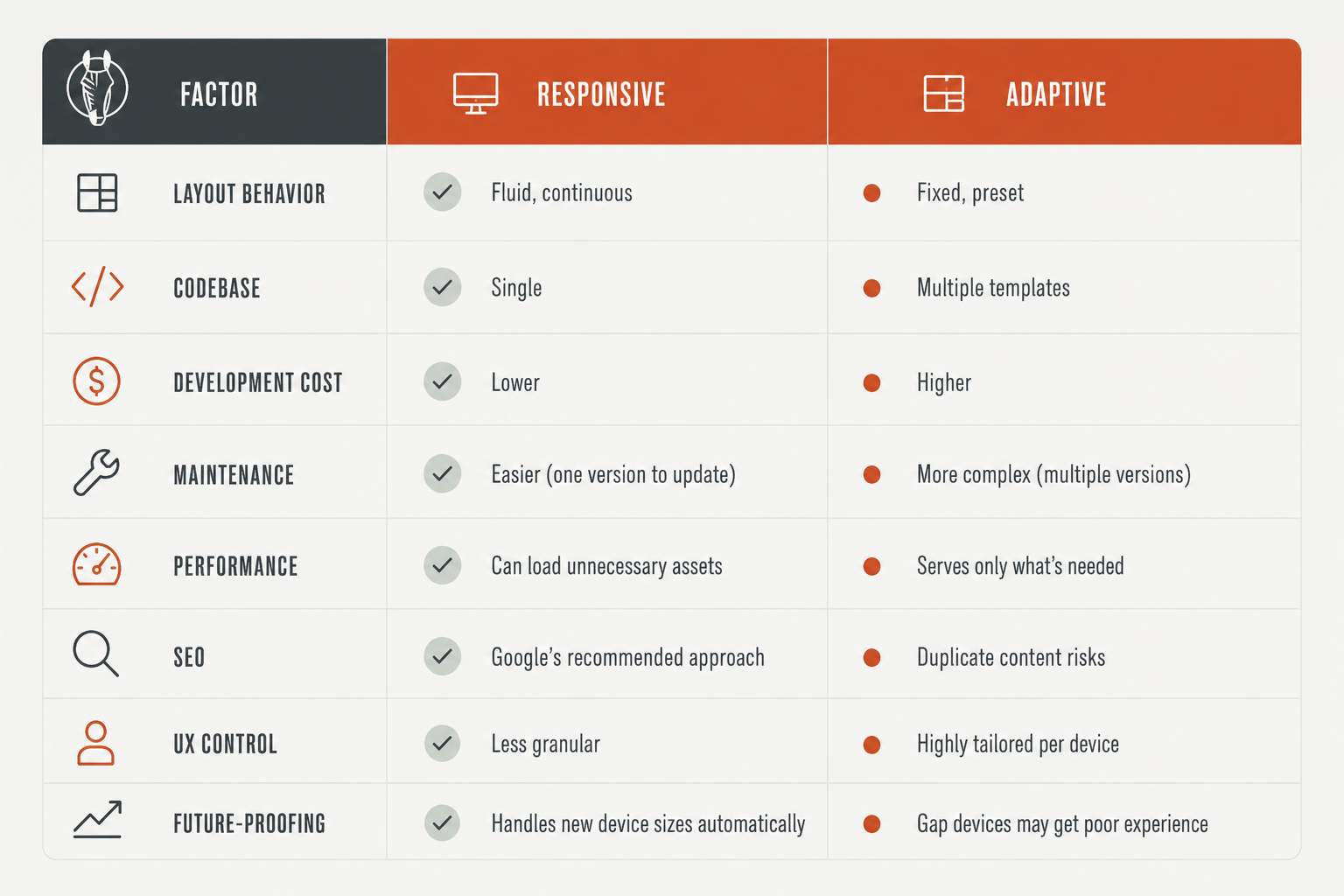
Responsive design is a single, fluid layout that stretches or compresses to fit any screen size. There's one codebase, one set of HTML, and CSS media queries control how the layout visually adjusts depending on the device.
It works through three core building blocks:
- Fluid grids. Layout widths are defined in relative units like percentages rather than fixed pixels. Elements resize proportionally as the screen gets smaller or larger.
- Flexible images. Images scale within their containers using techniques like max-width: 100% and modern tools like srcset, which lets the browser pick the right image size for the screen resolution.
- CSS media queries. Style rules are applied conditionally based on viewport width, height, or orientation. A two-column layout on desktop can become a single-column stack on mobile using a few lines of CSS.
In practice, this means columns stack on mobile, navigation collapses into a hamburger menu, and font sizes adjust automatically. The underlying page is always the same. Only the presentation changes.
Modern CSS has pushed this even further. Features like Container Queries now let individual components adapt to their own container size, not just the viewport. This makes truly modular, component-level responsive design possible in a way that wasn't available a few years ago.
How to spot a responsive site: slowly resize your browser window. If the layout shifts smoothly and continuously as the window shrinks, it's responsive.
What is adaptive design?
Adaptive design takes a fundamentally different approach. Instead of one fluid layout, it pre-builds multiple fixed layouts, each designed for a specific screen size. When a user visits the site, the server detects their device and serves the layout that matches it best.
Most adaptive sites are built around six standard breakpoints: 320px, 480px, 768px, 1024px, 1200px, and 1440px. Each one has its own fully designed template, not a stretched or compressed version of another.
The key difference from responsive is that adaptive layouts can serve entirely different content per device, not just rearranged content. A mobile layout can show a simplified version of a page while the desktop version shows a richer, more detailed experience. Mobile users can also get a lighter, faster version of the site because the server only sends the assets that device actually needs.
How to spot an adaptive site: resize your browser window. If the layout snaps to a different configuration at specific widths with no smooth transition in between, it's adaptive. You can also inspect the CSS: adaptive sites typically use fixed pixel widths within each breakpoint range, while responsive sites lean heavily on relative units and media queries.
Responsive vs adaptive design: side-by-side comparison
SEO implications: why Google has a preference
From an SEO standpoint, responsive design wins clearly. Google has officially recommended it as the preferred approach for mobile-friendly sites for years, and mobile-first indexing has made this even more important.
The core reason is single-URL architecture. Responsive sites give every page one URL. Google's crawlers only need to visit it once to understand the full content. There's no duplicate content risk, no canonical complexity, and no confusion about which version to rank.
Adaptive design introduces real risk here. If your implementation uses separate mobile URLs like m.yoursite.com, you have two versions of the same content that need careful canonical management. Get it wrong and you split your SEO signals across multiple URLs, which dilutes your rankings. Even single-URL adaptive implementations can cause inconsistency issues if the server serves different content to crawlers versus users.
Responsive design also pairs naturally with modern web design trends that align with Google's ranking signals, including Core Web Vitals, accessibility, and consistent structured markup across devices.
Performance: where adaptive gets its edge
This is adaptive design's strongest argument. Because it serves a layout specifically built for the user's device, it only loads the assets that device actually needs. Mobile users get a lighter, faster page without downloading the large images and scripts built for a desktop display.
Responsive design traditionally loads everything, then uses CSS to hide or scale what isn't shown. The content is still downloaded even if it's invisible. On a slow mobile connection, this matters.
That said, the gap is closing. Modern responsive techniques including lazy loading, next-gen image formats like WebP and AVIF, and responsive image handling built into Webflow website design do a lot to close the performance gap. Your platform choice makes a big difference here. For example, when considering Webflow vs WordPress, Webflow handles responsive image optimization natively while WordPress typically requires a plugin stack to achieve the same result.
Adaptive sites can be 2 to 3 times faster per device when done well, but that performance gain comes with significantly more upfront build time, ongoing maintenance, and development cost.
Responsive and adaptive design examples from real websites
Sometimes the easiest way to understand the difference is to see it. Here are a few well-known sites that show both approaches done right.
Responsive design in practice
Slack - Slack's marketing site is fully responsive. Navigation collapses into a hamburger menu on mobile, feature grids reflow into stacked cards, and hero sections adapt their typography and spacing across breakpoints. The same page works cleanly from a 320px phone to a 2560px desktop monitor.
Shopify - Shopify demonstrates how content-heavy, complex pages can be made fully responsive without sacrificing usability. Pricing tables, feature grids, and documentation all reflow naturally using a consistent responsive grid system.
Dribbble - Dribbble's portfolio grid adjusts its column count based on viewport width, and each card maintains its aspect ratio and visual impact at every size. A clean example of responsive layout that doesn't feel like a compromise.
Adaptive design in practice
Amazon - Amazon uses adaptive techniques to serve genuinely different experiences across devices. The mobile version prioritizes search and one-tap purchasing, while the desktop version surfaces broader browsing categories, comparison tools, and more detailed product information. These aren't the same page resized, they're different experiences built intentionally.
IHG (InterContinental Hotels Group) - IHG's booking flow adapts significantly between mobile and desktop. Mobile simplifies the form and surfaces location-based features. Desktop provides richer filtering, a map view, and more detailed hotel comparison options.
Which one should you choose?
Choose responsive design if you:
- Are building a new site from scratch
- Want a single codebase that's easy to maintain and update over time
- Have SEO as a priority
- Expect your audience to use a wide and unpredictable range of devices
- Are working within a realistic development timeline or budget
Choose adaptive design if you:
- Are adding mobile support to an existing desktop site without doing a full rebuild
- Need genuinely different content or interaction flows per device, not just rearranged layouts
- Have the development resources to build and maintain multiple templates
- Are targeting a very defined, known set of devices with stable specs
Consider a hybrid approach if:
- You want a responsive foundation but need fine-tuned performance on specific devices
- You can layer adaptive enhancements on top of a responsive base, such as device-specific image sets, alternate navigation patterns, or server-side content variations for mobile users
The hybrid model is increasingly common among high-traffic sites. A responsive grid handles the general layout while a few adaptive elements make sure critical pages perform well on mobile without requiring a complete second codebase.
The verdict
For most websites, responsive design wins. It's simpler to build, cheaper to maintain, better for SEO, and handles new device types automatically without any extra work. Google recommends it, modern CSS has made it more powerful than ever, and the performance gap with adaptive is narrowing fast.
Adaptive design isn't obsolete, but it's situational. It makes sense for legacy modernization, performance-critical mobile products, or cases where mobile and desktop genuinely need different content. For most business websites, marketing sites, and SaaS platforms, the added complexity isn't worth the tradeoff.
When in doubt, start responsive. Layer in adaptive enhancements only where you have a clear, data-backed reason to do so.
The choice between responsive and adaptive design is just one of many technical decisions that shape how your site performs, ranks, and converts. At Striped Horse, our responsive web design services help brands build websites that are fast, search-optimized, and designed to work across every device people use today and tomorrow.