10 Best School Website Designs of 2026

A school website is no longer just a digital bulletin board. For most families, it is the very first impression of your institution and, increasingly, the deciding factor in whether they pick up the phone, book a tour, or move on to the next school on their list. In a competitive admissions landscape, a great school website design has to do more than look good. It needs to tell a compelling story, guide different audiences to the right information, and convert curious visitors into enrolled students.
The best school website design examples balance three things: visual appeal that reflects the school's identity, intuitive navigation that serves parents, students, and staff equally, and conversion-focused features that make it easy for prospective families to take the next step. In this article, we have curated 10 of the best school website designs of 2026, with specific design takeaways you can apply to your own school's online presence.
What makes a great school website design?
Before diving into the examples, it helps to understand what separates a truly exceptional school website from an average one. The best school websites consistently get five things right.
Mobile-first experience
More than 67% of parents and prospective families browse school websites on a mobile device. That means a slow, hard-to-navigate mobile experience is not just an inconvenience - it is a direct threat to enrollment. A mobile-first school website design prioritizes fast load times, tap-friendly navigation menus, and typography that remains readable on smaller screens without pinching or zooming.
Clear navigation and information architecture
Parents, students, and staff all visit a school website with very different needs. A parent wants admissions details and tuition information. A student wants to know about clubs and athletics. A staff member needs quick access to internal tools. The best school website design examples are built around a clear understanding of how each audience moves through the site, a process known as user journey mapping, which ensures every visitor lands exactly where they need to be within one or two clicks.
Strong visual storytelling
Before a visitor reads a single word, they are already forming an impression based on what they see. Hero videos, authentic campus photography, and dynamic imagery communicate the personality and culture of a school in seconds. From worst fonts to color palettes, every visual decision shapes how families perceive your school before they read a single word.
Admissions-focused CTAs
A beautiful website that does not convert visitors into inquiries is a missed opportunity. The most effective school website design examples place clear calls to action such as Apply Now, Schedule a Visit, and Request Information in prominent, consistent locations throughout the site. These CTAs turn passive browsers into active leads.
Accessibility and performance
In 2026, accessibility is not optional. ADA-compliant design ensures that all visitors, including those with visual or physical impairments, can fully navigate the site. Fast load times and clean code also directly impact search engine rankings, meaning a well-optimized school website attracts more organic traffic from families actively searching for schools in the area.
10 best school website designs of 2026
From K-12 private schools in the US to boarding schools in Scotland and conservatories in New York City, the following examples represent some of the most thoughtful and effective school website design ideas available today. Each one does something distinctive — whether that is immersive storytelling, smart admissions UX, or bold visual identity - and each one has something worth learning from.
1. The Walker School - storytelling through horizontal scrolling
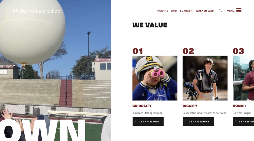
The Walker School is an independent, co-educational college preparatory school in Marietta, Georgia, serving students from PK3 through 12th grade. Its website immediately breaks from the typical school site playbook. Instead of a standard vertical scroll, the homepage guides visitors through a horizontal narrative journey, showcasing the school's values, campus life, and academics in a sequence that feels more like a story than a brochure. Rich video and photography anchor the experience, while admissions CTAs like "Inquire" and "Plan Your Visit" stay visible throughout without ever feeling pushy.
What they do well:
- The horizontal scrolling layout creates a distinctive, guided experience that sets the school apart from every competitor site
- High-quality rich media including campus video and student photography does the emotional heavy lifting before a parent reads a single word
- Admissions navigation including Inquire, Visit, and Summer programs is pinned at the top of every page, making the conversion path completely frictionless
2. Dunham School - personalized recommendations that guide every visitor
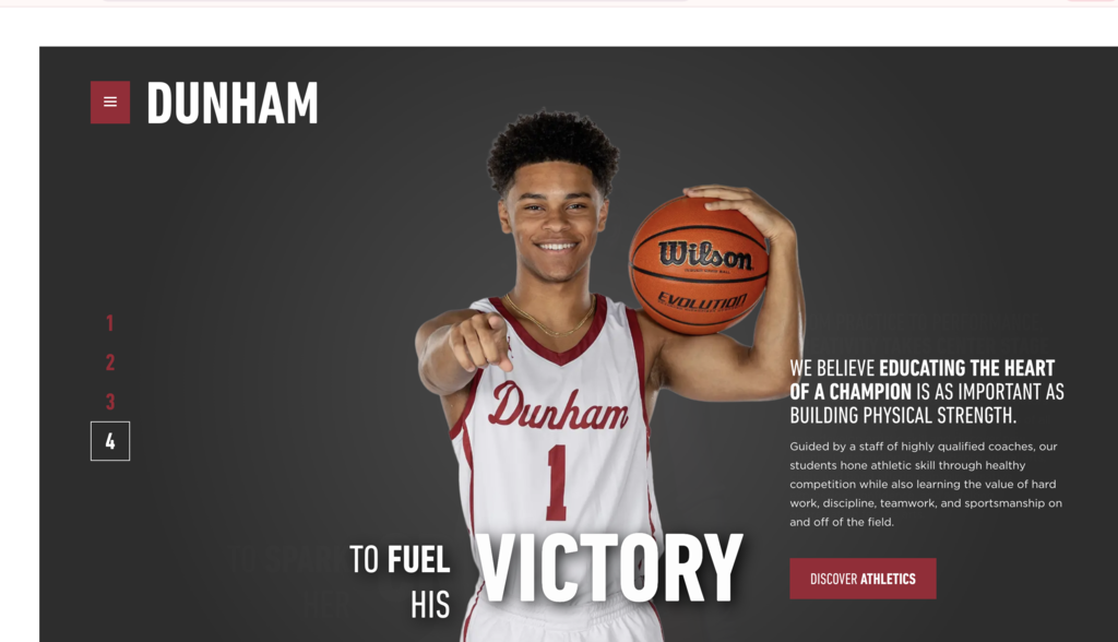
The Dunham School in Baton Rouge, Louisiana, is a PreK-12 Christian college preparatory school that has been recognized as one of the most innovative schools in the country and has earned Apple Distinguished School status seven times. Its website reflects that identity with a personalized recommendations engine that guides visitors to the most relevant pages based on their interests and their likelihood to inquire. Rather than presenting a one-size-fits-all homepage, the site adapts to each visitor, making the experience feel tailored and intentional. Navigation is organized both by age group and by interest area, which is a genuinely thoughtful approach that sets this site apart from most school website examples.
What they do well:
- Personalized content recommendations reduce friction and help parents find the information most relevant to their stage in the decision-making process
- Navigation organized by both age and interest area reflects a deep understanding of how different visitors approach a school website
- Clear pathways to campus tour scheduling are integrated naturally throughout the site rather than relegated to a single contact page
3. Brentwood School - interactive design that reflects a dynamic community
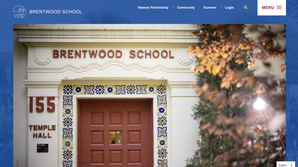
Brentwood School is one of Los Angeles' most respected independent, coeducational K-12 day schools, with two campuses in the Brentwood neighborhood. Its website earned a Silver W3 Award for digital excellence. The design is immediately engaging with interactive typography on the mission statement, where letters shift into a rainbow of branded colors on hover. It is a subtle but memorable touch that reinforces the school's identity from the first scroll. The site does an excellent job of serving multiple audiences simultaneously, with dedicated sections for prospective families, current students, and alumni.
What they do well:
- Interactive typography on the mission statement creates a memorable brand moment that few other school website examples replicate
- A filterable course catalogue organized by subject area and grade level allows parents and students to self-serve, reducing email inquiries and saving admissions staff time
- A news hub with event image galleries keeps the site feeling active and current for both prospective and existing families
4. Gordonstoun School - heritage storytelling with a modern finish
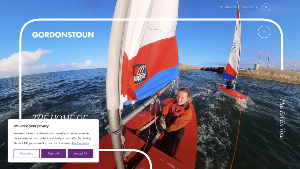
Founded in 1934 by educator Kurt Hahn and located in Moray, Scotland, Gordonstoun is one of the UK's most distinctive boarding schools, known for its motto "Plus est en vous" (There is more in you) and its tradition of blending rigorous academics with outdoor learning and character education. The school's website channels that heritage beautifully. Large, immersive photography dominates the homepage, smooth scroll transitions guide visitors through each section, and the navigation is organized clearly by school stage including Prep, Senior, Sixth Form, and Boarding so that every type of visitor can find what they need immediately.
What they do well:
- Immersive full-screen imagery communicates the school's dramatic Scottish landscape and outdoor ethos before any copy is read
- Navigation organized by school stage makes the site equally accessible to families considering a 4-year-old for the Prep School and those researching Sixth Form boarding options
- Refined transitions and clean design give the site a premium feel that matches the school's long-standing reputation
5. Worcester Academy - bold typography, confident design
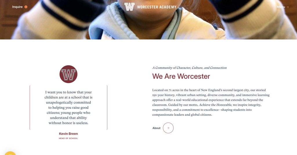
Worcester Academy is an independent, coeducational day and boarding school for grades 6 through 12 and postgraduate students, set on 71 acres in the heart of Worcester, Massachusetts. Established in 1834, it is the first independent school founded in Worcester and has more than 190 years of history behind it. Its website is one of the most visually confident school website design examples on this list. Bold typography, strong color choices, and a high-contrast layout create a site that feels modern and assured. Despite the visual strength of the design, the site remains easy to navigate, with intuitive pathways that guide parents quickly to academics, admissions, and campus life.
What they do well:
- Bold typographic hierarchy gives the site a distinctive visual identity that stands out against templated school websites
- Admissions information is surfaced prominently with tour booking, information sessions, and a School Snapshot download all accessible from the admissions section
- The confident design language aligns with the school's deep academic heritage, reinforcing trust before a visitor reads a single page of content
6. Kent College - AI-powered support meets bold visual design
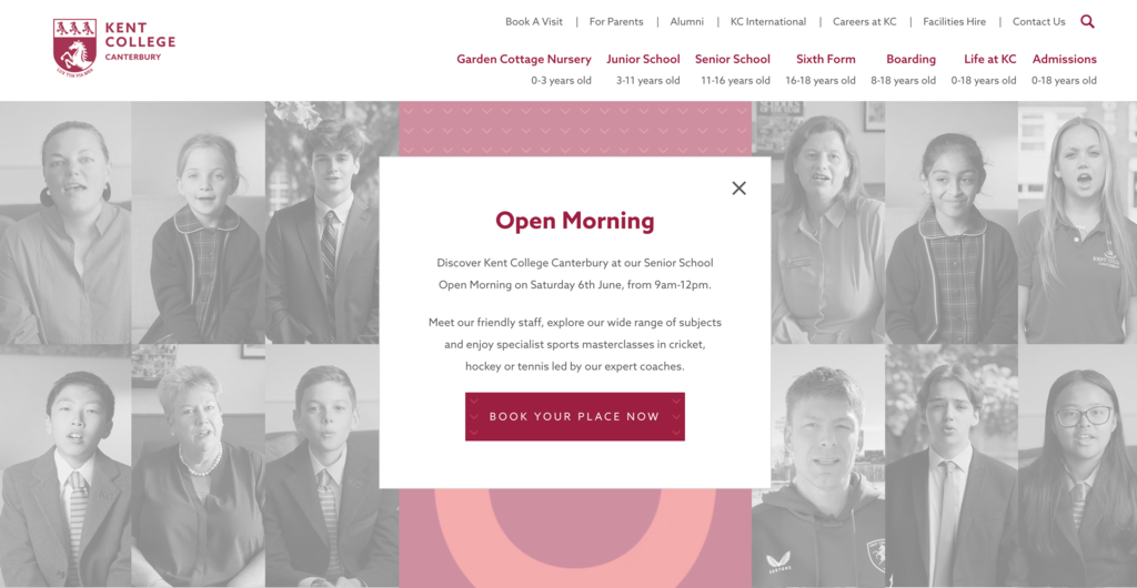
Kent College, Canterbury, is a co-educational private school for boarding and day students between the ages of 3 months and 18 years, founded in 1885 and located in one of England's most historic cities. Its website is one of the most forward-thinking school website design examples of 2026. The site combines bold graphic design and parallax scrolling with practical technology, most notably an AI-powered chatbot that gives parents instant answers to common admissions questions around the clock. The navigation is organized by school stage, from the Garden Cottage Nursery through to the Sixth Form, with a clear "Book A Visit" CTA available at all times in the header.
What they do well:
- An AI-powered chatbot handles common parent and student inquiries around the clock, reducing the administrative burden on admissions staff while improving the visitor experience
- Parallax scrolling effects add visual depth to the homepage without slowing the page down or distracting from the school's key messages
- Navigation organized by age group from 0 to 18 makes it genuinely simple for parents of any prospective student to find the right section
7. Manhattan School of Music - editorial design for a world-class conservatory
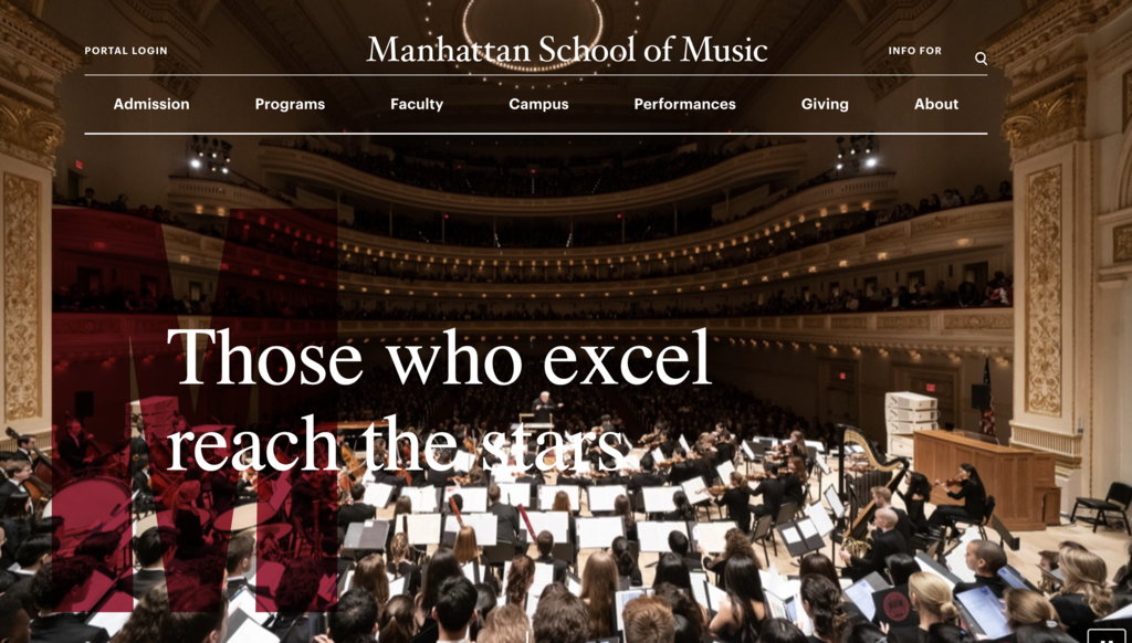
Manhattan School of Music (MSM) is a private music conservatory located in the Morningside Heights neighborhood of New York City, founded in 1917 and widely regarded as one of the world's premier conservatories for classical music, jazz, and musical theater. Its website reflects that world-class status with an editorial, content-rich design that prioritizes performance schedules, faculty profiles, and academic programs. The site does an excellent job of communicating the energy and prestige of MSM, with clear pathways for prospective students across undergraduate, graduate, precollege, and summer programs.
What they do well:
- An editorial layout brings the school's rich calendar of performances and events to the foreground, reinforcing MSM's identity as a living, active musical community
- Faculty profiles and alumni spotlights are prominently featured, giving prospective students a clear sense of the mentorship and professional network available to them
- The admissions section is well-structured with clear pathways for each program type, including a dedicated viewbook and admission event listings
8. Melbourne Girls Grammar - clean design that leads with community
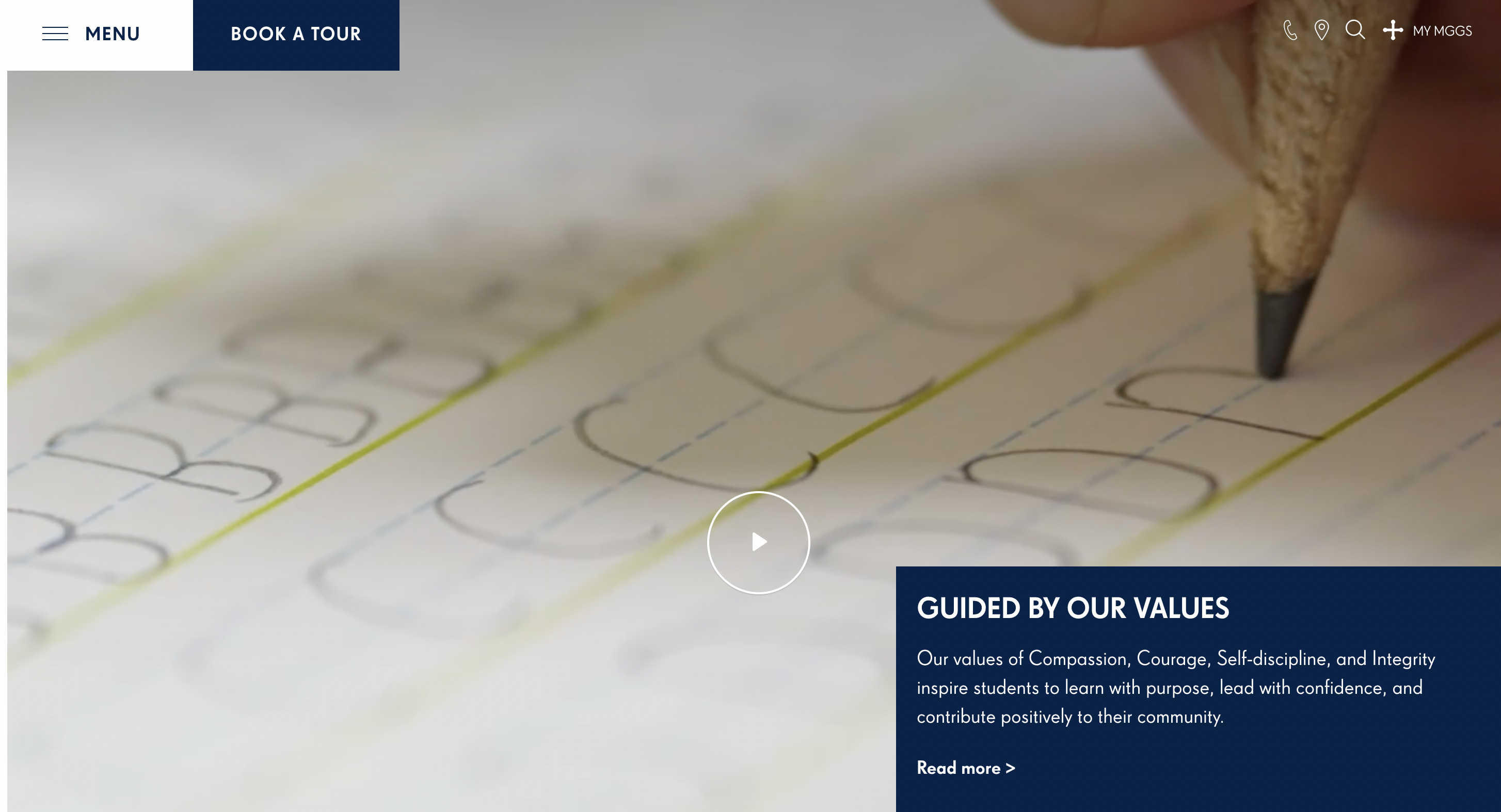
Melbourne Girls Grammar (MGGS) is an independent Anglican school for girls from Early Learning through Year 12, located in South Yarra, Australia. Founded in 1893, it has more than 130 years of history and a strong reputation for excellence in girls' education. Its website makes a powerful first impression through a hero video on the homepage that immediately communicates the school's values and community, followed by high-quality photography and clear information about programs and facilities. The homepage leads with the school's four core values of Compassion, Courage, Self-discipline, and Integrity, grounding the visual experience in something meaningful from the very first scroll.
What they do well:
- A homepage hero video gives visitors an instant, authentic feel for the school's culture and student life before they engage with any written content
- A "Book a Tour" CTA is pinned in the header throughout the site, ensuring the most important conversion action is always one click away
- The site surfaces the school's values prominently on the homepage, which is an effective way to attract families who align with the school's ethos before they invest time in the admissions process
9. High Tech High - transparent, mission-driven design
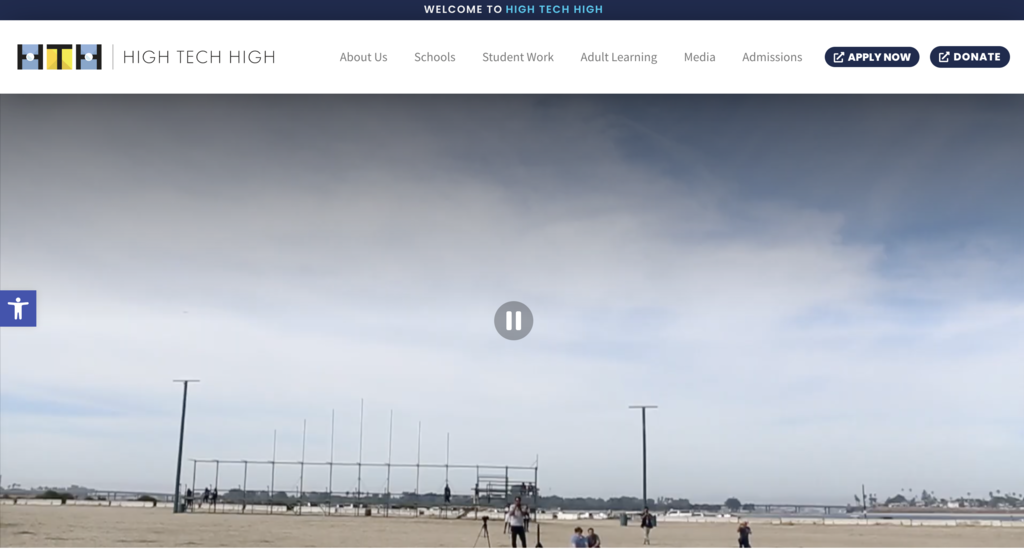
High Tech High is a network of 16 public charter schools in San Diego, California, serving approximately 6,350 students across K-12. Founded in 2000, the school is internationally recognized for its project-based learning model and its commitment to equity and personalization. Its website reflects that philosophy of transparency and authenticity. Rather than leaning on polished marketing language, the site leads with the school's mission to connect the classroom to the world and backs it up with rich examples of student projects, publications, and real-world work. Student work has its own dedicated section in the main navigation, which is a rare and refreshing choice that signals exactly what this school prioritizes.
What they do well:
- The site's mission and design principles are presented clearly and honestly, giving prospective families an immediate picture of the school's educational philosophy
- A dedicated student work section in the main navigation showcases projects and publications, letting the quality of student output speak for itself
- Admissions information is clearly structured with a prominent "Apply Now" CTA and a schools directory that helps families navigate the multi-campus network
10. Stanford Law School - clean, content-led design built for a world-class institution

Stanford Law School is one of the most prestigious law schools in the world, located in Stanford, California. Its website is a strong example of how a leading educational institution can present a rich body of research, news, and programs in a clean, well-organized layout without overwhelming the visitor. The homepage leads with a full-width video hero and a clear brand statement, "Not just law. Stanford Law.", before surfacing research highlights, faculty scholarship, podcast content, and news in a structured editorial grid. Navigation is intuitive and consistent throughout, making it easy for prospective students, faculty, and the public to find exactly what they need. This is also a site that Striped Horse has had the privilege of working on, and it remains one of our favorite examples of purposeful, content-driven educational web design.
What they do well:
- A full-width video hero and a confident brand statement immediately communicate the school's prestige and ambition without relying on lengthy copy
- An editorial content grid surfaces research, news, podcasts, and faculty scholarship in a structured, scannable format that keeps the homepage feeling current and active
- Clean, consistent navigation makes a deeply complex site with hundreds of pages feel approachable and easy to explore for every type of visitor
What parents look for on a school website
Understanding the parent perspective is essential when evaluating school website design. Research consistently shows that parents visiting a school website for the first time are looking for a handful of specific things, and if they cannot find them quickly, they move on.
Admissions clarity is the most common priority. Parents want to know the application process, key deadlines, and what the school is looking for in prospective students, without having to email or call to find out. Schools that bury this information deep in their navigation consistently lose prospective families to competitors whose sites surface it immediately.
Tuition and financial aid information is the second major consideration. Parents are often reluctant to invest time in a school's admissions process only to discover the tuition is out of range. Schools that are transparent about fees, even if they lead with financial aid availability, build more trust and generate better-quality inquiries.
Faculty and staff profiles matter more than most schools realize. Parents want to know who will be teaching their child. A well-designed faculty directory with professional photos and qualifications goes a long way toward building confidence before a first visit.
Safety policies and emergency communication have become increasingly important for families evaluating schools. A clearly accessible section on safety protocols and communication procedures signals that the school takes student welfare seriously.
Finally, community feel, conveyed through authentic photography, student testimonials, parent stories, and evidence of campus life, is often the deciding emotional factor. Parents can assess a school's academic reputation from third-party rankings. What they cannot assess without visiting is whether the community feels like the right fit. A school website that conveys warmth, belonging, and a genuine sense of community has a significant competitive advantage.
Future trends in school website design
The best school website designs of 2026 already reflect several shifts that will define the next few years of the category.
AI-powered admissions support is moving from a differentiator to an expectation. Tools like the chatbot on Kent College's site, capable of answering parent questions around the clock, are becoming standard at competitive independent schools. As AI improves, these tools will become more personalized and more capable, reducing the burden on admissions teams while improving the parent experience.
Personalized content by visitor type is another emerging trend. Rather than presenting the same homepage to every visitor, leading school websites are beginning to serve different content based on whether a visitor is a prospective parent, a current student, an alum, or a community member. This approach improves relevance and reduces bounce rates significantly.
Multilingual support is increasingly expected, particularly at international and urban schools serving diverse communities. Schools that offer key admissions and community content in multiple languages signal inclusivity and widen their prospective family pool.
Virtual campus tours embedded directly into the website are becoming a standard admissions tool. High-quality virtual walkthroughs allow families who cannot visit in person to get an authentic feel for the campus, reducing one of the biggest barriers to inquiry for out-of-area and international families.
Conclusion
The best school website designs of 2026 share a common thread: they treat the website as a strategic enrollment and community-building tool, not just a digital placeholder. From The Walker School's immersive horizontal storytelling to Kent College's AI-powered admissions chatbot, every example on this list makes a deliberate, confident case for why a family should choose that school.
Great school website design does not happen by accident. It requires a clear understanding of your audience, a commitment to authentic visual storytelling, and a design partner who understands how to balance brand, usability, and conversion. At Striped Horse, education website design is one of our core specialties. We have worked with institutions including Stanford Law School to build websites that do exactly that, telling a compelling story and driving real results.
If your school's website is not working as hard as it should be, we would love to help you change that. Get in touch with the Striped Horse team.