.svg)


10 Best SaaS Landing Page Examples
The best SaaS landing pages do more than look polished. They quickly explain what the product does, make the value relevant to a specific audience, provide enough proof to reduce uncertainty, and guide visitors toward a clear next step.
This guide covers 10 SaaS landing page examples worth studying for inspiration. The list includes two websites designed by Striped Horse alongside product, feature, AI, and comparison landing pages from established SaaS companies.
For each example, we look at the specific design and messaging decisions that make the page effective and what you can apply to your own landing page.
In this guide, “SaaS landing page” refers to a focused marketing page built around a primary conversion goal. That can include a dedicated product, feature, solution, comparison, or campaign page. It can also include a SaaS homepage when the page is structured around a clear audience and primary action.
What makes a great SaaS landing page?
We selected these SaaS landing page design examples based on how quickly they communicate the offer, how clearly they identify the intended audience, how well they demonstrate the product, how they use proof, and how focused the conversion path remains.
Many of the same principles also appear across the best SaaS websites, but landing pages usually have a narrower job. Instead of introducing an entire company, they need to move a specific visitor toward a specific action.
A strong SaaS landing page should answer three questions quickly:
- What is this?
- Is it relevant to me?
- What should I do next?
From there, the rest of the page should provide enough product detail and proof to make that next step feel reasonable.
1. Amperon
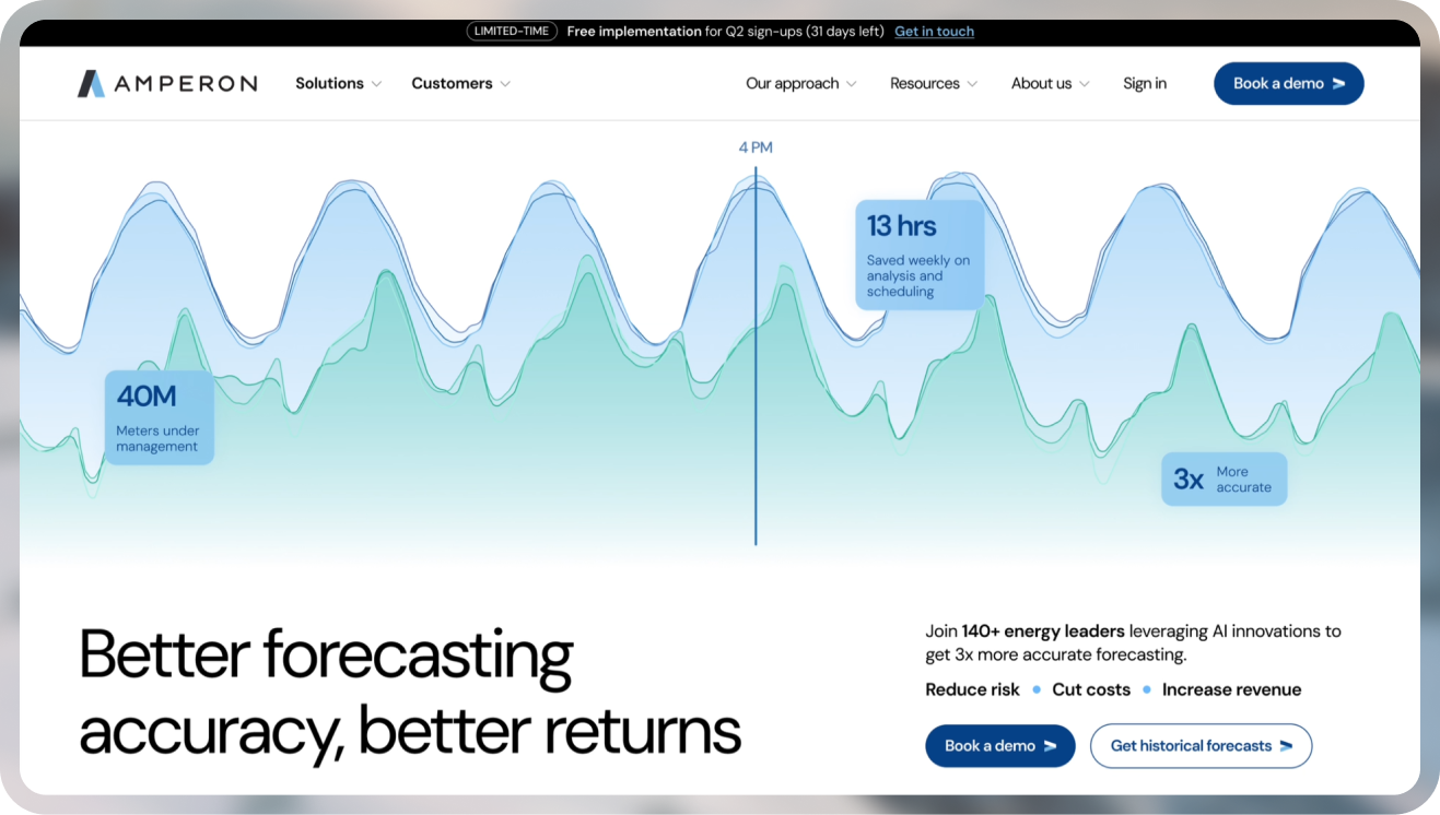
Industry: Energy technology / B2B SaaS
Amperon provides AI-driven energy forecasting software for utilities, power traders, retailers, independent power producers, and commercial energy users. Striped Horse handled the CRO, redesign, and information architecture restructure. Amperon’s current page leads with forecasting accuracy and financial outcomes, then separates solutions by buyer type.
What works:
- Outcome-led headline connects forecasting accuracy with business results
- Solutions are segmented by buyer type, helping different visitors find relevant information
- Performance metrics and customer logos provide proof close to the main value proposition
2. MagView
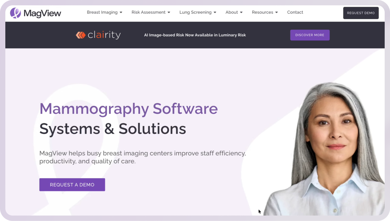
Industry: Healthcare SaaS
MagView provides mammography reporting, tracking, and workflow software for breast imaging centers. Striped Horse completed a website redesign and UX/UI overhaul, with our landing page design services focused on creating clearer paths for different healthcare audiences. The current site highlights more than 2,500 facilities and over 30 years of experience.
What works:
- Messaging focuses on real breast-imaging workflows rather than generic software features
- Product areas are organized around distinct clinical needs
- Industry experience and facility numbers provide relevant trust signals
3. Loom Free Online Screen Recorder
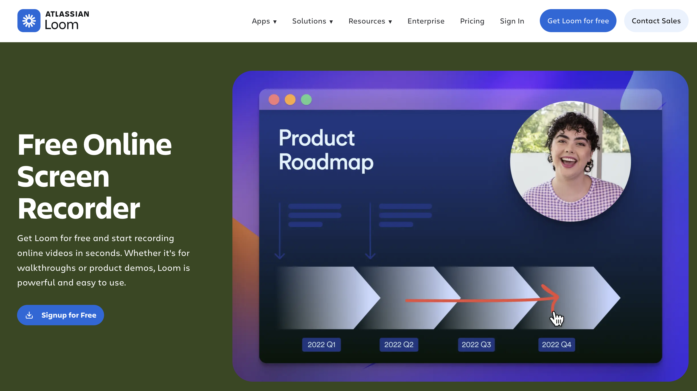
Industry: Video communication SaaS
Loom’s Free Online Screen Recorder page is built around one specific need: recording and sharing screen videos. The page immediately identifies the product, offers free signup, and then explains recording, editing, sharing, and collaboration features.
What works:
- The headline closely matches the visitor’s likely intent
- “Signup for Free” gives the page a clear primary action
- Product capabilities are organized around practical tasks rather than broad feature categories
4. Figma Sites
Industry: Design software
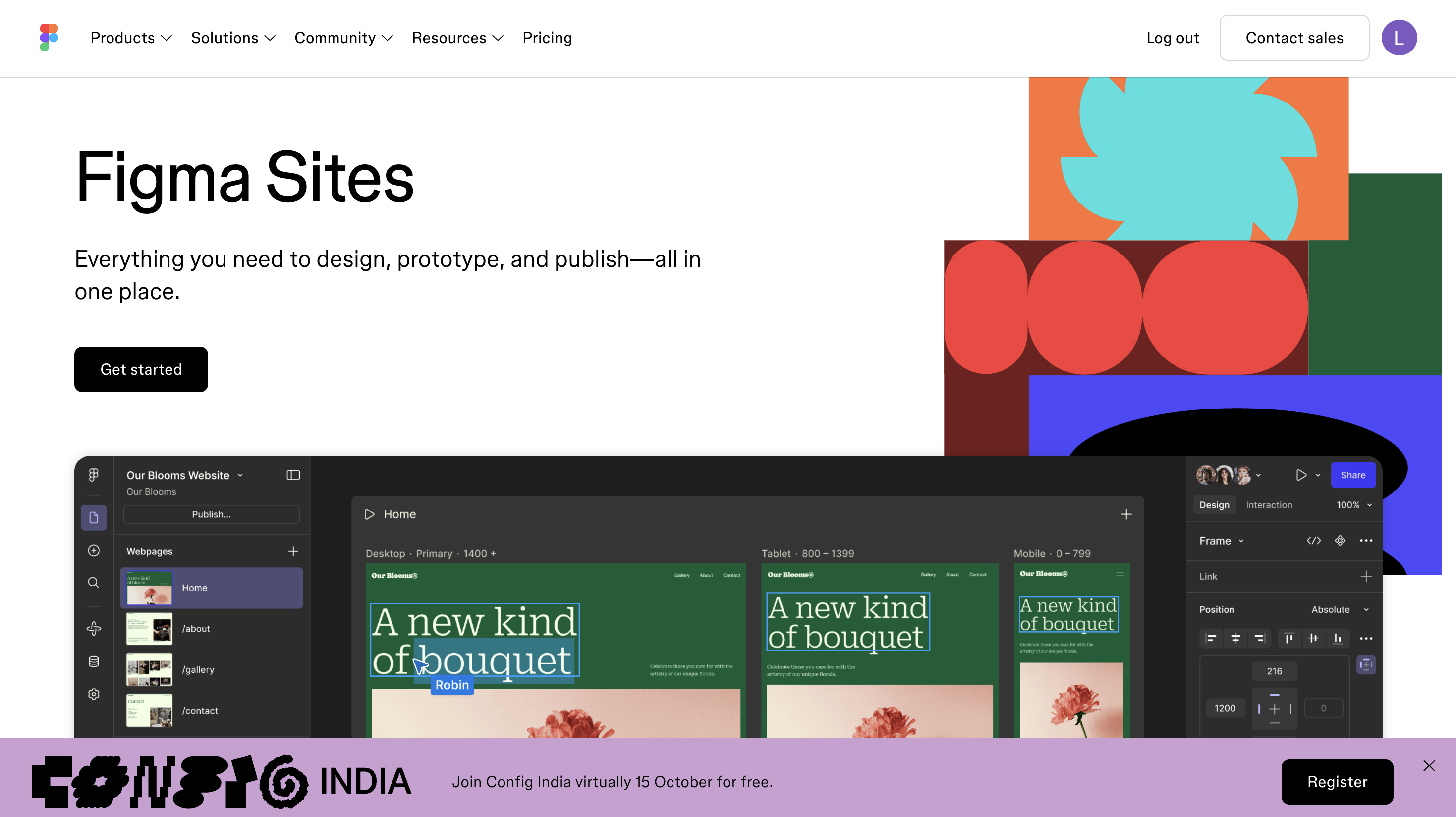
Figma Sites lets users design, prototype, and publish websites within Figma. Its landing page introduces that promise immediately, followed by responsive layouts, reusable blocks, interactions, CMS functionality, and templates.
What works:
- The hero explains the product in one clear sentence
- Product capabilities are demonstrated as part of the design-to-publish workflow
- Templates give visitors a concrete way to imagine getting started
5. Stripe Billing
Industry: Payments and financial infrastructure
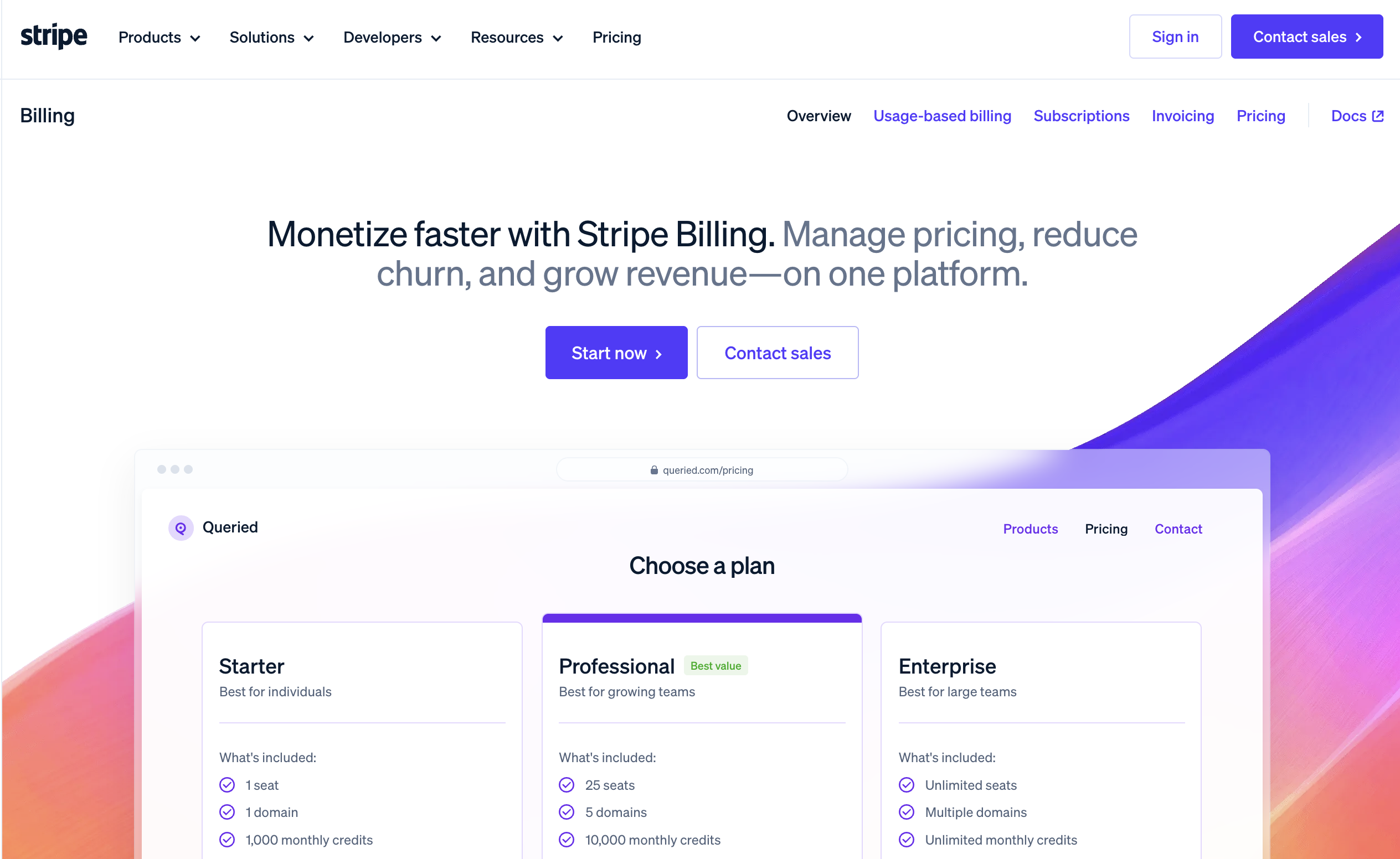
Stripe Billing is a focused product page for managing subscriptions, usage-based billing, invoicing, pricing, and recurring revenue. The hero connects the product to monetization, churn, and revenue and gives visitors both “Start now” and “Contact sales” paths.
What works:
- Business outcomes appear before detailed technical information
- Self-service and sales-led buyers have separate next steps
- Related billing capabilities are organized under one clearly defined product
6. Wrike vs. Asana
Industry: Work management SaaS
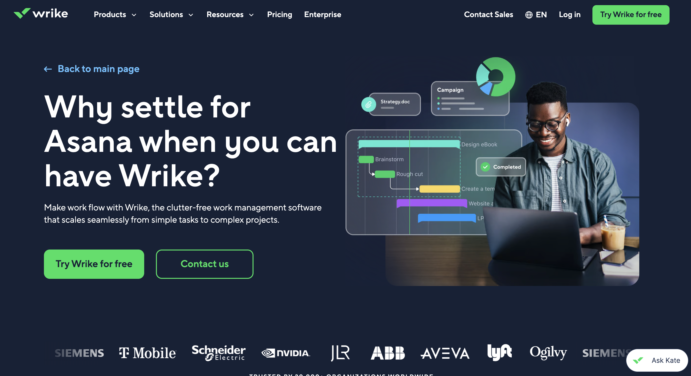
Wrike’s Asana comparison page targets visitors who are already evaluating work management platforms. It names Asana directly in the hero, offers a free trial, and supports the comparison with product information and trust signals.
What works:
- The page is built for a very specific, high-intent audience
- The competitor is addressed directly rather than indirectly
- The free-trial CTA matches visitors who are already comparing products
7. Fin
Industry: AI customer service software
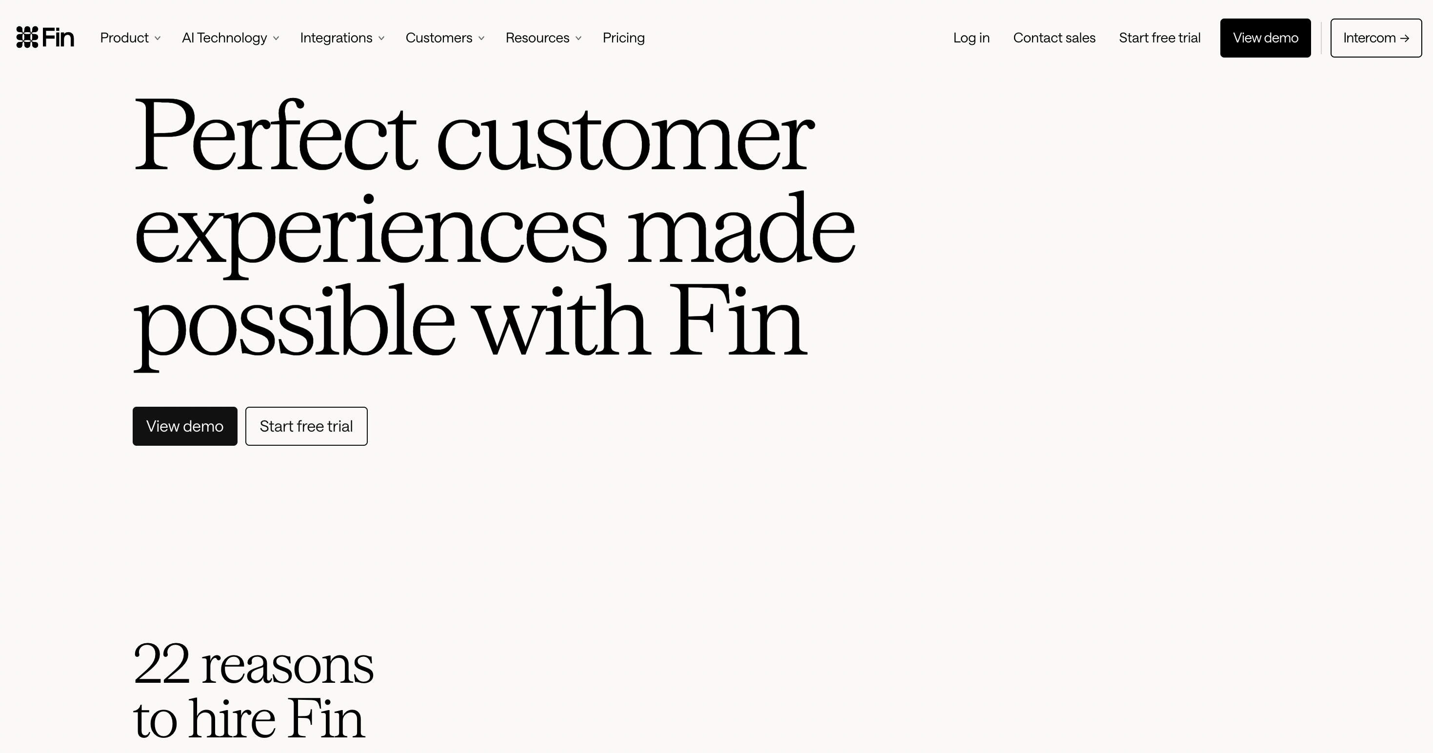
Fin’s product page focuses on its AI customer service agent and gives visitors two immediate evaluation paths: viewing a demo or starting a free trial. The rest of the page expands on the product, its capabilities, and its use in customer support.
What works:
- The page stays focused on one product rather than the broader Intercom platform
- Demo and trial CTAs support different levels of buyer readiness
- The product proposition is established before deeper information appears
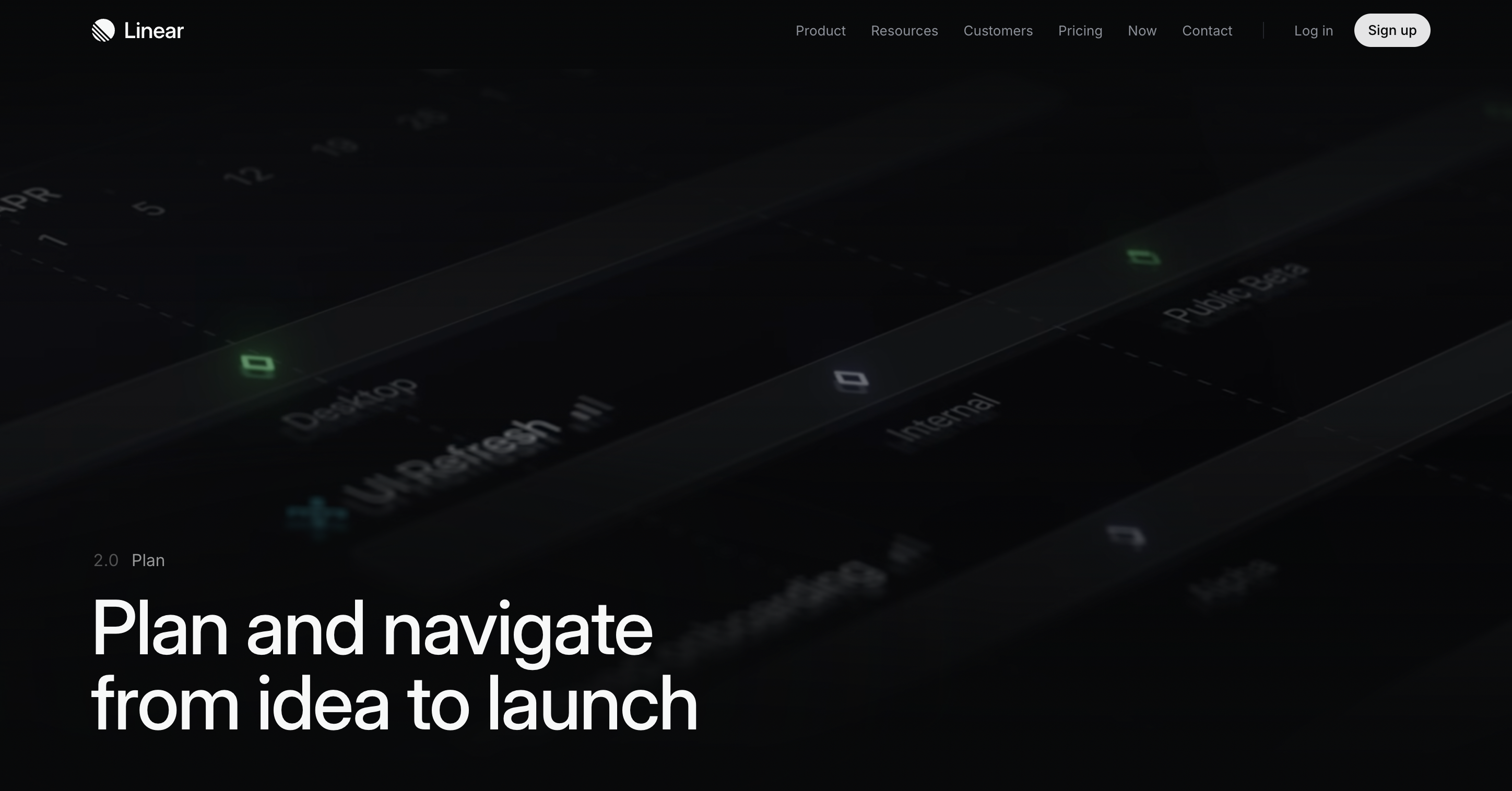
8. Linear Plan
Industry: Product management SaaS
Linear’s Plan page focuses on one workflow: taking product work from idea to launch. It covers projects, project health, updates, and other planning capabilities instead of trying to explain the entire Linear platform.
What works:
- One user goal gives the page a clear narrative
- Features are presented within a recognizable planning workflow
- Product UI and project examples help explain how the features work
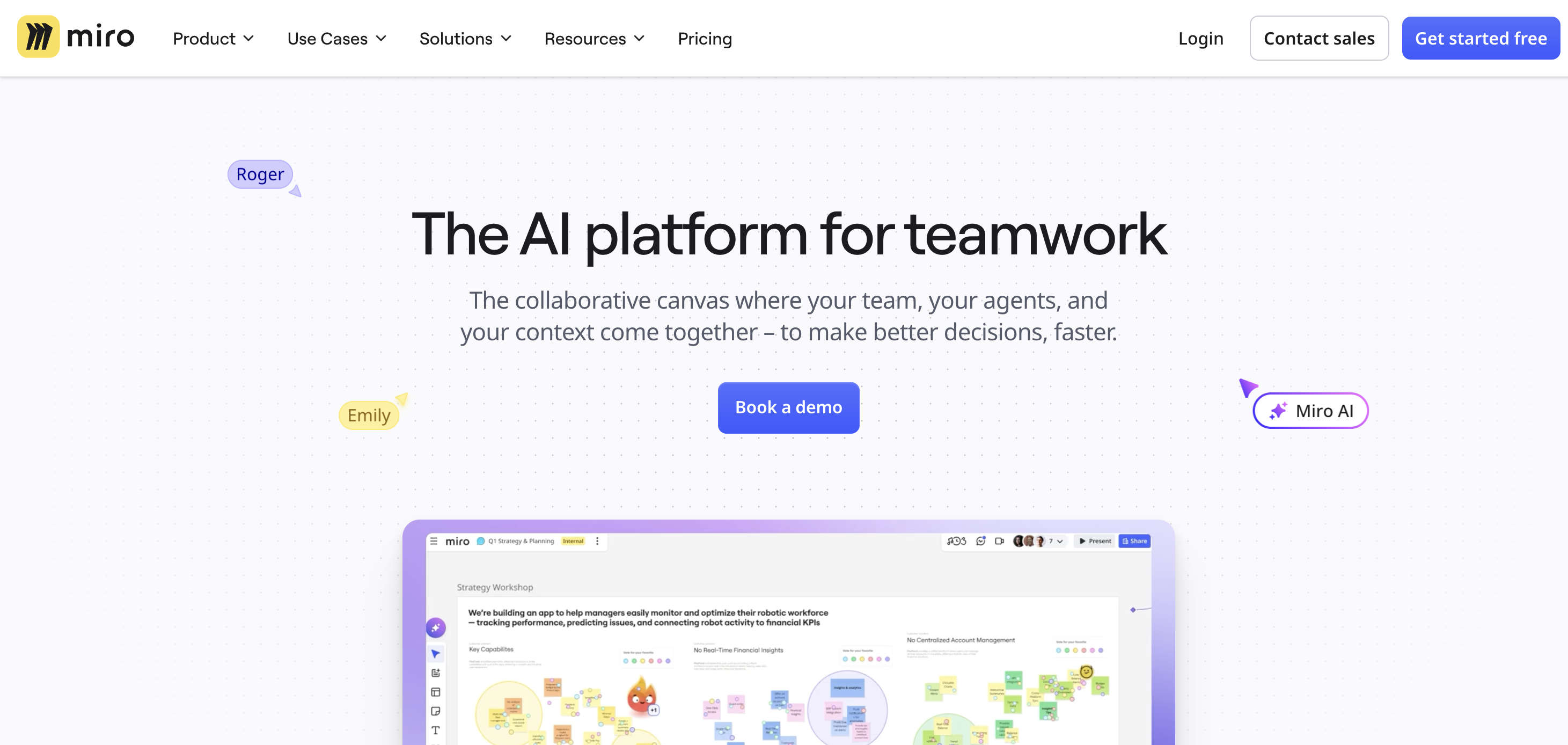
9. Miro AI
Industry: Collaboration SaaS
Miro’s AI page focuses specifically on AI-assisted teamwork. The hero positions Miro as an AI platform for teamwork, explains how teams, AI agents, and context come together on the collaborative canvas, and leads with a “Book a demo” CTA.
What works:
- A broad platform capability gets its own focused landing page
- The headline establishes the product category immediately
- The demo CTA matches a more considered product-evaluation journey
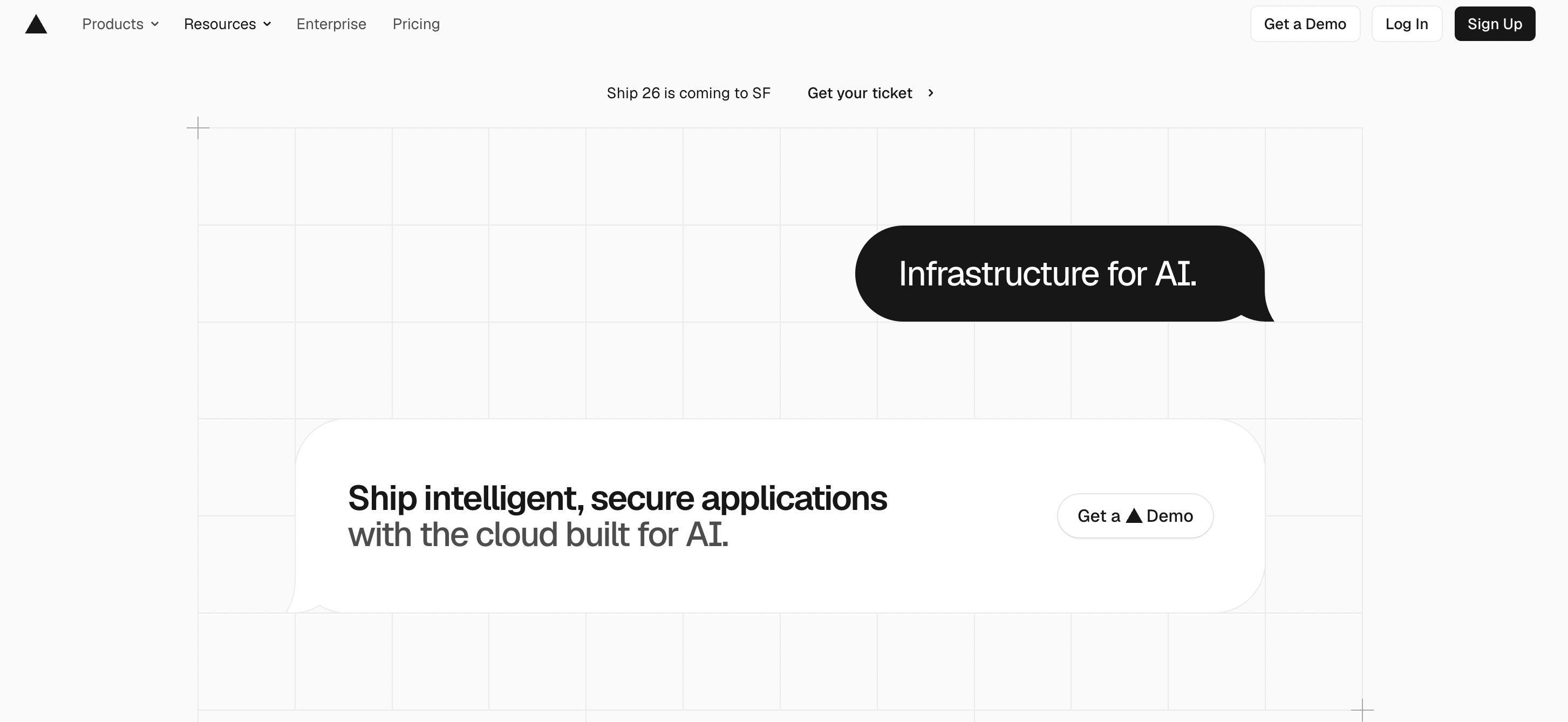
10. Vercel AI
Industry: Developer infrastructure SaaS
Vercel’s AI landing page focuses on infrastructure for building AI applications. It starts with a concise product proposition, followed by areas such as AI Gateway, compute, sandboxing, and supporting developer tools.
What works:
- The hero keeps a technical product proposition concise
- Deeper technical information appears after the main value is established
- Documentation links give technical buyers a direct path to further evaluation
SaaS landing page best practices these examples share
Ten different products, ten different audiences, and the same decisions keep appearing. These are the SaaS landing page best practices worth applying to your own page.
Lead with the outcome, not the product
The most common mistake on SaaS landing pages is a headline that describes the software instead of the result. "AI-powered project management platform" tells a visitor what the tool is. "Ship projects two weeks faster" tells them what changes for them. Every page in this list opens with a promise, then spends the rest of the page justifying it. If a competitor could put your headline on their own site without changing a word, it is not specific enough.
Answer three questions above the fold
Research from Nielsen Norman Group found that 57% of user viewing time is spent above the fold. That space has one job: earn the scroll. Visitors need to know what the product does, whether it is for them, and what to do next, all before they decide to leave. Every example here has a clear headline, a supporting line that qualifies the audience, and one visible CTA before the first scroll.
Show the product, not an illustration of it
SaaS buyers benefit from seeing what they are actually evaluating. Product screenshots, interface previews, videos, and interactive demonstrations can make features easier to understand before a visitor signs up or requests a demo. Figma Sites, Linear Plan, Loom, and Stripe Billing all make the product itself part of the page rather than relying entirely on abstract illustrations.
Use social proof in more than one place
A single testimonials section in the middle of a page is decorative. Social proof works when it has specific jobs: validating the claim immediately after the hero, confirming the product delivers after the features section, and reducing hesitation near the final CTA. Specificity matters as much as placement. "Great tool, highly recommend" does almost nothing. A named customer with a job title and a measurable result does the persuading for you.
Keep one primary CTA
A SaaS landing page can offer more than one conversion path, but one action should remain visually dominant. A self-service product might prioritize “Start free,” while an enterprise product may lead with “Book a demo.” Stripe Billing and Fin show how secondary actions can coexist without making the page’s primary conversion goal unclear.
Segment when you have more than one buyer
When a SaaS product serves multiple audiences, letting visitors self-select can make the page easier to navigate. Amperon separates solutions by buyer type, while Fin presents different applications of its AI customer service product. The goal is not to create as many paths as possible, but to help visitors reach the information most relevant to them.
Reduce friction at the point of action
Every unnecessary step between interest and conversion creates another opportunity for a visitor to leave. Keep forms appropriate to the level of commitment you are asking for, make the primary CTA easy to find, and avoid requesting information that is not necessary at that stage of the buyer journey.
Conclusion
The pages in this list work because they make deliberate choices rather than following one SaaS landing page template. Loom focuses on a specific product need. Figma Sites and Linear Plan use the product itself to explain the value. Wrike speaks directly to visitors already comparing alternatives, while Stripe Billing and Fin support different levels of buyer readiness. Amperon and MagView show how the same principles apply in specialized B2B markets.
The strongest starting point is knowing exactly who the landing page is for, what that visitor needs to understand, and what action you want them to take. From there, the headline, product demonstration, proof, page structure, and CTA should all support the same goal.
If you are planning a redesign or building a new page, working with a SaaS website design agency that understands software products, complex buyer journeys, and conversion-focused UX can help turn those principles into a stronger overall website. Get in touch to talk through your project.
Frequently asked questions