How to Design a Services Page
Your services page does more work than almost any other page on your website. By the time someone lands here, they already know roughly what they need. What they're deciding is whether you're the right fit to deliver it. That makes services page design one of the highest-leverage projects you can take on, yet it's often treated as an afterthought wedged between the homepage and the contact form.
The good news is that a well-designed services page isn't complicated. It just needs the right elements, in the right order, built around how your visitors actually make decisions. This guide walks through the elements every services page needs, how to decide on the right page structure, how to plan before you design, layout best practices, real examples worth learning from, common mistakes to avoid, and the SEO basics that help the page get found in the first place.
The core elements every services page needs
Before you open a design tool, it helps to know what you're actually building toward. Across the best-performing services pages, the same elements show up again and again, regardless of industry or business size.
A clear, benefit-driven headline
Your headline has one job: tell the visitor they're in the right place. A vague tagline like "Our Services" wastes the most valuable real estate on the page. Instead, name the problem your visitor has and hint at the outcome you deliver. A useful test is to imagine explaining what you do to a stranger on a plane. If your headline alone wouldn't make sense to them, it's too vague for a first-time visitor either. The goal isn't to be clever, it's to be instantly clear.
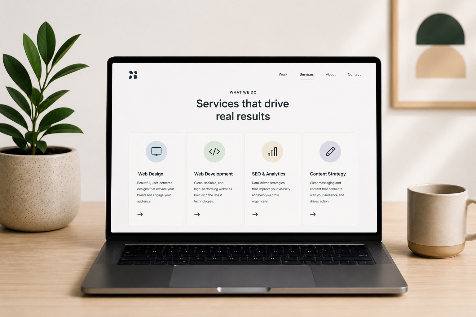
A service breakdown that leads with benefits
Once the headline earns attention, the service breakdown has to hold it. List out what you offer, but write each one around what the client gets rather than what you do. "We build custom websites" describes a feature. "A website built to convert visitors into customers" describes a benefit, and benefits are what move people to act. For services with multiple steps or phases, consider laying out a simple timeline so visitors know what to expect once they sign on.
Visuals that show real work
Stock photography reads as generic. Screenshots, photos, or short clips of actual deliverables signal credibility. If you've solved a real problem for a real client, showing that work does more convincing than any line of copy. If your work doesn't lend itself to screenshots, photos of your team in action or footage from a client engagement can fill the same role.
Social proof and trust signals
Testimonials, client logos, certifications, and review scores all answer the same unspoken question: can I trust this company? Place proof near the decision points on the page, not just buried at the bottom, so it's doing work exactly when visitors need it. A testimonial placed right after a service description, for example, reinforces the claim you just made instead of asking visitors to take it on faith.
Pricing, even if it's just a range
Not every business can post exact pricing, but leaving the topic out entirely creates friction. A simple line like "Packages start at $1,500" or "Most projects range from $2k to $5k depending on scope" gives serious prospects enough information to self-qualify, while still leaving room to customize per client. Skipping pricing altogether often means losing visitors who assume the worst rather than asking.
Internal links
A services page shouldn't be an island. Linking out to relevant case studies, related service pages, or helpful blog content keeps visitors moving through your site and gives search engines a clearer picture of how your pages relate to each other.
FAQs
Every services page collects the same handful of questions: pricing, timelines, process, and scope. Answering them directly on the page removes friction before it turns into a bounce, and a well-structured FAQ section also gives you a shot at AI Overview and featured snippet visibility.
A strong, visible CTA
Your CTA should be impossible to miss and tied to one specific action: book a call, request a quote, fill out a form. Repeating it at natural break points down the page, alongside the proof elements that support it, is one of the most direct ways to improve your conversion rate. Avoid offering several different CTAs that compete for attention. The fewer decisions a visitor has to make, the more likely they are to make one.
One page or many? Choosing your services page structure
Before you write a word of copy, decide how you want to structure the page itself. Businesses with a handful of closely related offerings can usually get away with one comprehensive services page that covers everything in clear sections. Businesses with a wide range of distinct offerings are often better served by a hub page that gives a brief overview of each service, then links out to a dedicated page for each one.
This decision depends entirely on what you do and how different your services are from each other. A web development company offering web design, web development, and ongoing maintenance might want a dedicated page for each, since the audience and search intent behind "web development services" looks different from "website maintenance plans." A solo consultant offering three tightly related coaching packages, on the other hand, can usually cover all three on a single page without diluting any of them.
If you do go with individual pages, give your main services page a clear navigation structure that lets visitors jump straight to the page they need. The goal either way is the same: visitors should never have to dig to figure out what you offer or how to learn more.
Plan before you design
The strongest services pages are planned before a single pixel gets placed. Skipping this step is how you end up with a page that looks good but doesn't convert.
Define your primary goal
Decide on one action you want every visitor to take. That might be booking a consultation, submitting a form, or starting a chat. Every section on the page should build toward that single goal instead of splitting attention across several competing CTAs. If you're tempted to ask for three different things, ask yourself which one actually moves the relationship forward, and cut the rest.
Know your audience's pain points
Put yourself in your ideal client's position. What are they trying to solve, and what questions do they still have by the time they reach your site? Building a user journey map is one of the most useful exercises here, since it shows exactly where the services page fits into a visitor's path and what they need to see before they're ready to act. A visitor arriving from a Google search with high intent needs different information than one clicking over from your homepage out of curiosity, and your page should account for both.
Do a quick keyword check
Before you write a word of copy, confirm the page is built around terms your audience is actually searching for. This doesn't mean stuffing keywords into every sentence. It means making sure the natural language you'd use to describe your services lines up with how people search for them. If your internal name for a service doesn't match how clients describe it, the page should speak the client's language, not yours.
Services page layout best practices
Once you know what the page needs to say, layout determines whether anyone sticks around long enough to read it.
Visual hierarchy and white space
Guide the eye down the page in a deliberate order: headline first, then the value proposition, then details, ending at the CTA. Use size, weight, and spacing to make that order obvious without visitors having to think about it. Crowding the page to fit more in actually works against you, since it makes every element compete for attention instead of guiding visitors toward the next one.
Scannable structure
Most visitors skim before they read. Short paragraphs, clear subheadings, and bullet points where it makes sense all help someone scan the page and still walk away with the key information. If a section can't be summarized in a sentence or two, it's usually a sign the content needs to be broken into smaller pieces.
Navigation placement
Your services page should be reachable within one or two clicks from anywhere on the site. If you offer multiple services, a dropdown menu from the main navigation makes it easy for visitors to jump straight to the specific page they need, and a section on your homepage that links to the services page gives visitors who land there first a clear next step.
Real client work that shows these principles in action
It helps to see these principles applied to real businesses we've actually built for, rather than borrowed examples from brands we have no connection to. None of these is a single, isolated services page, they're full site projects, but each one shows a principle from this guide playing out in practice.
DGTL Agency
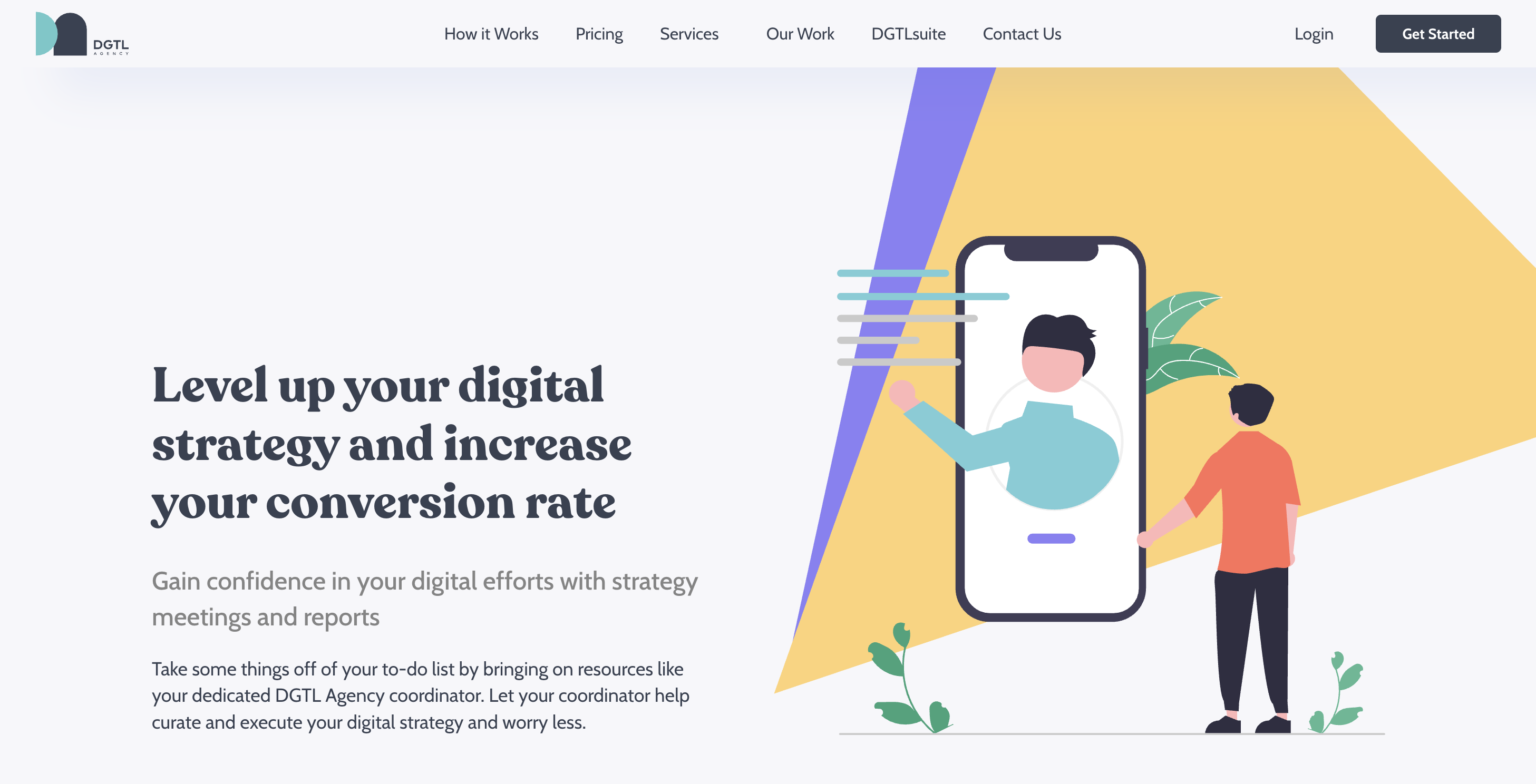
DGTL Agency builds and sells DGTLsuite, a proprietary software platform built around six specialized tools, on top of a broader range of digital marketing services. When Striped Horse built their site from the ground up, the hardest problem wasn't visual, it was informational: how do you present a multi-layered software-plus-services offering without overwhelming visitors before they convert. The fix was a clean, structured layout that organized the services, the software suite, and the value proposition into a sequence visitors could actually follow, paired with navigation built specifically to guide people through services, software, and conversion paths rather than treating everything as one undifferentiated list. The site shipped fully responsive and cross-browser consistent, on the agreed timeline. It's a good example of how clarity, not decoration, solves the hardest problem on a complex services page.
POWERSYNC Energy Solutions

POWERSYNC manufactures advanced energy storage products across three distinct product lines and sells to very different buyers: residential homeowners, commercial and industrial operators, and mobile applications. Rather than route everyone through the same generic overview, Striped Horse mapped each segment's buyer journey separately and built a structured path through the site for each one, with content and next steps tailored to what that specific buyer needs to feel confident enough to inquire or purchase. The build went well beyond a single page. It included a full eCommerce platform across all three product lines, a product literature library for technical downloads, a dedicated installer and dealer portal for B2B leads, and multilingual support across English, Spanish, Portuguese, German, and French. It's a clear example of the audience-segmentation principle in this guide taken to its logical end: when your buyers are different enough, build them different paths, not just different paragraphs on the same page.
Positive Impact Health Centers

Positive Impact Health Centers had been serving the Atlanta HIV community for more than 30 years, but their site hadn't kept pace with how much they actually offer: medical, dental, and nutritional care, mental health and addiction recovery, HIV and STI testing and prevention, pharmacy, and patient support programs like housing and case management. Striped Horse's redesign gave each of those service areas its own clearly defined section instead of cramming everything into one undifferentiated page, paired with a vibrant but still credible color system suited to a healthcare nonprofit. The result is a site where a new patient looking for HIV testing and someone who needs help with housing can each navigate to the right place quickly, without sorting through services that don't apply to them.
Common mistakes that hurt conversions
A handful of mistakes show up on underperforming services pages over and over. A vague headline could belong to any company in the industry, leaving visitors with no reason to keep reading. A service breakdown that lists features without ever mentioning the benefit to the client fails to answer the only question visitors actually have, which is what's in it for them. Skipping the FAQ section leaves visitors to abandon the page rather than dig for answers themselves. Missing internal links strands the page instead of connecting it to supporting content that could move visitors further down the funnel. And a CTA that's buried at the bottom instead of repeated throughout the page asks visitors to do the work of finding it, which most won't bother to do.
Fixing even one or two of these is often enough to see a measurable lift in performance, and fixing all of them turns a page that visitors skim past into one that actually generates leads.
SEO basics for services pages
Design gets visitors to convert once they're on the page. SEO gets them there in the first place.
Start with meta tags: a clear, keyword-relevant title under 60 characters and a description under 160 characters that gives visitors a reason to click. Add schema markup, particularly Service and FAQ schema, to help search engines understand exactly what the page offers and to make it eligible for rich results. Build out an internal linking strategy that connects the services page to relevant blog posts, case studies, and other service pages, since pages with more internal links pointing to them tend to carry more authority in search engines' eyes. And don't overlook FAQ schema specifically. It's one of the more reliable ways to earn visibility in AI Overviews as more searches shift toward AI-generated summaries instead of a traditional list of blue links.
If you've split your offerings across individual service pages rather than one combined page, make sure each one targets a distinct set of keywords. Two pages competing for the same search term will usually cannibalize each other's rankings instead of reinforcing one another.
Conclusion
A services page that converts isn't about flashy design. It's about clarity. Lead with the right headline, back it up with real proof, make the page easy to scan, and give visitors a clear next step. If you want a services page (and a website) built around all of this from the ground up, Striped Horse's website design & development services can help you build one.