11 Best Financial Website Designs of 2026

Your financial website has one job before anything else: convince a stranger that their money is safe with you. That is a harder brief than most industries face. There is no product to hold, no storefront to walk into, and no handshake to close the deal. Everything has to happen on screen, in seconds, before a single form is filled out.
The best financial website designs in 2026 understand this. They do not rely on stock photos of handshakes or walls of compliance text to signal credibility. They use design itself: color, typography, layout, imagery, and copy to communicate trust before a word is consciously registered. Here are 11 sites doing it right, and the specific choices behind them.
What makes a great financial website design?
Before getting into examples, it helps to understand what separates the sites that actually work from the ones that just look like financial websites.
Trust signals above the fold
The best financial sites design credibility into the hero. Client numbers, regulatory information, specific outcomes, and third-party recognition appear as intentional content rather than as fine print buried in footers. When a user lands on the page, the answer to "should I trust these people?" starts forming before they scroll.
Brand identity that earns confidence
Color, typography, and visual language do heavy trust-lifting in financial services. Blues and whites are not accidental. They are psychological shorthand for stability and reliability. But the most interesting financial brands in 2026 are moving beyond the default palette, using distinctive digital branding as owned territory that competitors cannot easily copy. This is where branding and identity design services directly drive conversion.
Navigation built around user needs
Financial products are complex. The sites that convert well organize their navigation around what users need to do rather than what the company wants to show. The difference is between a menu that lists every product and one that answers the question: what are you trying to accomplish?
Authentic imagery over stock
Stock photos of anonymous people in business attire are a trust killer in 2026. The best financial sites use real photography of real people, custom illustration systems, or strong abstract design -anything that feels like it was created for this brand specifically, not licensed from a library.
CTAs that don't feel desperate
Financial users are cautious by nature. Aggressive CTAs backfire in this category. The sites that convert best use confident, low-pressure language - "See how it works," "Get started," "Learn more""-and let the design do the persuading rather than the button copy. If you are thinking about how to improve conversion rate on a financial site, CTA language and placement are one of the highest-leverage places to start.
11 best financial website designs of 2026
The following sites span traditional financial services, neobanks, and fintech platforms. What they share is not a visual style but a commitment to using design as a trust-building tool. Each entry breaks down the specific choices that make it work.
1. Stripe
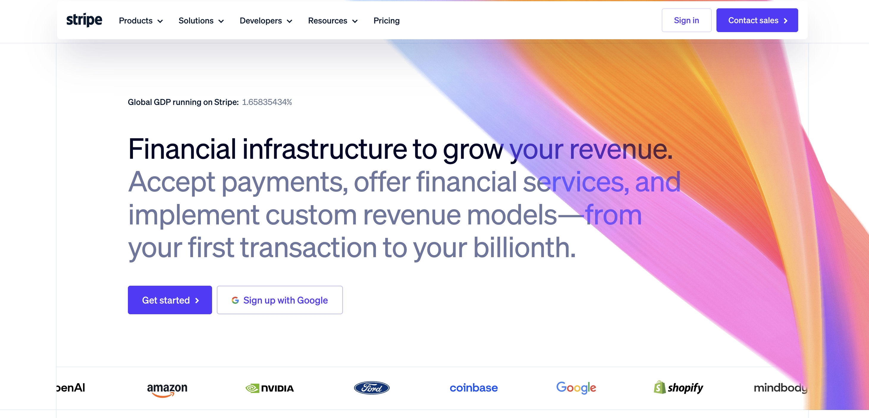
Stripe's homepage opens with an animated gradient that shifts in real time, and it does something most financial hero sections fail to do: it signals technical sophistication before a single word is read. The gradient is not decoration. It is a visual argument for the product itself -dynamic, precise, and operating at a level most companies cannot match.
The typography and layout follow the same logic. Clean, precise, no visual noise. Every design choice says "reliable infrastructure," which happens to be exactly what Stripe is selling. Trust stats and developer metrics appear as designed content modules rather than footnotes. The product demo is interactive. Stripe's visual identity IS its product positioning. You do not need to read the copy to understand what they are and why they are the serious choice for any company processing payments at scale.
2. Wise
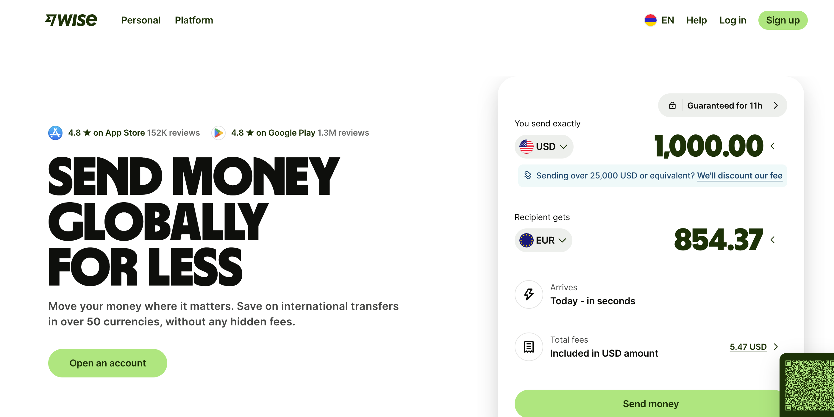
Wise serves 14.8 million customers across more than 80 countries, and its homepage design reflects a brand that has earned the right to be confident. The bright green palette is a deliberate departure from traditional finance aesthetics -it signals transparency and fairness before a word is read, which is precisely the brand promise.
What makes the homepage design particularly sharp is that the fee calculator lives in the hero. The product promise -"we are cheaper and more transparent than your bank" -is not stated. It is demonstrated right on the landing page, before the user has committed to anything. Wise's redesign is one of the most studied in fintech for a reason: every element is working toward the same goal.
3. Mercury
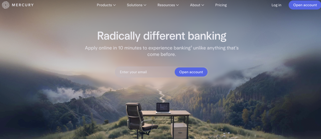
Mercury is a bank for startups, and its website is one of the clearest examples of designing for a specific audience rather than everyone. The muted palette, generous whitespace, and editorial photography are borrowed from luxury brands and fashion rather than from banking. That is intentional.
The visual language says "we take your company as seriously as you do," which is exactly what a founder wants to hear from their bank. The product sandbox is ungated: you can explore the interface before signing up, which is a show-don't-tell approach that communicates confidence in the product. Mercury's design succeeds because it makes its specific audience feel understood, not just served.
4. Robinhood
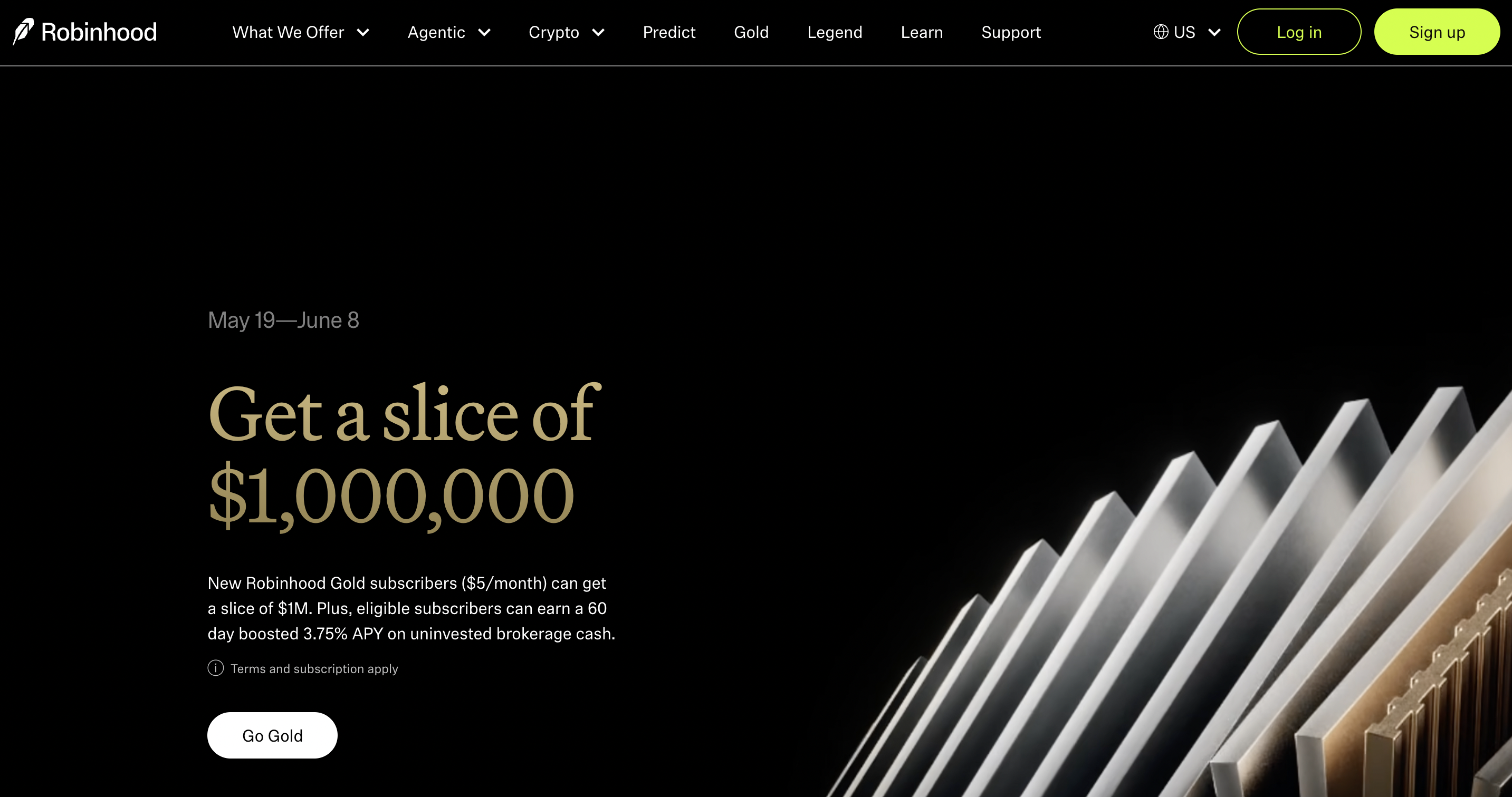
Robinhood's 2024 rebrand, developed with design studio Porto Rocha, treats financial marketing as editorial design rather than product marketing. The result feels more like a magazine than a brokerage, which is exactly what the brand was going for as it transitioned from scrappy disruptor to mature financial platform.
The brand color Robin Neon, a lime neon applied against black and white, is a committed visual conviction in a category full of safe palettes. The typographic system features Robinhood Phonic, a custom sans-serif with ink traps that bring personality without sacrificing precision, paired with Martina Plantijn for headers. Even the photography direction is unconventional: close-up still-life images that could be interpreted as returns or risk rather than the standard aspirational lifestyle shots. Robinhood's identity is a bet that editorial design is the future of fintech branding, and it is a bet worth watching.
5. Betterment
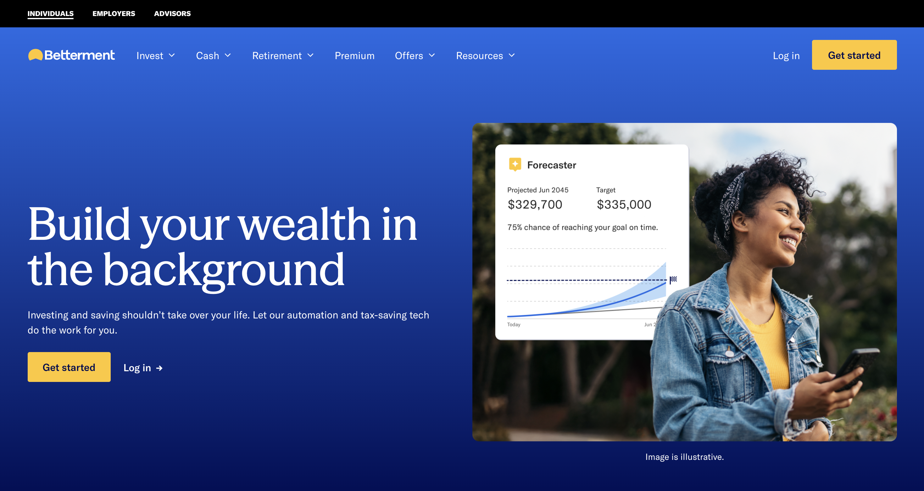
Betterment's design solves a specific problem: how do you make automated investing feel approachable without making it feel cheap? The answer, in Betterment's case, is restraint. Clean layout, considered imagery, strong typographic hierarchy -the site communicates sophistication without requiring the visitor to be sophisticated themselves.
Multiple products (automated investing, high-yield cash accounts, retirement accounts) are handled without overwhelming the user. The navigation is organized around goals rather than product names. CTAs are confident without being aggressive. The design expresses the brand promise clearly: investing does not have to be complicated or intimidating. That clarity is harder to achieve than it looks.
6. Chime
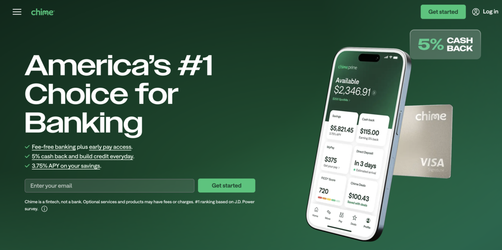
Chime's design makes two smart decisions that most financial sites get wrong. First, it uses a custom illustration system instead of stock photography -diverse, warm, and clearly created for this brand specifically. Second, the homepage is organized around user pain points ("no hidden fees," "get paid up to two days early") rather than product features.
The result is a site that feels built for people rather than for investors. The bold, accessible color palette is approachable without being childish. The visual language communicates that Chime understands its audience -people who have been underserved by traditional banking -and is talking directly to them rather than past them. That specificity is what makes the design work.
7. Morgan Stanley
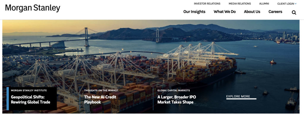
Morgan Stanley's homepage does something counterintuitive for a financial services company: it leads with content. Articles, market insights, and thought leadership fill the above-the-fold area. There is no aggressive product pitch, no hero banner demanding you open an account.
The restraint is the message. For a brand at Morgan Stanley's level, the design communicates that they do not need to sell hard because the reputation speaks for itself. Whitespace, clean typography, and minimal visual noise create an atmosphere of professionalism through what is absent as much as what is present. The navigation serves both institutional clients and individual investors without compromising either. The best institutional financial sites sell by not selling, and Morgan Stanley is the clearest example of that principle in practice.
8. Wealthfront
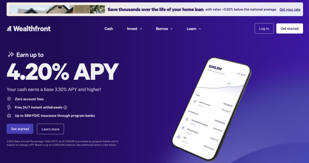
Wealthfront's homepage makes data the visual design rather than the footnote. Charts, projections, and financial models appear as the primary content in the hero, which is a smart move for a product that is fundamentally data-driven.
The interactive financial planning tool built into the homepage is one of the clearest examples of show-don't-tell design in the financial services category. Instead of describing what Wealthfront does, the site lets you experience it before signing up. The design communicates the brand promise -automated, data-driven, trustworthy -through the interface itself rather than through copy. For a product built on sophisticated financial modeling, having sophisticated, data-forward design is not just a style choice. It is a credibility signal.
9. Plaid
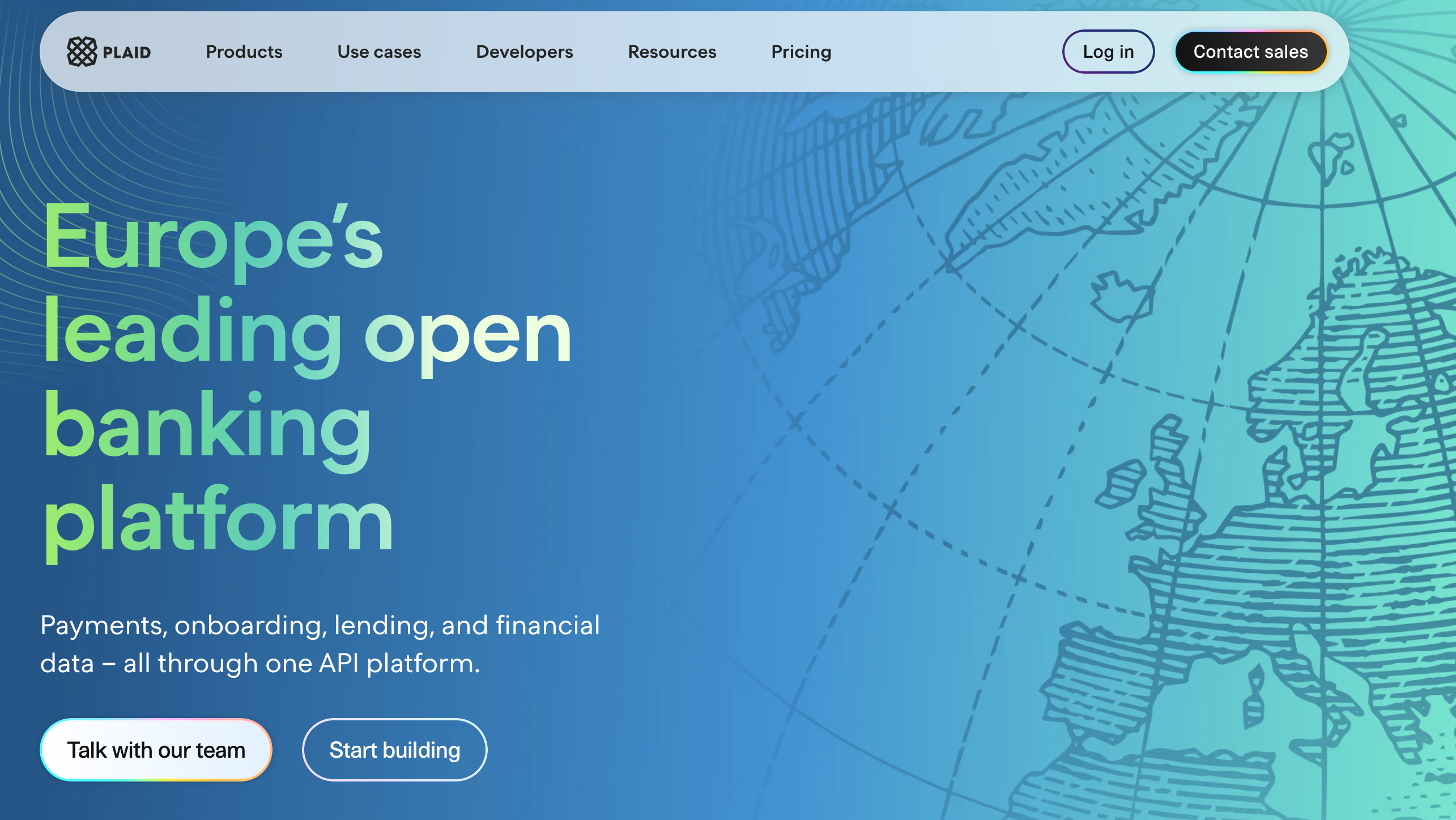
Plaid's design is the most unexpected in B2B fintech. While every competitor reached for gradients and geometric sans-serifs, Plaid went with a heritage banknote aesthetic: guilloche-inspired patterns, woodcut-style illustration, and a design system that references the visual language of currency and financial documents.
The result is instantly ownable territory. Nobody else in the category looks like Plaid. According to Plaid's own data, 1 in 2 U.S. adults with a bank account have connected to an app or service through Plaid -a number that appears as a hero trust statement rather than buried in an About page. The site manages to serve two very different audiences (developers and business decision-makers) without splitting its visual identity in the process. Plaid is proof that the most distinctive design move is often the one that looks backward while everyone else is looking forward.
10. ClearScore
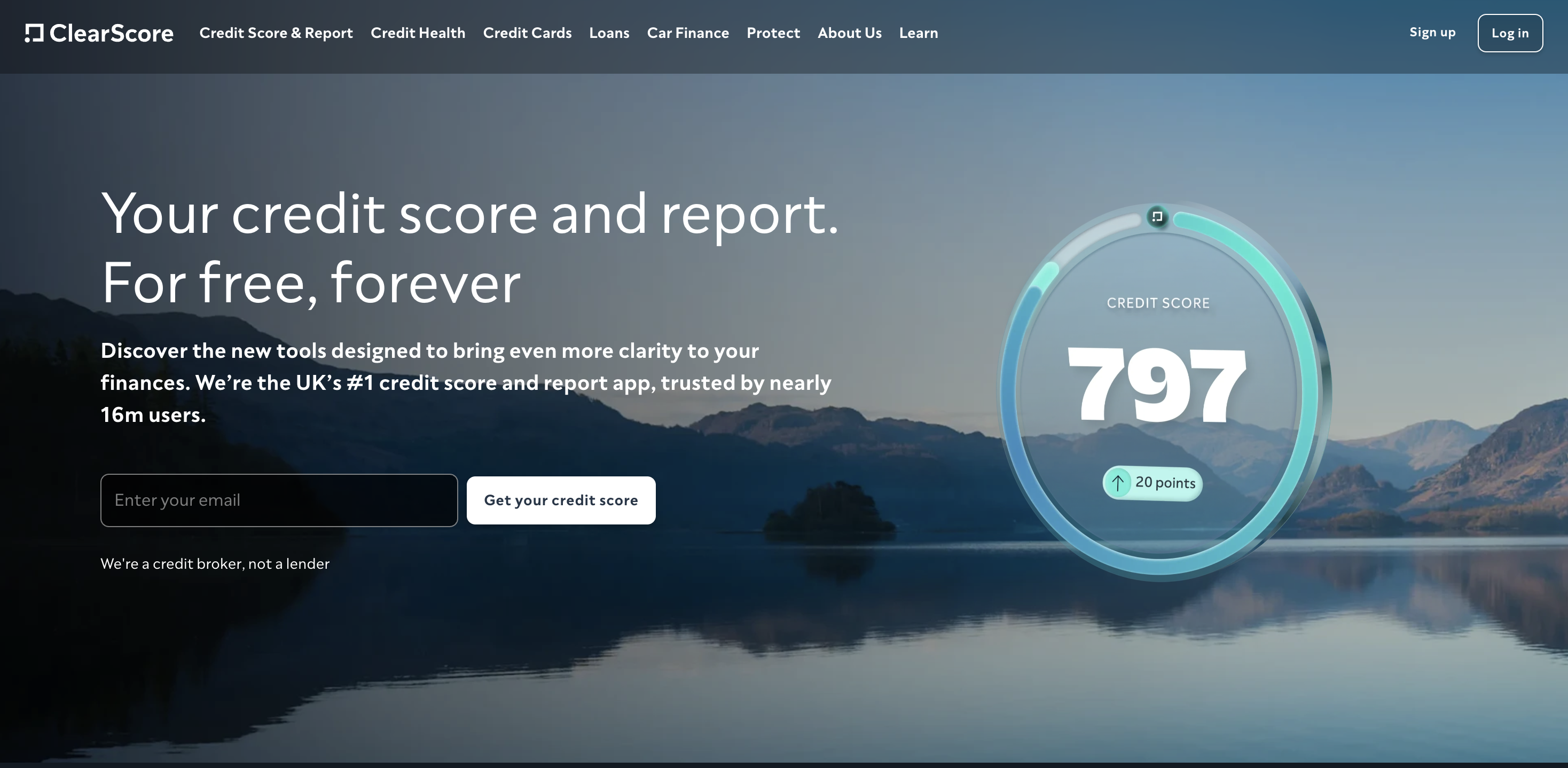
ClearScore's design does something that sounds simple but is genuinely difficult: it expresses the product name in every visual decision. Clear. Readable. Uncluttered. The site is organized and calm in a way that is intentional for a product that deals with a topic -credit scores -that causes real anxiety for a lot of people.
The subdued color palette, strong typographic hierarchy, and generous use of whitespace create an atmosphere of clarity and control. The site carries a high volume of information (scores, recommendations, financial products) without ever feeling overwhelming. That balance between content density and visual breathing room is a design achievement that most financial sites fail at. ClearScore gets it right because the design brief was clearly "calm and clear," and the execution never loses sight of that.
11. Ellevest
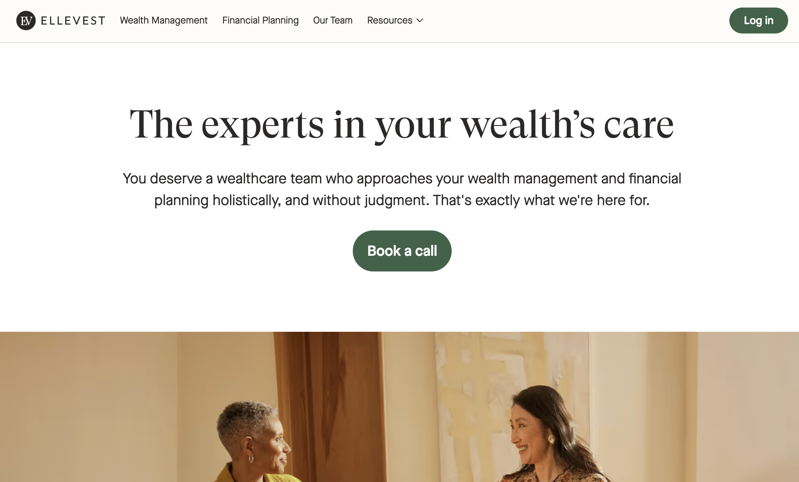
Ellevest is a financial platform designed specifically for women, and its website makes that clear within three seconds of landing on the page -which is exactly the point. Bold visual language, real photography of diverse women, and copy that speaks directly about financial independence and long-term security.
What makes Ellevest's design worth studying is that it avoids the two most common traps in audience-specific financial design: it does not "pink it and shrink it," and it does not overcorrect into sterile gender-neutral design that serves no one specifically. The imagery and copy work together as a unified message. Designing for a defined audience is sometimes treated as a limitation, but Ellevest demonstrates the opposite -knowing exactly who you are talking to and committing to that in your design creates a connection that generic financial sites cannot replicate.
What these financial websites have in common
Looking across all 11 sites, the pattern is not a shared aesthetic. They look nothing alike. What they share is conviction.
Every site on this list made a clear decision about who they are, who they are for, and what their design should communicate -and then executed that decision consistently. Stripe looks like reliable infrastructure. Wise looks like transparency. Mercury looks like a bank that understands startups. Nubank looks like it was built for people the financial system had been ignoring. None of them look like they were designed by committee. If you want to see the same principle applied to a different category, the best SaaS website designs follow much of the same logic.
The second pattern is that brand identity and web design are treated as the same project, not sequential ones. The color, typography, and visual language on each of these sites is not a wrapper applied after the product was built. It is part of how the product communicates its value. For financial services especially, where trust is the product before anything else, that integration between brand and design is not a nice-to-have. It is the work.
The third pattern is specificity. The sites that perform best are not trying to speak to everyone. Chime designs for people underserved by traditional banking. Ellevest designs for women. Mercury designs for founders. That specificity does not narrow the audience in any meaningful way -it deepens the connection with the right audience, which is worth far more.
Ready to redesign your financial website?
The financial websites on this list did not get where they are by following a template. They made deliberate decisions about brand, audience, and visual identity, and they executed those decisions without compromise. That is what separates a financial website that builds trust from one that just checks boxes.
If your website is not doing that work for you, that is where we come in. Striped Horse is a web design and development agency based in Los Angeles. Our financial services website design work spans banks, fintech platforms, and B2B brands that need websites built to convert. If you are thinking about a redesign or starting from scratch, we would love to hear about it.