Best Dental Websites for Inspiration 2026
The best dental website design does more than look polished, it gets a nervous new patient to actually pick up the phone or book online. Below are 10 real dental and oral health practice websites worth studying, each handling a different part of that job well, along with what to actually borrow from each one.
These aren't ranked by an agency rating its own client work. They're real practices, each chosen for something specific they do right.
1. BrightSmiles Pediatric Dentistry
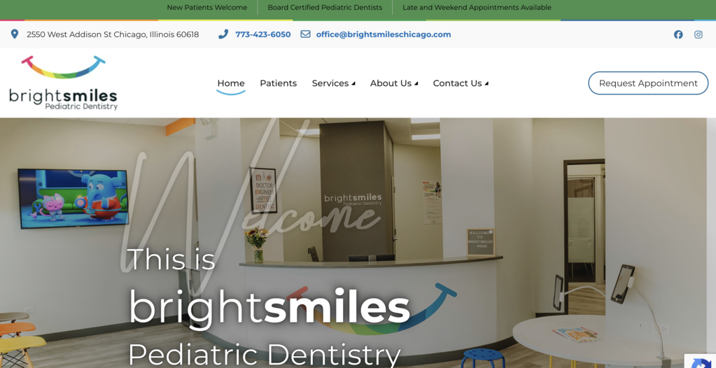
BrightSmiles, a Chicago pediatric practice in the Roscoe Village neighborhood, builds its homepage entirely around parent reassurance. The language leans gentle and specific (tech-friendly, modern, nurturing), and real parent testimonials sit right on the homepage rather than buried on a separate reviews page. Office hours and late/weekend appointment availability are called out in the top bar before a visitor scrolls at all, addressing a real scheduling pain point for working parents immediately.
Takeaway: for a pediatric or family practice, putting the most common parent objections (will my kid be scared, can I get an appointment that fits my schedule) front and center, rather than burying them in an FAQ, removes hesitation before it starts.
2. Pediatric Dental Surgical Associates

PDSA solves a positioning problem most specialty practices struggle with: explaining a narrow, specific role clearly. The homepage states upfront that this is a surgery-only practice, serving children ages 1 to 6 who need full-mouth dental rehabilitation under general anesthesia, and that patients return to their primary dental home afterward for routine care. Two separate paths (Patients, Dentists) split the homepage immediately, since referring dentists and parents need completely different information.
Takeaway: when a practice intentionally does one thing and refers everything else out, saying so plainly on the homepage builds more trust than vague, broad service language would.
3. Dentologie
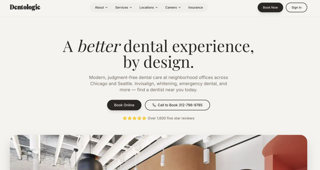
Dentologie operates across more than a dozen neighborhood offices in Chicago alone, plus Seattle, and its site handles that scale without feeling impersonal. The brand voice is distinctive and a little irreverent ("dentists who are different by design"), and a location finder makes it simple to land on the right neighborhood office instead of a generic citywide page. Service pages cover everything from cleanings to Invisalign to implants in plain, non-clinical language.
Takeaway: a strong, consistent brand voice can make a large, multi-location practice feel like a single coherent business rather than a chain, as long as every location page still feels specific to its neighborhood.
4. Jackson Family Dental

Jackson Family Dental, a Liberty, Missouri practice, leans hard into in-office comfort touches, massage chairs, neck wraps, and a cookie on the way out, and makes sure all of it shows up on the website, not just in person. Real patient reviews are woven throughout service pages rather than isolated to one testimonials section, and a savings plan with transparent annual pricing is laid out clearly for patients without insurance.
Takeaway: small, tangible comfort details (not abstract claims like "gentle care") give visitors something concrete to picture before their first visit, which matters most for anxious patients.
5. Forni Dental
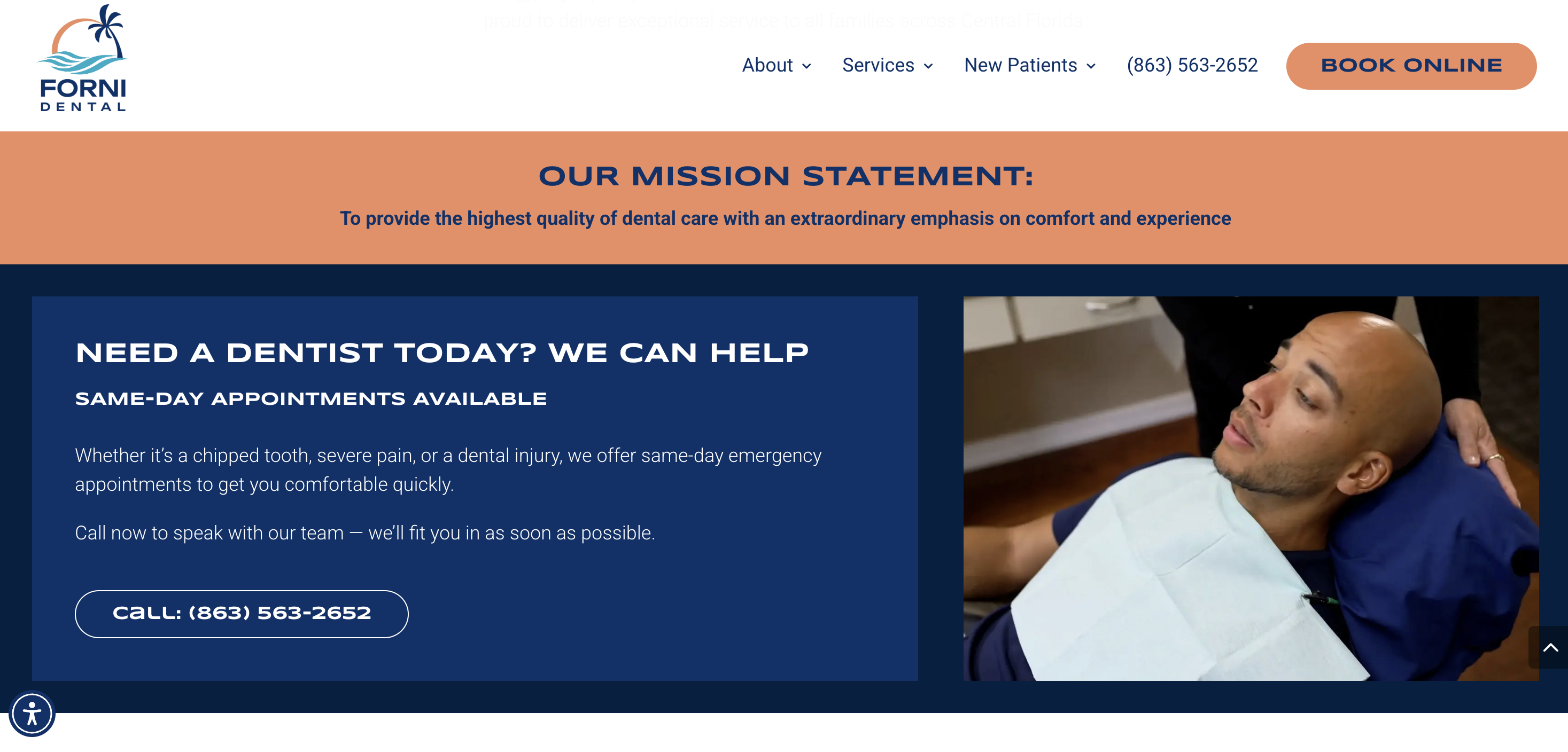
Forni Dental, based in Lake Wales, Florida, positions itself around keeping referrals to a minimum, general, cosmetic, implant, and oral surgery care are all handled in-house. The site backs that claim with a doctor bio describing decades of local practice and postdoctoral training across multiple specialties, plus a "comfort menu" (sedation options, Netflix, noise-canceling headphones) that makes the all-in-one promise feel patient-focused rather than just convenient for the practice.
Takeaway: if a practice's real differentiator is breadth of services under one roof, the site should make that explicit, since patients searching for a single dentist to handle everything won't know to look for it otherwise.
6. Staten Island Oral & Maxillofacial Surgery
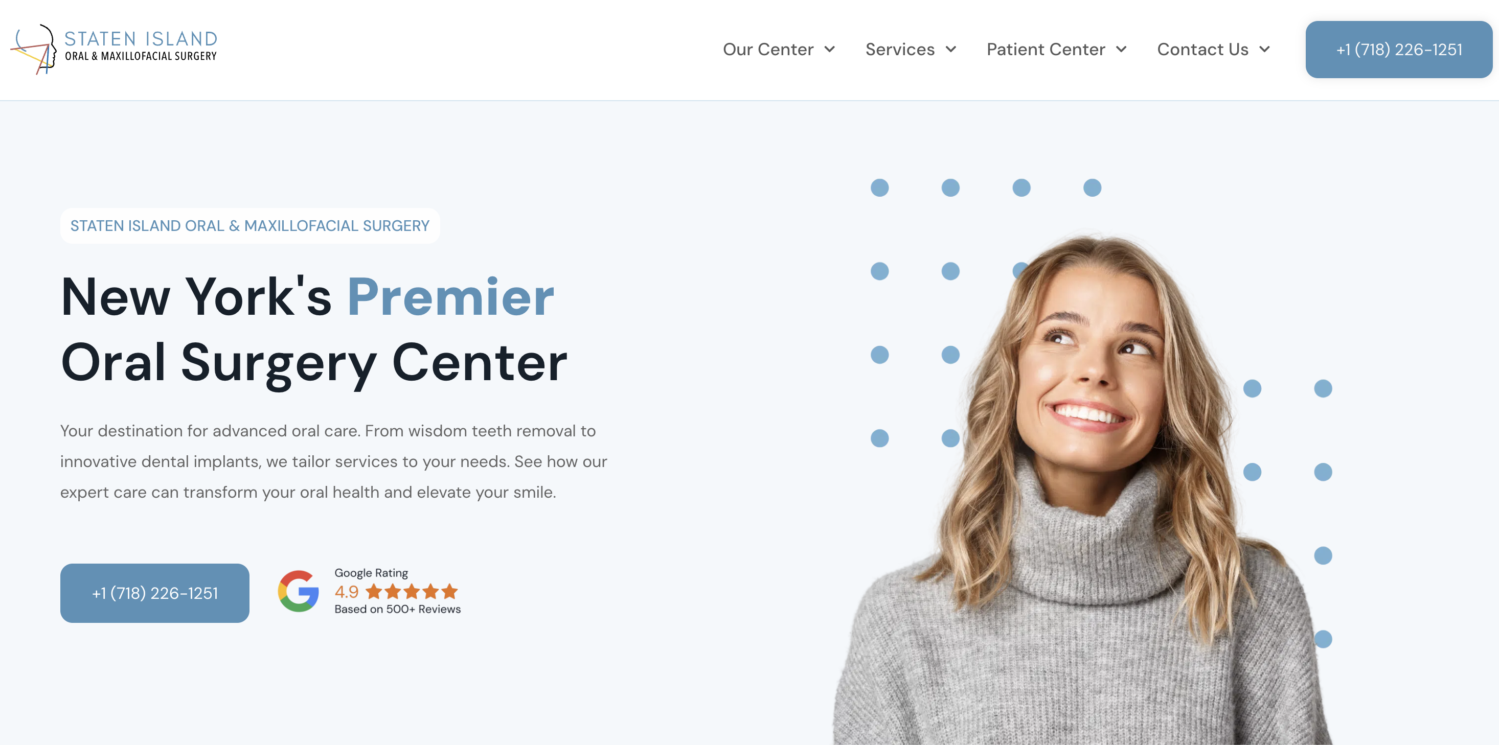
Staten Island Oral & Maxillofacial Surgery handles a more intimidating specialty than general dentistry, and the site works to lower that anxiety through specificity: board certifications, named surgeons with detailed bios, and a breakdown of advanced technology (3D imaging, photogrammetry systems) used for procedures like Teeth-in-a-Day implants. A dedicated media section features real patient stories, including pediatric cleft lip and palate cases, building credibility through documented outcomes rather than general claims.
Takeaway: for higher-anxiety procedures, naming the specific technology, credentials, and patient outcomes does more trust-building work than reassuring language alone.
7. Vivid Specialized Dentistry
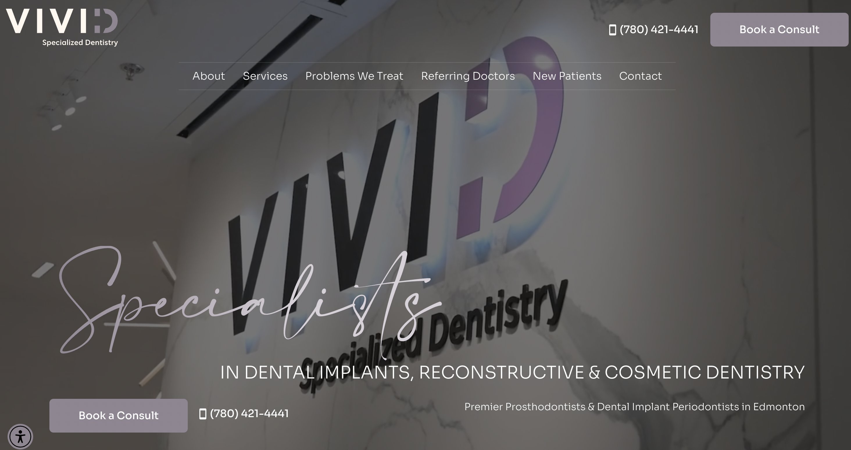
Vivid, an Edmonton multispecialty clinic combining prosthodontics, periodontics, and an in-house dental lab, faces a specific challenge: most visitors arrive confused about what a prosthodontist even is. The site addresses that directly with a plain-language explainer (a prosthodontist has additional specialty training beyond a general dentist, focused on complex restorative and implant work) before getting into services. An FAQ section answers the practical question patients actually have, "I don't know what I need," with reassurance that the team will guide them rather than expecting them to self-diagnose.
Takeaway: when a practice's specialty isn't widely understood, leading with a short, jargon-free explanation of what that specialty actually means removes a real barrier before a visitor even considers booking.
8. Holy City Orthodontics
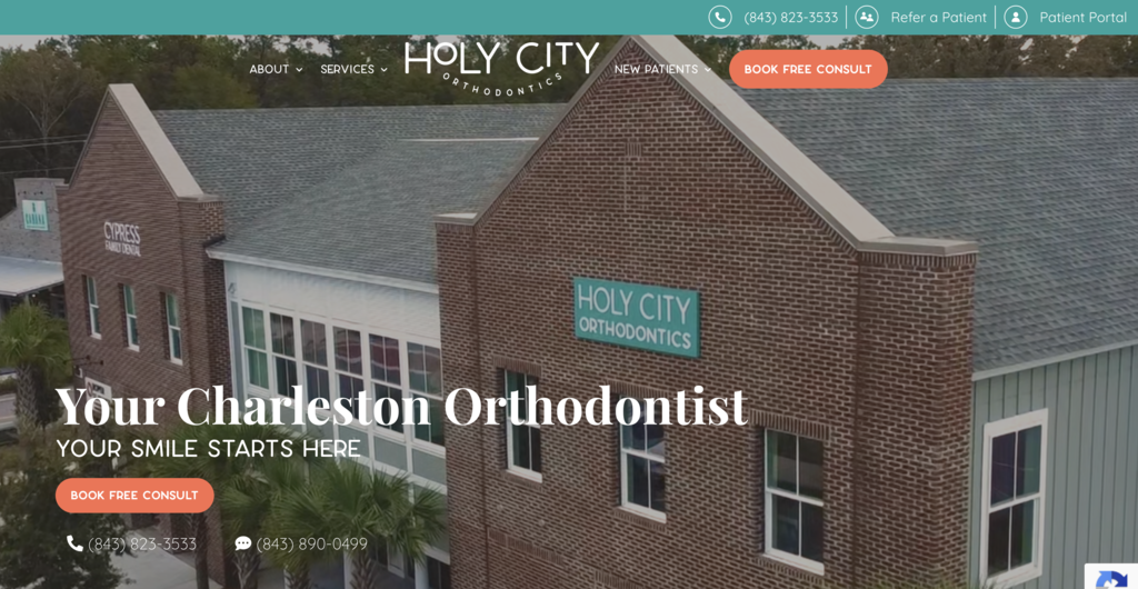
Holy City Orthodontics, a Johns Island, South Carolina practice in the Charleston area, softens what's typically a stiff, clinical category. The language is warm and specific ("we treat you like family," "Charleston charm than a clinic"), and a woman-owned, boutique positioning is stated directly rather than implied. Financing and pricing language is upfront and reassuring (0% interest, transparent cost, family discounts), addressing the cost anxiety that often stalls orthodontic decisions.
Takeaway: orthodontic treatment is a bigger financial and time commitment than a routine dental visit, so addressing cost and flexibility early, rather than waiting for a consultation, can reduce drop-off before someone ever calls.
9. Dental Care Seattle
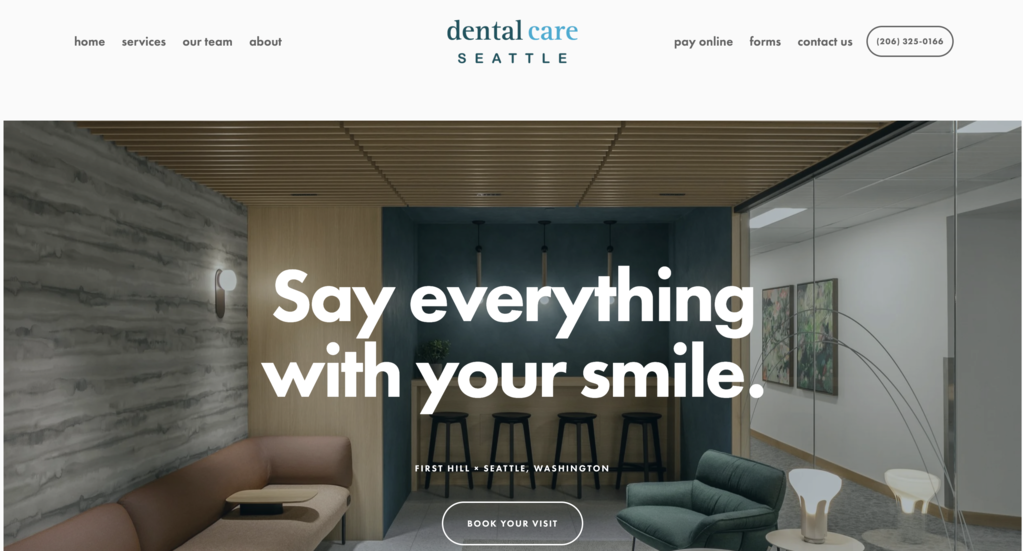
Dental Care Seattle, a locally-owned First Hill practice, proves a smaller build can still feel polished. The design stays clean and unfussy: a straightforward scroll layout, clear hours, a streamlined appointment path, and no unnecessary flourishes competing for attention. The site leans on a six-dentist team, named technology (iTero intraoral scanners, Invisalign certification), and a row of professional association logos (ADA, WSDA, Seattle King County Dental Society) to build credibility without needing a large custom development budget.
Takeaway: a strong dental website doesn't require a fully custom build. A clean, well-organized site on a more accessible platform can still convert, as long as the essentials (hours, location, booking, credibility signals) are clear and easy to find.
10. First City Dentistry
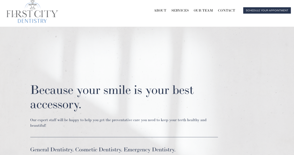
First City Dentistry, a Savannah, Georgia family practice, keeps things warm and personal throughout the site. The homepage leads with patient testimonials using real first names and specific praise for named doctors, and the doctor bios go beyond credentials into personal, local detail (where they grew up, their families), reinforcing a hometown feel. The design is clean and simple, easy to navigate with a clear appointment CTA in the main nav and service descriptions written in plain, accessible language.
Takeaway: for a community-focused general practice, personal specificity in bios and testimonials (named doctors, real patient voices) does more trust-building work than polished stock photography or generic 'compassionate care' language.
What these dental website examples have in common
Looked at together, these 10 sites don't share a single visual style. Some lean playful (BrightSmiles, Dentologie), some lean clinical and credential-heavy (Staten Island Oral Surgery, Vivid), some keep things simple on an accessible platform (Dental Care Seattle). What they share is a structural pattern:
A clearly defined scope of care stated early, whether that's a narrow specialty (PDSA's surgery-only model) or a deliberately broad one (Forni Dental's all-under-one-roof positioning). Trust signals matched to the anxiety level of the procedure, credentials and technology for surgery, warmth and financing clarity for orthodontics, comfort details for general anxious patients. Local or human specificity over generic claims, named doctors, real history, real neighborhoods, rather than interchangeable "compassionate, modern care" language that could describe any practice. And a scheduling path that matches how patients actually search, whether that's a location finder for a multi-office practice or a simple, fast booking flow for a single-location one.
None of this is about chasing a particular aesthetic. It's about matching the site's structure and tone to what a given practice's patients actually need to feel comfortable booking.
Bringing these lessons to your own dental practice's site
Most dental website redesigns don't fail because the design looks dated. They fail because the site doesn't address the specific hesitation a patient has, whether that's fear of a procedure, confusion about a specialty, or uncertainty about cost.
Our team has built dental and pediatric practice websites with exactly that structure in mind, mapping out what a practice's patients actually need to see before they call, not just what looks good in a portfolio. That's the kind of website design work we do for healthcare clients specifically, and if you're considering a redesign, that's the conversation worth having first.
FAQ
What makes a dental website actually work?
The sites that convert best aren't necessarily the most visually striking, they're the ones that answer a visitor's real hesitation quickly: is this practice trustworthy, can I book easily, and does this fit what I'm specifically worried about (cost, pain, finding the right specialist).
Should I hire a dental website design agency or use a template?
It depends on the practice. A single-location general dentist can do well with a clean, well-built template site, as Dental Care Seattle shows. A multi-location practice, a specialty practice, or one juggling referral relationships usually benefits from an agency that understands those structural needs from the start.
What sets dental website design companies apart from general agencies?
A firm with dental-specific experience already understands things like HIPAA-conscious contact forms, scheduling integrations, and how to write content that doesn't read as generic across treatment pages. A general web design firm can still produce a good-looking site, but may need more guidance on healthcare-specific details.
How long does a dental website redesign take?
It varies by scope. A single-location redesign moves faster than a multi-location build with location pages and custom scheduling. Most of the timeline goes into content and structure, not just visual design.
Does a dental website need regular redesigns?
Not on a fixed schedule. A redesign is worth considering when the site no longer reflects current services or doctors, mobile usability feels outdated, or patients are clearly dropping off before booking.