How to Write an About Us Page That Builds Trust

Most About Us pages say a lot without actually saying anything. A founding year, a mission statement that sounds like every other mission statement, maybe a team photo grid. Visitors click over, scan for ten seconds, and leave no more convinced than when they arrived.
The pages that actually work do something different. They make the reader feel like they've found the right team before they've even finished reading. That's not an accident. It's the result of intentional choices about what to say, how to say it, and how the page is designed to deliver that message.
This guide walks you through all of it, from what to include to how to write it, with real examples of About Us pages that get it right.
What is an About Us page?
An About Us page is a dedicated section of your website where visitors can learn who you are, why you exist, and whether they can trust you. It's not a sales page. It's the page people go to when they're already interested and want to know if you're the right fit.
And more people visit it than most business owners expect. Customers who visit an About Us page spend 22.5% more than those who don't, and 52% of people say it's the first thing they want to see when they land on a website.
For service businesses especially, the About Us page is one of the most important pages on the site. When someone is deciding between two agencies, two consultants, or two service providers with similar offerings, the About Us page is often where that decision gets made. It's where they figure out who they actually want to work with.
It also supports your SEO. A well-written About Us page helps Google understand who is behind your content, which contributes to E-E-A-T (experience, expertise, authoritativeness, and trustworthiness). It's also a natural place to link out to your service pages and portfolio, strengthening your site's overall authority.
What to include on an About Us page
There's no single format that works for every business, but the strongest About Us pages tend to cover the same core elements. Here's what those are and why each one matters.
Your origin story
Not when you were founded. Why you were founded.
There's a real difference between the two. A founding year is a fact. An origin story is a reason for someone to care. It answers the question visitors are actually asking: why does this business exist, and why should I trust the people running it?
Your origin story doesn't need to be dramatic. It just needs to be specific and honest. What problem did you see? What gap were you trying to fill? What experience pushed you to start? The more concrete the answer, the more believable it is.
XO Baking Co does this well. Founder Lindsey Braham opens her About page by talking about her lifelong relationship with baking, then pivots to a diagnosis of Celiac disease in 2009 that completely reoriented her mission. She wasn't just starting a business. She was solving a real problem she had personally experienced. That specificity is what makes it compelling.
Mission and values
Your mission tells visitors what you're working toward. Your values tell them how you work. Together, they help potential clients figure out whether you're aligned before they ever reach out.
Keep both grounded in reality. Phrases like "we're committed to excellence" or "we put clients first" have been written on so many About pages they've stopped meaning anything. Instead, write about what you actually believe, the decisions you make because of it, and the things you'd never compromise on.
The team
People buy from people. A page that lists services and credentials but never shows a human face creates a subtle barrier that's hard to overcome.
Introducing your team with real photos, names, and brief bios removes that barrier. It tells visitors there are real people behind the work, with real expertise and real accountability. It also makes your business feel approachable, which matters a lot when someone is about to hand over a significant budget or a project they care deeply about.
BrightSmiles Pediatric Dentistry leads their About page with exactly this. They open with their doctors, photos included, credentials clear, and a direct statement of their mission to provide specialized care. For a pediatric dental practice where parents are making decisions about their kids' wellbeing, that combination of faces, names, and expertise does a lot of trust-building work quickly.
Social proof
By the time someone reaches your About Us page, they're already interested. What they need now is confirmation that others have trusted you and been glad they did.
Social proof can take a few forms: client logos, testimonials, awards, or notable results. The most effective version is specific. A testimonial that describes a real outcome is more convincing than one that just says "great to work with." Recognizable client logos carry implicit credibility. If you've worked with well-known brands or earned industry recognition, this is the right place to say so.
A clear CTA
Every page on your website needs a next step, and your About Us page is no exception. Once a visitor has read your story, met your team, and seen your social proof, they should know exactly what to do next.
That might mean getting in touch, exploring your portfolio, or learning about your services. The CTA doesn't need to be aggressive. It just needs to be there and feel like a natural next step given everything they've just read.
How to write an About Us page: step by step
Knowing what to include gets you halfway there. Actually writing it in a way that lands is the other half. Here's how to approach it.
1. Start with your reader, not yourself
This is the most common mistake on About Us pages. The page is called "About Us," so it feels natural to write entirely about yourself. But visitors aren't reading it just to learn about you. They're reading it to figure out if you're the right fit for them.
Before you write a single word, ask: who is reading this? What are they trying to figure out? What do they need to feel before they'll trust us enough to reach out? A user journey map can help you visualize exactly how visitors arrive at your About Us page and what they're looking for when they get there. Then write the whole page with those questions in mind.
2. Lead with your "why" before your "what"
Your "what" is what you do. Your "why" is the reason you do it.
Leading with the "why" works better because it connects on a values level before a functional one. By the time you explain what you offer, the reader already has a sense of whether they're aligned with how you think. That's a much stronger foundation for trust than a services list.
3. Tell a story, not a timeline
A timeline of company milestones is the most forgettable structure you can use. It puts the company at the center and the reader nowhere.
A story works differently. It has a problem, a turning point, and a direction. It invites the reader in rather than reporting facts at them. Even if the underlying information is exactly the same, framing it as a narrative makes it more engaging and more memorable.
4. Write like a human
Read your draft out loud. If it sounds like it was written by a committee or generated by a template, rewrite it. The best About Us pages sound like a real person talking: warm, direct, and specific.
That means using contractions. Shorter sentences. Dropping jargon. Letting some personality through. The goal isn't necessarily to sound casual. It's to sound like a human being that someone could actually have a conversation with.
5. Let design and copy work together
Copy is only half the equation. The way your About Us page is designed shapes how visitors experience everything you've written.
A well-designed About Us page guides the eye intentionally. The most important message should be the first thing someone sees. The team section should feel warm and approachable, not like an org chart. Visuals and words should reinforce the same ideas rather than pulling in different directions.
If the copy is doing all the right things but the design undercuts it, trust doesn't build the way it should. Working with an experienced web development company ensures your About Us page is built to perform as well as it reads.
5. Add trust signals strategically
Trust signals work best when they appear where doubt is most likely to surface, not all grouped at the bottom of the page.
If you're making a bold claim about your expertise, follow it immediately with a client quote that backs it up. If you're introducing the team, pair real photos with real credentials. If you've worked with recognizable clients, weave those logos into the narrative rather than burying them in a footer. The goal is to answer objections before they fully form.
6. End with a CTA that makes sense in context
A visitor who has read your entire About Us page is warm. They know who you are, they've connected with your story, and they've seen your social proof. This is exactly the right moment to invite them somewhere.
The CTA at the end should feel like a natural next step, not a sales push. Something like "Take a look at our work" leading to your portfolio, or "Let's talk about your project" leading to a contact form, fits the tone of the page. Keep it simple, keep it human, and make sure it leads somewhere worth visiting.
About Us page examples done right
The best way to understand what works is to see it in practice. Here are a few examples worth studying closely.
Mailchimp
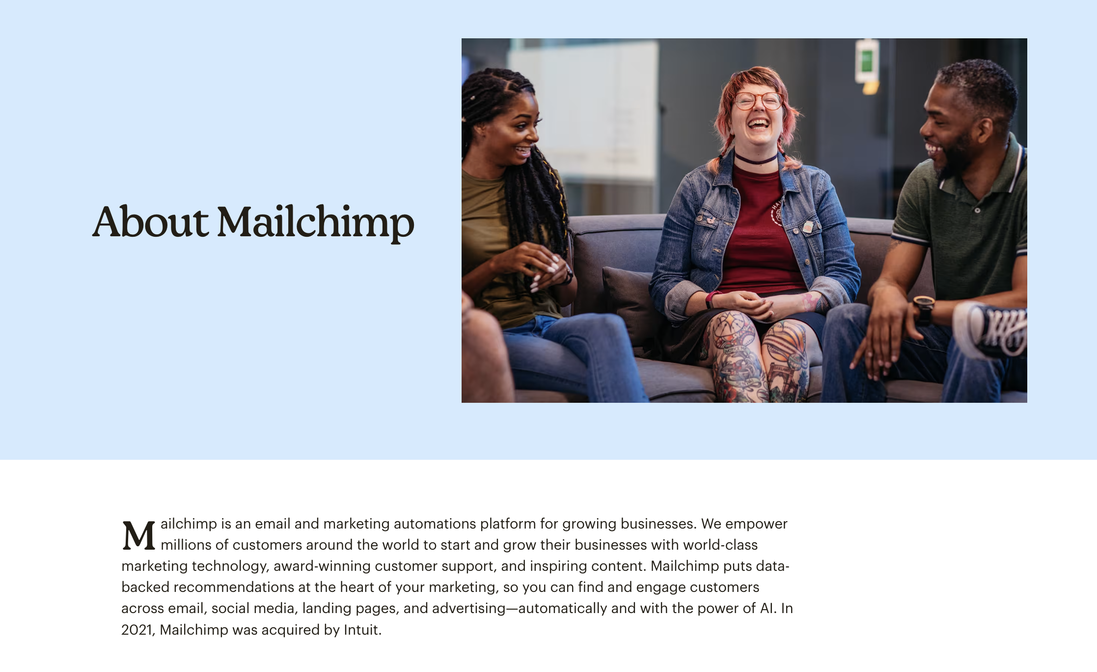
Mailchimp's About page opens with the founders' story and ties it directly to their core mission of supporting small businesses. Rather than leading with product features or company size, it leads with belief: a shared conviction that small businesses deserve the same tools as larger ones.
What to borrow: connect your origin story to your mission in a way that feels earned rather than stated. The values shouldn't appear as a separate section. They should come through in the story itself.
HubSpot
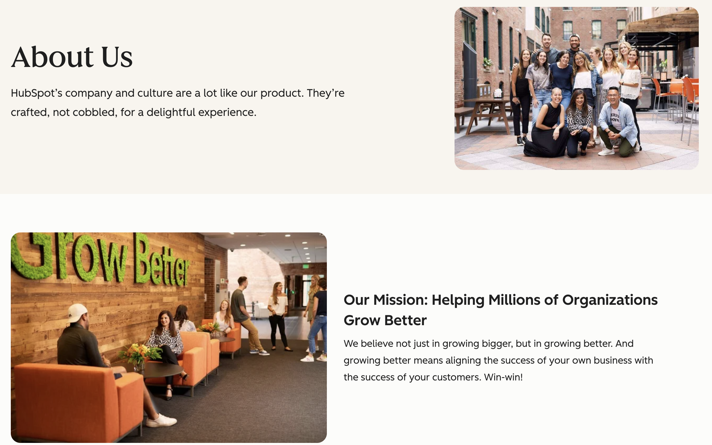
HubSpot's About page opens with a specific observation that became the entire foundation of the company. In 2004, co-founders Brian Halligan and Dharmesh Shah noticed that buyers no longer wanted to be interrupted by ads. They wanted helpful information instead. That single insight is why the company exists, and the page makes that clear right from the start.
What works well is that the origin story and the product are completely inseparable. HubSpot doesn't describe what it does and then explain why. It leads with a problem it saw in the industry, and everything else follows naturally from that. By the time you understand what HubSpot does, you already understand why it was built.
What to borrow: tie your origin story to a belief about your industry. If you saw something broken and built something better because of it, that's your story. Lead with the problem you saw, not the product you created.
XO Baking Co
%201.png)
XO Baking Co takes the same approach and makes it deeply personal. Founder Lindsey Braham opens with a lifelong love of baking, then a Celiac disease diagnosis in 2009 that completely reoriented her mission. She wasn't filling a market gap in the abstract. She was solving a problem she had lived.
The result is an About page that feels completely real. You understand exactly why this business exists, you trust the person behind it, and you believe she knows what she's talking about because she's been through it herself.
What to borrow: lead with a personal, specific experience rather than a broad company statement. Readers connect with people, not positioning language.
BrightSmiles Pediatric Dentistry
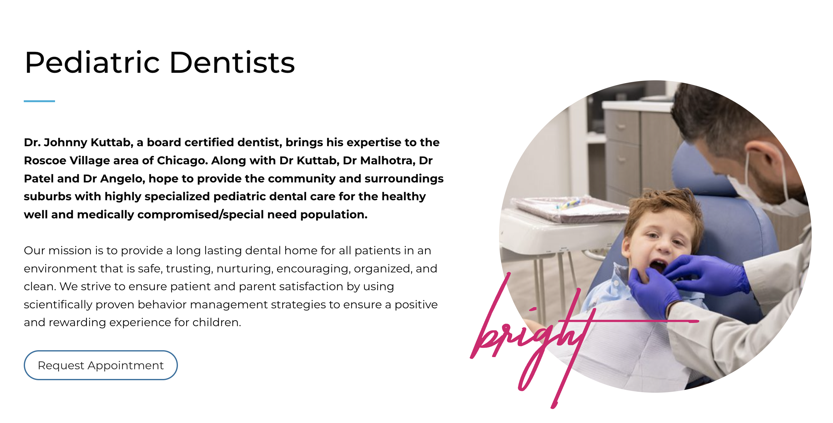
BrightSmiles takes a credentials-first approach that works perfectly for their context. When parents are choosing a dentist for their child, they want to know the doctors are qualified, experienced, and genuinely committed to their patients' wellbeing. BrightSmiles leads with exactly that: doctor names, real photos, board certifications, and a mission statement that speaks directly to how they work.
What to borrow: match your trust-building approach to what your specific audience needs to feel confident. For some businesses that's a story. For others it's credentials and clarity. Know which one your visitors are looking for.
About Us page design tips
Great copy earns attention. Good design holds it. Here's what to focus on when thinking about how your About Us page actually looks and feels.
Visual hierarchy
The most important message on your page should be the first thing the eye lands on. That usually means a strong headline and a short statement of who you are and who you serve, above the fold, before anything else competes for attention.
From there, the page should guide visitors through your story in a logical order. Use section breaks, typographic contrast, and spacing to signal transitions and give each element room to breathe.
Team photos
Real photos of real people build trust in a way stock photography simply cannot. Visitors can tell the difference immediately, and stock images signal inauthenticity even when everything else on the page is genuine.
Team photos don't need to be formal. Natural, well-lit shots that show personality tend to perform better than stiff corporate headshots. If your brand has a specific energy, whether that's creative, technical, approachable, or bold, the photography should reflect it.
Mobile layout
More than half of your visitors will read your About Us page on their phone. According to StatCounter, mobile devices accounted for 64.35% of global web traffic as of mid-2025. That means your layout needs to hold up at small screen sizes: readable font sizes, sections that stack naturally, and images that don't break the layout or slow the page down.
Test it on an actual device. A page that looks polished on desktop but falls apart on mobile undercuts the trust you're working to build.
White space and readability
Crowded pages feel overwhelming. White space, the empty areas between elements, gives content room to land. It makes the page feel considered and professional rather than rushed.
Keep paragraphs short. Break up long sections with subheadings. Give visuals enough breathing room that they have impact. The goal is a page that feels easy to read from top to bottom, not one visitors have to fight through.
Build an About Us page that earns trust
The best About Us pages don't try to impress. They try to connect. They show the thinking behind the work, the people doing it, and the values driving the decisions. By the time a visitor reaches the end, they don't feel like they've been sold to. They feel like they've found the right team.
That's what trust looks like in practice, and it's what your About Us page should be built to create.
If you're starting from scratch or rethinking a page that isn't working, Striped Horse works with businesses to build pages that earn that kind of trust, from the copy to the layout to the final detail.