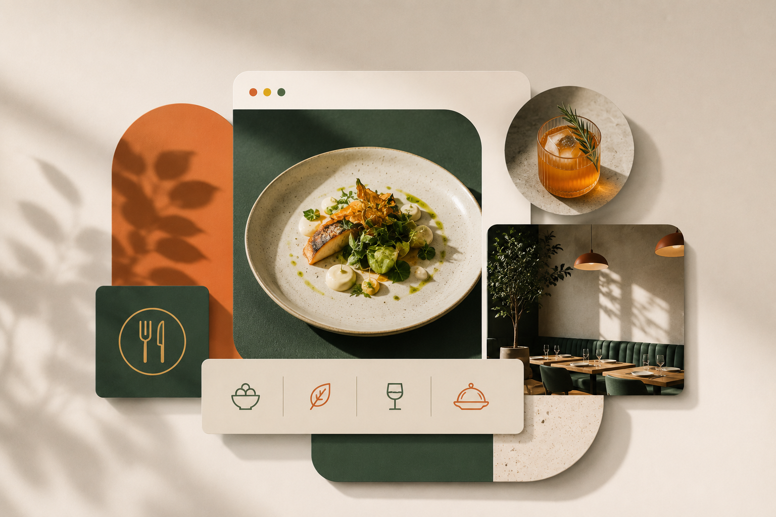
12 Best Restaurant Website Designs
Your restaurant's website is the first impression most diners get before they ever walk through the door. And that impression matters more than most restaurant owners realize. Studies show that 77% of diners visit a restaurant's website before deciding where to eat, and 69% say a website is the single most persuasive factor in that decision.
Despite those numbers, most restaurant websites undersell the experience. Bad photography, buried menus, and designs that have nothing to do with the actual restaurant are more common than they should be.
The 12 examples below are different. Each one does something specific and worth paying attention to, whether it is the way they handle photography, navigation, personality, or conversion. Here is what they got right and what you can take from each one.
12 best restaurant website design examples
Each of these sites does something specific and worth paying attention to. Some nail the visual identity, others get the functionality exactly right, and a few manage to do both at once.
1. Nobu
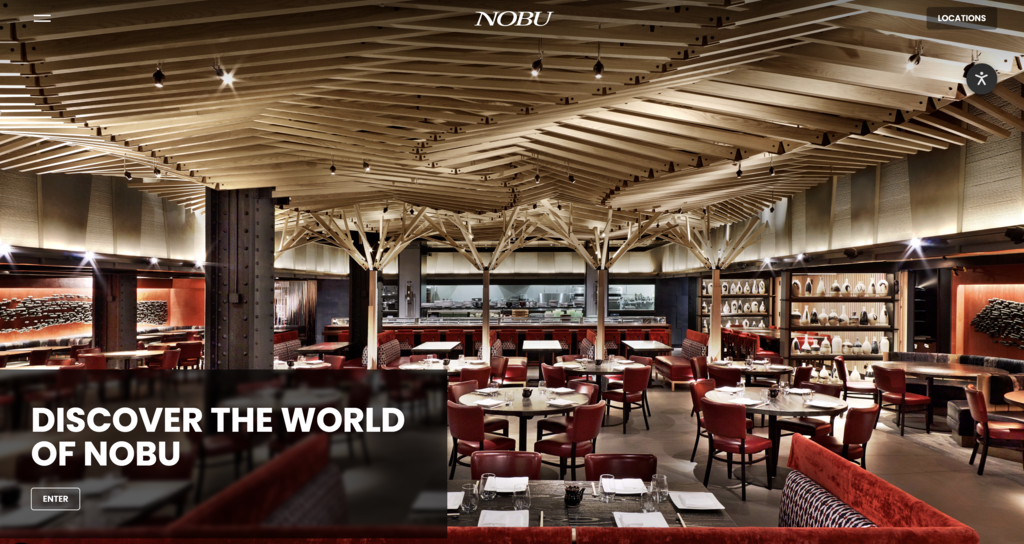
Founded by Chef Nobu Matsuhisa alongside Robert De Niro and Meir Teper, Nobu has grown into one of the most recognized Japanese restaurant brands in the world with locations across the US and internationally. The website reflects that global status without overcomplicating things.
The navigation is clean and direct: Menus, Reservations, Contact and Hours, Takeout, Private Events. Everything a visitor needs is one click away from the top of the page. The Reservations button sits prominently in the header on every location page, never buried. Below that, high-quality photography carries each section, with concise copy and a single CTA per block.
Nothing competes for attention. The design trusts the food and the brand name to do the heavy lifting, and gets out of the way.
What to steal: Put your reservation or order CTA in the header and keep it there on every page. Visitors should never have to hunt for it.
2. Sweetgreen
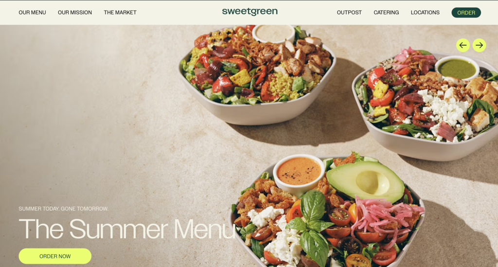
Sweetgreen was founded in 2007 by Nicolas Jammet, Nathaniel Ru, and Jonathan Neman, three Georgetown University graduates who opened a 500-square-foot restaurant serving salads made with organic produce. What started as a single location has grown to over 200 locations across the US, and the website has scaled with the brand without losing what makes it distinct.
The navigation is where it stands out. Most restaurant sites bury the order button below the fold or tuck it into a corner. Sweetgreen puts "Order" directly in the top navigation alongside "Our Menu," "Our Mission," and "Locations." Everything a visitor needs is treated as equally important, including the mission. That is not an accident. The brand was built around the belief that fast food could be healthy and sustainable, and the site reflects that by giving the mission the same real estate as the menu.
The homepage hero rotates with the current seasonal menu, which keeps content fresh and gives regulars a reason to check back. Each menu item is displayed with a clean photo and a full ingredient list, with an "Order now" link on every card.
What to steal: Make ordering or reservations a top-level navigation item, not a buried button. If your mission or story is central to your brand, give it its own nav link rather than folding it into a generic About page.
3. Shake Shack
Shake Shack started as a hot dog cart in Madison Square Park in New York City in 2001. By 2004 it became a permanent kiosk, and today it operates over 400 locations globally. The brand built its reputation on a simple premise: elevated versions of American classics using quality ingredients. The website reflects exactly that.
The navigation puts Menu first, ahead of everything else. Ordering is accessible from the homepage without any friction. The "Values" page, which Shake Shack calls "Stand for Something Good," sits alongside the menu in the main navigation, signaling that the brand considers it as important as what they serve. The footer is organized into three clear sections - About Us, Explore, and Inquiries - so visitors can find whatever they need without any guesswork.
Nothing on the site competes for attention in a way that slows the visitor down. There are no unnecessary sections, no decorative content that gets in the way of the two things most visitors are there to do: look at the menu and place an order.
What to steal: Treat your menu and your ordering flow as the primary purpose of the site. Every other element, including your story and your values, should support that, not compete with it.
4. Federalist Pig
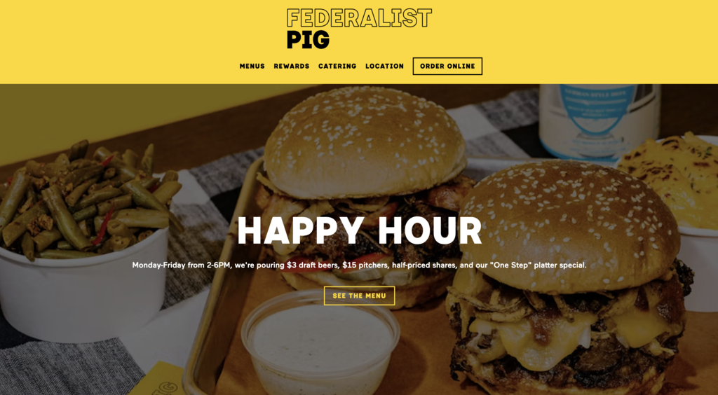
Federalist Pig is a craft American barbecue restaurant in Washington DC's Adams Morgan neighborhood and a two-time Michelin Bib Gourmand winner. The tagline is "'Que 4 the People," and the website carries that energy all the way through.
The navigation is tight and functional: Menus, Rewards, Catering, Location, and Order Online in the primary bar. But what makes the site stand out is not the structure. It is the copy. Every section has a distinct voice. The about page reads: "In order to form a more perfect BBQ, the Federalist Pig is determined to bring all the best flavors together." Menu descriptions include lines like "Ask not what BBQ can do for the sandwich - just get the sandwich." Even the catering section calls the team the "Barbecrew." That level of consistency across an entire site is rare and it makes the restaurant feel like a real place run by people with a genuine point of view.
The site also features a dedicated Awards page, a rotating specials section with a monthly chef's special, and a loyalty program through Catalogue Club, giving both new and returning visitors something to engage with every time they visit.
What to steal: Your brand voice should carry through every word on the site, not just the homepage headline. If the copy on your menu page sounds nothing like the copy on your about page, the brand feels inconsistent and forgettable.
5. Butcher & Bee
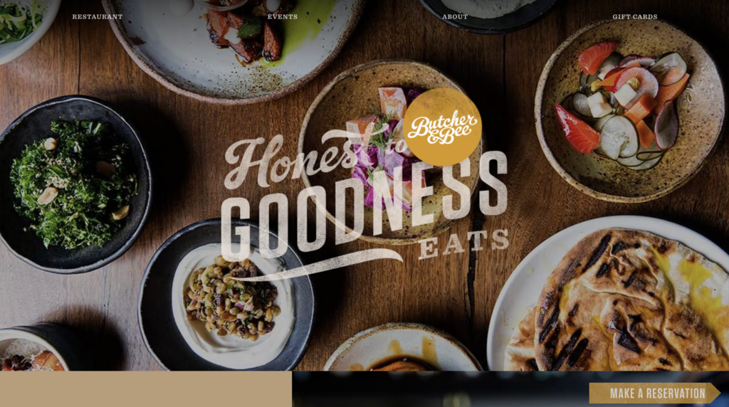
Butcher & Bee opened its first location in Charleston in 2011 with a straightforward mission: serve sandwiches with the flavor combinations and food quality usually reserved for fine dining. The Charleston location was a finalist for the James Beard Foundation Award for Outstanding Restaurant in 2022. Today the Nashville location on Main Street in East Nashville is the flagship, and the website reflects the same honest, thoughtful approach that built the brand.
The homepage opens not with a food photo carousel but with a statement of values: "We build meaningful relationships with our suppliers, especially the farmers who bring us the finest and freshest seasonal produce." The reservation CTA sits in the navigation where it is immediately visible without scrolling. The color palette is warm and understated, with an off-white background that feels considered rather than generic.
What keeps the site engaging is how it handles imagery. Rather than relying on a standard hero slideshow, it uses photography in a way that gives the page texture and flow without ever feeling like it is trying too hard. The result is a site that feels like the restaurant itself: unpretentious, ingredient-driven, and genuinely welcoming.
What to steal: Lead your homepage with your food philosophy, not just a pretty photo. Visitors who understand why you cook the way you do are more likely to make a reservation than visitors who just see a nice picture of a dish.
6. Redheaded Stranger
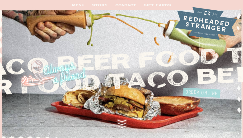
Redheaded Stranger is a neighborhood taco shop at 305 Arrington St in East Nashville's McFerrin Park, opened in 2019 by chef Bryan Lee Weaver and restaurateur Michael Shemtov of Butcher & Bee. The name comes from Weaver's favorite Willie Nelson album, a detail the Nelson family personally approved. It earned a Michelin Bib Gourmand in 2025 and was featured on Diners, Drive-Ins and Dives in 2022.
The website is a single-page layout with four navigation items: Menu, Story, Contact, and Gift Cards. The very first thing a visitor sees is the address, hours, and phone number, followed immediately by "First Come, First Serve! No Reservations." There is zero ambiguity about what this place is or how it works.
The personality comes through in specific, deliberate details rather than loud design choices. Menu sections are called Sunup and Sundown. The chef intro reads: "Get to know Bryan Lee Weaver. The one on the right." A short queso drip video runs on the menu section. An Instagram feed runs at the bottom. None of it feels forced. It all feels exactly like the restaurant it is describing.
What to steal: You do not need a complex site to have a great one. Nail the basics first - address, hours, how to order - then let your personality show through the details. Small, specific choices do more for brand personality than big, dramatic design moves.
7. Girl & the Goat
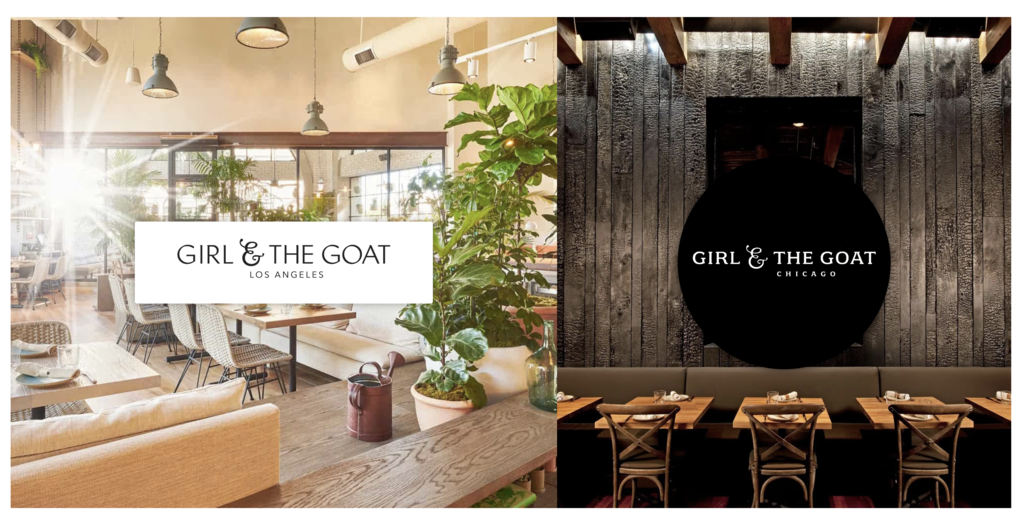
Girl & the Goat was founded by Chef Stephanie Izard, winner of Top Chef Season 4, in partnership with Boka Restaurant Group. The Chicago location opened in 2010 as one of the first restaurants on the West Loop's Restaurant Row at 809 W Randolph. A Los Angeles location followed in summer 2021 in the Arts District at 555-3 Mateo Street, drawing on California's local produce and long growing seasons while carrying the same globally influenced, shareable approach as the Chicago original.
The website is built on Webflow and handles the two-location brand cleanly. The homepage is a simple, elegant landing page showing just the two location logos, letting visitors choose where they are going before they see anything else. Each location page then tells its own story with large, high-quality photography of the dining room and food, prominent address and hours, and a reservation CTA that appears both in the navigation and throughout the page.
What stands out is how consistently the chef's identity comes through. Stephanie Izard's name appears in the page title on every location. The copy has a warm, casual voice that matches the restaurant's feel: the email signup reads "Join the herd," the Sunday brunch section invites guests to "gather your G.O.A.T crew." The design and the copy say the same thing at the same time, which is harder to achieve than it looks.
What to steal: If the chef is the brand, the website should make that clear from the first thing a visitor reads. And if you have multiple locations, a clean location selector saves visitor confusion before it starts.
8. République
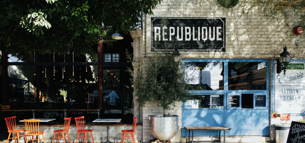
République is a French-inspired bakery, café, bar, and formal dining room located at 624 S La Brea Avenue in Los Angeles's Miracle Mile neighborhood. The building was originally erected in 1928 by Charlie Chaplin and later housed the iconic La Brea Bakery and Campanile Restaurant before Chefs Walter and Margarita Manzke opened République in 2013. In 2023, Chef Margarita won the James Beard Award for Outstanding Pastry Chef or Baker, and the Los Angeles Times has called the restaurant "an unassailable cornerstone of Los Angeles dining."
The navigation tells you a lot about how the restaurant thinks about its relationship with guests. Events is a top-level item in the main nav, sitting alongside Menus, Reservations, and Contact. That is not an accident. Chef Walter's multi-course tasting menu changes weekly and is announced each Thursday, which gives regulars a genuine reason to check the site regularly rather than just once before a first visit. The Order Online dropdown covers café takeout, bakery pre-orders, gift cards, and even a cookbook, reflecting how many different ways the restaurant serves its community beyond dinner reservations.
A separate events email address is listed on the contact page, and a newsletter signup captures guests who want to stay current with upcoming dinners and offerings. The site is built for the full lifecycle of a guest relationship, from first-time visitor to loyal regular.
What to steal: Give events their own navigation item rather than burying them in a dropdown. And think beyond the first visit. Returning guests are your best guests, and your site should give them something new to find every time they come back.
9. Damian
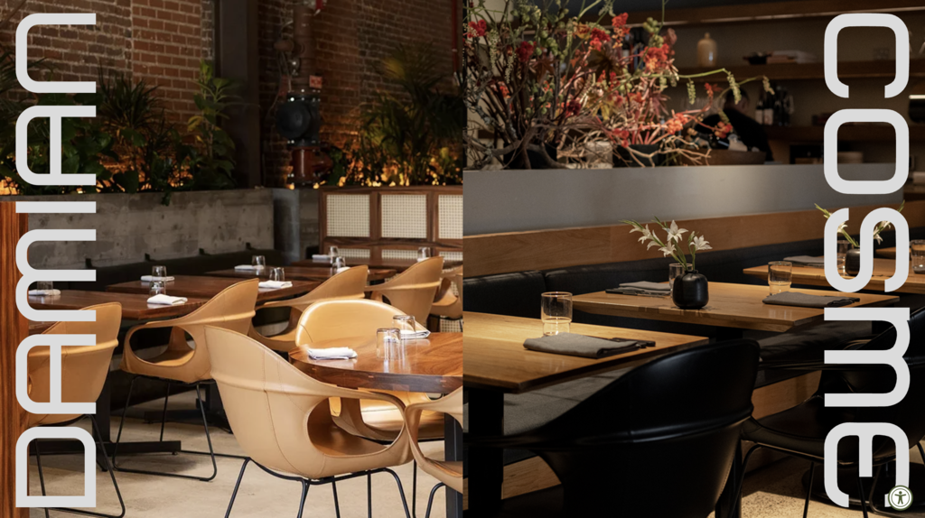
Damian is a Casamata restaurant in Los Angeles' Arts District at 2132 E 7th Place, opened in October 2020 by Chef Enrique Olvera, best known as the founder of Pujol in Mexico City and Cosme in New York. The kitchen is led by Jefe de Cocina Chuy Cervantes. The menu is rooted in Mexican culture with a focus on seasonal Californian produce and Pacific coast culinary traditions. Michelin has recognized it in the 2025 Guide.
The website is a single-page design with a custom dark aesthetic that immediately communicates the restaurant's character: polished, ingredient-forward, and rooted in craft. The navigation is anchor-based: About, Menu, Gallery, Events, Contact, Gift Card, and Reservations. The Reservations button via Resy sits prominently in the header throughout.
The About section is three sentences and says exactly what needs to be said. Three team members are featured with photos — Chef Founder Enrique Olvera, Jefe de Cocina Chuy Cervantes, and General Manager Carlos García de la Cabada — making it clear who is behind the food and the room. The full menu is displayed directly on the page rather than as a PDF download, which keeps visitors engaged and makes the food feel accessible before they have even made a reservation.
A link to the sister taqueria Ditroit at the top of the page extends the brand story without cluttering the experience.
What to steal: Keep your About section short and specific. Three sentences that say something true are more compelling than three paragraphs of brand language. And if you have a sister concept, link to it cleanly rather than trying to explain both in the same place.
10. Dave's Hot Chicken
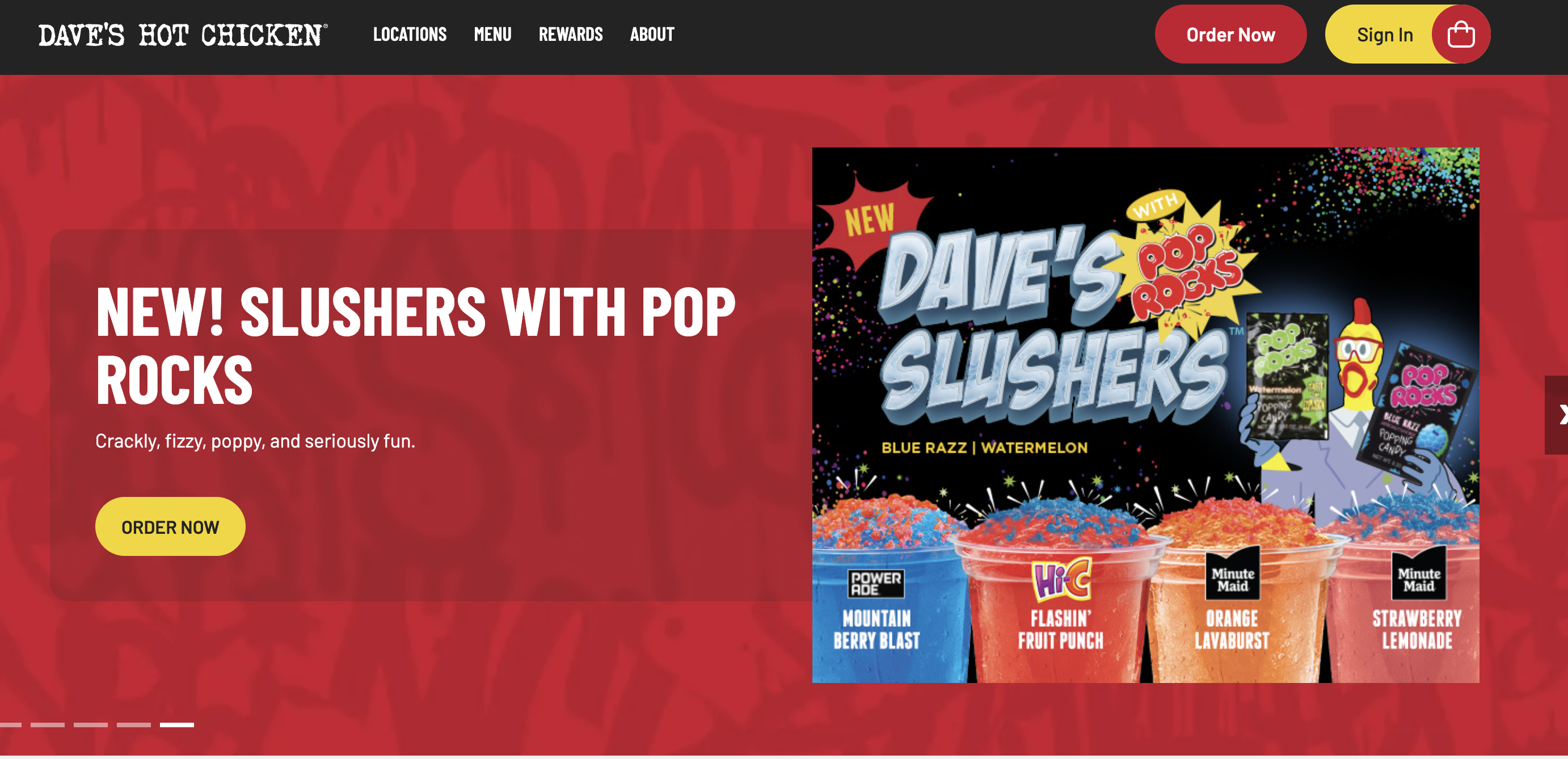
Dave's Hot Chicken was founded in 2017 by Dave Kopushyan, Arman Oganesyan, Tommy Rubenyan, and Gary Rubenyan. It started as a pop-up in an East Hollywood parking lot, went viral after an Eater LA article calling it "East Hollywood's New Late Night Hot Chicken Stand That Might Blow Your Mind," and grew into one of the fastest-growing fast-casual chains in the US. As of 2026 it operates 390 restaurants globally and was acquired by Roark Capital in June 2025 in a deal valued at $1 billion.
The website reflects a brand that knows exactly what it is and what visitors are there for. The entire homepage is a rotating hero carousel where every single slide has one CTA: ORDER NOW. There are no distractions, no lifestyle content, no long brand story above the fold. Beneath the carousel, there is an app download section with a free drink incentive, followed by another ORDER NOW section for pickup. The About, Locations, and everything else lives in the footer.
The visual identity carries through every pixel: black background, bold red typography, graffiti-style textures, and copy that sounds like the brand actually talks. "Crackly, fizzy, poppy, and seriously fun." "Get it in all its melty, crispy, cheese pull-y glory."
What to steal: When ordering is your primary revenue driver, make it the only thing your homepage does. Every additional element you add competes for attention with the action you most want visitors to take.
11. Smith & Wollensky

Smith & Wollensky opened its flagship location in New York City in 1977 and has grown into one of the most recognized steakhouse brands in the United States, with locations in Boston, Chicago, Las Vegas, Miami Beach, Wellesley MA, and New York, as well as international locations. The brand's positioning is straightforward: "America's Steakhouse."
The homepage leads with that heritage directly. The headline is "Welcome to America's Steakhouse," and the location carousel beneath it frames each restaurant with a line that reinforces the brand's sense of place and gravitas: Boston is "steeped in history, breathtaking views," Chicago is "riverfront dining in the heart of the Windy City," Miami Beach is "oceanview dining with iconic Miami flair." Every location earns its own identity while staying unmistakably Smith & Wollensky.
The navigation keeps things efficient: Locations, Private Events, Gift Cards, Reservations. Gift cards and private events sit alongside reservations as primary nav items, not buried in a footer. The brand's 45-year history is referenced directly on the Our Story page, with sourcing details about USDA Prime beef, a minimum 28-day in-house aging program, and partnerships with Double R Ranch and Snake River Farms. The provenance of the product is used as trust-building content, not just a marketing bullet point.
What to steal: Your brand's history and the quality of your sourcing are trust signals. Put them somewhere visible, not in an About page nobody reads. Specificity earns credibility: "minimum 28-day aging from Double R Ranch" says far more than "we use only the best ingredients."
12. Marlowe
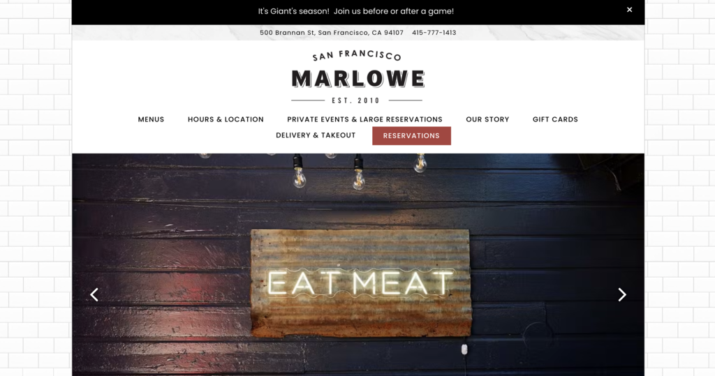
Marlowe is a New American bistro located at 500 Brannan Street in San Francisco's SOMA neighborhood, opened in 2010 and relocated to its current address in 2014. Executive Chef Jennifer Puccio created the menu alongside award-winning San Francisco designer Ken Fulk, who handled the interior. The restaurant is known in particular for its Marlowe Burger, topped with cheddar, caramelized onions, bacon, and horseradish aioli, which has become one of the most celebrated burgers in the city.
The website leads with the address and phone number in a bar above the navigation, before anything else loads. That is not an accident for a neighborhood restaurant in a city where people are often searching on the move. The navigation covers every practical need cleanly: Menus, Hours and Location, Private Events, Our Story, Gift Cards, Delivery and Takeout, and Reservations. Nothing unnecessary, nothing missing.
The homepage has three clear sections below the hero gallery: the menu, private events, and a direct booking link for large reservations through Tripleseat. An email signup sits at the bottom of the page for guests who want to stay in the loop. It is a site built around making it easy for the people who already love the restaurant to come back and bring others with them.
What to steal: Put your address and phone number somewhere visible before any other content loads. For a neighborhood restaurant, that information is often the only reason someone came to the site in the first place.
What the best restaurant websites have in common
Twelve different restaurants, twelve different concepts, twelve different approaches to design. But a few things showed up consistently across every site worth studying.
- The basics are never buried. Address, hours, and phone number appear early, often before anything else loads. This is not a design statement. It is an acknowledgment that most visitors have a simple, practical question and deserve a fast answer.
- Ordering and reservations are treated as primary actions. Whether it is a reservation button in the header, an Order Now CTA on every homepage slide, or an order link in the top navigation, the sites that convert best make the most important action the easiest one to find. No scrolling, no dropdown hunting.
- The design matches the restaurant. Damian's site feels like Damian. Redheaded Stranger's site feels like Redheaded Stranger. The gap between what a site looks like and what a restaurant feels like is one of the most common and most damaging mistakes in restaurant web design. Visitors who arrive expecting one thing and find another lose trust before they have even made a reservation.
- Food photography does the selling. Every site on this list uses photography intentionally. Not stock images, not phone snapshots, not menus as PDFs with no visuals. Real, well-lit, appetite-driven photography of the actual food. It is the single highest-impact element on any restaurant website.
- Personality comes through in the details. The best sites do not lead with a generic brand voice and hope it sticks. They let personality show up in small, specific choices: a menu section called Sunup and Sundown, copy that reads "Peep the Menu," an intro that says "Get to know Bryan Lee Weaver. The one on the right." Those choices are what make a site feel like a real place rather than a template.
How to design a restaurant website
The examples above show what good looks like across different restaurant types, price points, and brand personalities. Here is how to apply those lessons when building or redesigning your own site.
Start with your brand identity
Your website should feel like an extension of the physical space. Before you choose a color palette, a font, or a layout, get clear on what your restaurant actually feels like in person. The energy, the lighting, the kind of conversation people have when they sit down. Then design toward that.
If someone visited your website and then walked through your door for the first time, nothing should feel like a mismatch. The sites that build the most trust are the ones where the online and in-person experience feel like the same place.
Prioritize menu, location, and reservations
These are the three things most visitors are looking for. They should be reachable in one click from anywhere on the site, not buried in a dropdown or visible only after scrolling.
Put your address somewhere visible before anything else loads. Make your reservation or order button a persistent element in the navigation. And keep your menu in a format people can actually read on a phone - not a PDF that requires downloading and zooming.
Invest in food photography
No amount of good design compensates for bad food photos. Professional photography of your actual dishes is the single highest-return investment you can make in your restaurant's website. It is also what separates sites that make people hungry from sites that just provide information.
Shoot on the real plates, in the actual space, with the actual lighting. The goal is for someone looking at a photo to feel like they are already sitting at the table.
Build for mobile first
More than half of your visitors will find your site on their phone, often while they are already out and looking for somewhere to eat. That means a layout that stacks cleanly, text that is readable without zooming, and a reservation or order button that is easy to tap with a thumb.
Design for the phone screen first. Then adapt for desktop. Not the other way around. [Internal link: web design services / restaurant industry page]
Add a clear CTA on every page
Every page on your site should tell visitors what to do next. Reserve a table. View the menu. Order online. One CTA per page, placed where the eye naturally lands, in language that actually sounds like your brand.
The restaurants that convert browsers into diners are not the ones with the most impressive sites. They are the ones that make it easiest to take the next step.
Conclusion
A great restaurant website does what a great front-of-house does: it makes people feel something before they have even walked in. The best ones on this list are not necessarily the most elaborate or the most expensive. They are the ones that know exactly who they are, make it easy for visitors to do what they came to do, and feel like the restaurant they are representing.
If your site is not doing that right now, the examples above give you a clear picture of where to start. And if you want help getting there, Striped Horse builds restaurant websites that work as hard as the teams behind them.