10 Best Nonprofit Website Designs for Inspiration
The best nonprofit website designs have one thing in common: they turn visitors into donors, volunteers, and advocates within seconds of landing on the page. Good design here isn't about looking polished, it's about building trust fast enough that someone who's never heard of your organization decides to act.
Below are 10 nonprofit website examples worth studying, plus what to actually borrow from each one, not just what looks good, but what works.
1. charity: water
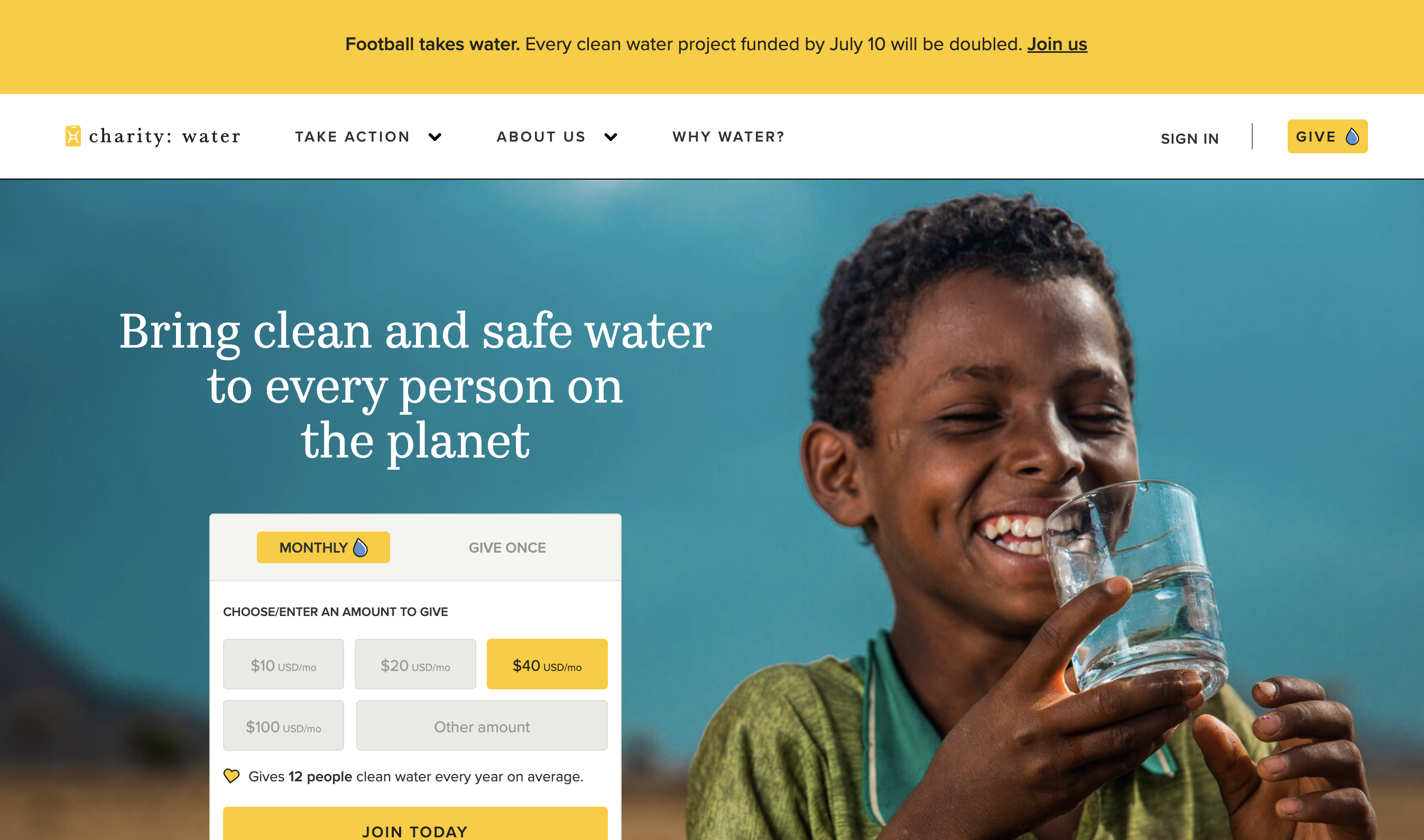
charity: water's homepage gets straight to the point: a live counter showing water projects funded, countries served, and people reached so far. Instead of asking visitors to trust a mission statement, the site backs it up with running proof, and every funded project comes with GPS coordinates and photos, so a donor can see exactly where their gift went.
The donation flow reflects that same transparency. Visitors can give once, join a monthly giving program, sponsor a specific water project, or start a personal fundraiser, all of it built around one clear promise: 100% of public donations go directly to funding water projects, with operating costs covered separately by private donors.
Takeaway: pairing a donation ask with visible, specific proof of impact builds more trust than storytelling alone.
2. St. Jude Children's Research Hospital
.png)
St. Jude's homepage leads with real patient stories, not statistics. Several rotating profiles feature actual current patients and their families, each with a direct quote and a link to their full story, putting a specific child's face behind the mission before asking for anything.
The donation ask follows naturally from that, but it's not the only path in: visitors can also register for a fundraising event like the St. Jude Memphis Marathon, shop the official gift store, or sign up for ongoing updates. The site backs all of it with one consistent promise, repeated across pages: families never receive a bill for treatment, travel, housing, or food.
Takeaway: leading with specific, individual stories (not composite or stock examples) makes a cause feel real faster than general mission language does.
3. Habitat for Humanity
.png)
Habitat for Humanity's homepage solves a real structural problem: a single global brand made up of hundreds of independent local affiliates. A "Find your local Habitat" tool sits prominently on the homepage, pointing visitors toward volunteering, shopping at a ReStore, or donating through their specific regional chapter instead of a generic national funnel.
Giving options go well beyond a single donate button too: one-time or monthly donations, donating goods or a car, workplace and corporate partnerships, stock donations, and a gift catalog all sit under one clear "Support" section. The mission framing stays consistent throughout: families build their own homes alongside volunteers and pay an affordable mortgage, not a handout.
Takeaway: for a federated or multi-chapter organization, routing visitors to their local branch early removes a major source of friction, and offering several concrete ways to give (not just cash) widens who can actually participate.
4. Smile Train
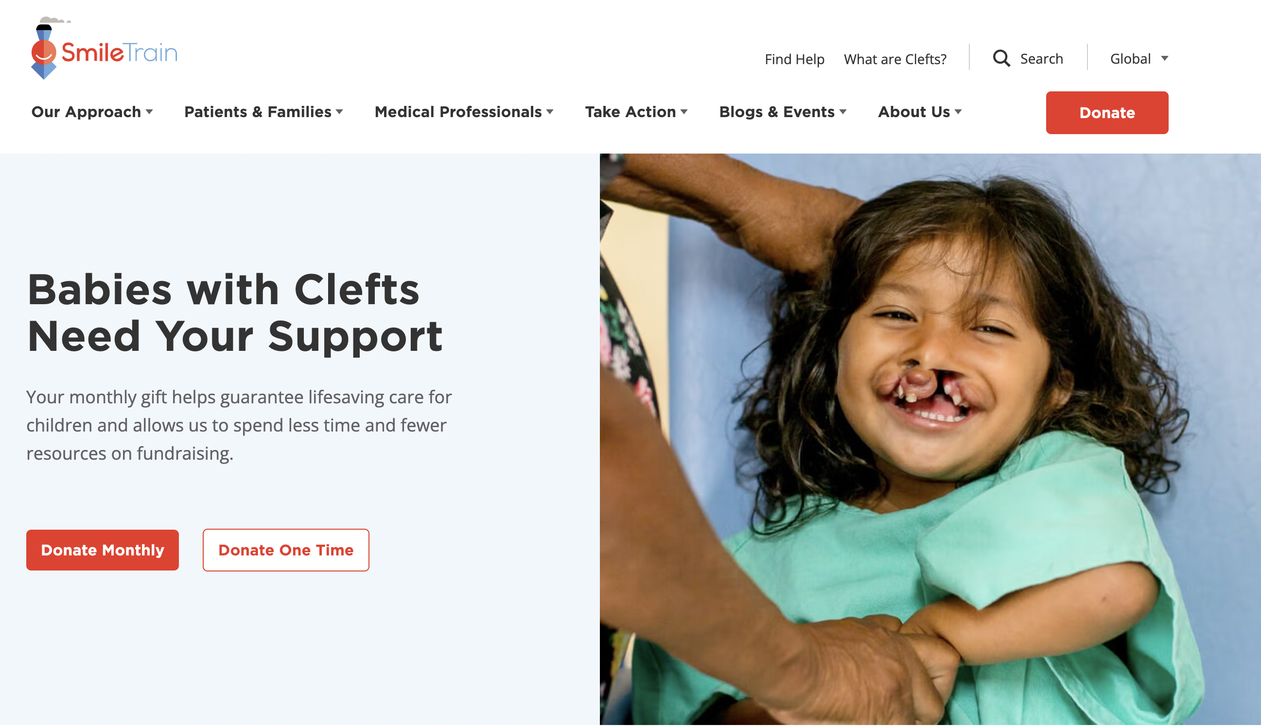
Smile Train's homepage uses a simple, powerful visual device: a rotating gallery of patients holding their own pre-surgery photos. Seeing someone's current self next to the image of who they were before treatment, held in their own hands, explains the impact of cleft surgery faster than a paragraph of copy could.
The site also localizes by country, with dedicated versions for places like Brazil, India, the Philippines, and the UK, while keeping a consistent global donation flow (one-time or monthly) and a steady stream of patient stories on the blog.
Takeaway: when a clear visual proof point exists, let it carry the message instead of competing with heavy copy around it.
5. The Ocean Cleanup
.png)
The Ocean Cleanup's site has to explain a fairly technical operation, engineering systems that remove plastic from oceans and rivers, without losing a general audience. It does this by splitting the mission into two plain ideas: cleaning up plastic already in the ocean, and stopping new plastic from getting there through rivers.
A dedicated updates section tracks deployments, milestones, and research publications in plain language, so visitors can follow progress over time instead of encountering the mission once and never returning. A newsletter signup reinforces that ongoing relationship.
Takeaway: when the work itself is technical, breaking it into two or three plain-language pillars makes a complex mission easy to grasp on a first visit.
6. Surfrider Foundation
.png)
Surfrider's site doesn't lead with a single, generic donate button. It splits its work into clear initiatives (beach access, ocean protection, plastic pollution, climate and coasts) and lets visitors find the specific issue they care about before asking for anything.
Because Surfrider runs through a network of local chapters, the site also points visitors toward ways to get involved beyond money: joining a chapter, volunteering for a coastal cleanup, or shopping the branded store, with proceeds supporting the mission.
Takeaway: for advocacy-driven nonprofits, organizing the site around specific issues, not just the mission broadly, helps visitors self-select into the cause they actually care about.
7. Water.org
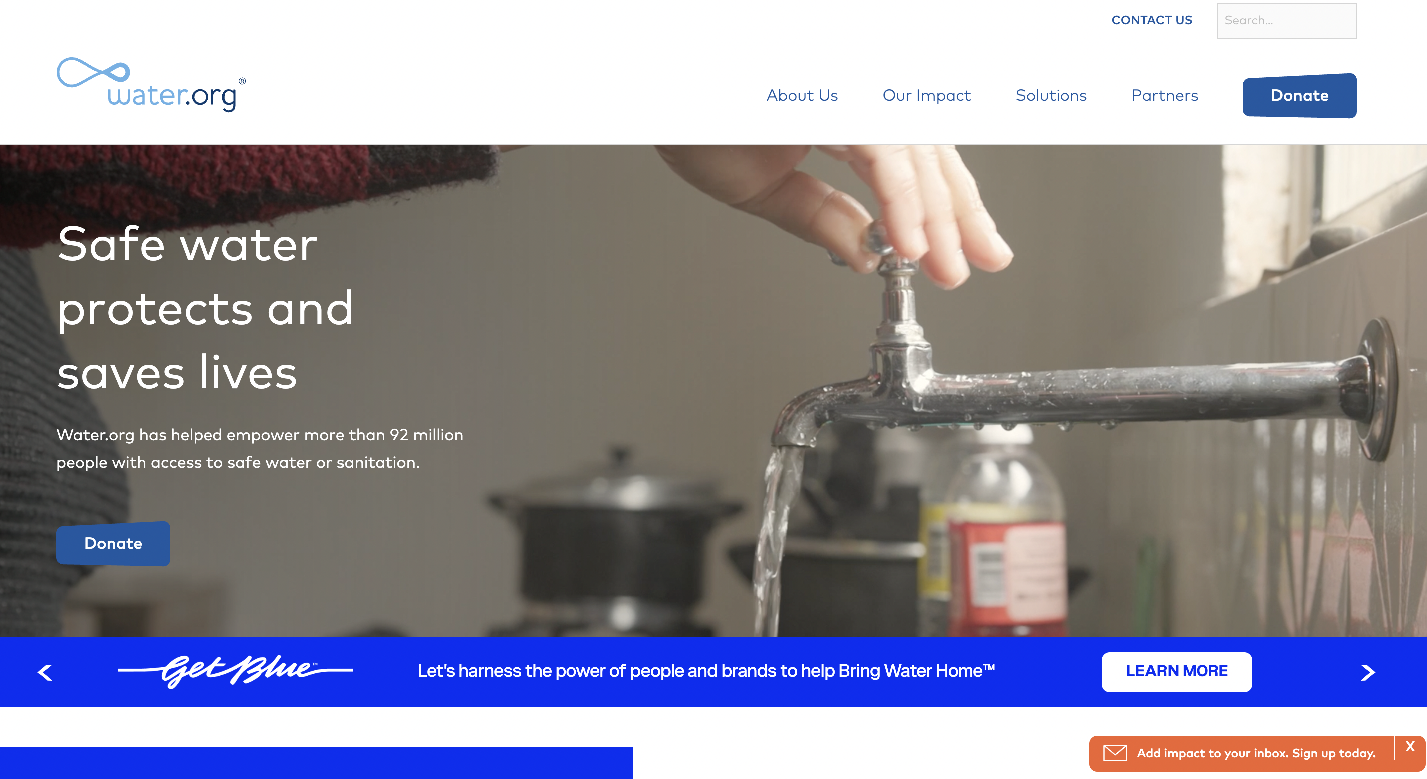
Water.org's homepage makes its core difference from other water-focused charities clear fast: instead of funding wells directly, it provides small, affordable loans that let families finance their own water and sanitation access. The site explains this financing model in plain terms, then backs it with a simple "$5 turns on a tap" framing that makes an unusual approach to charity feel concrete.
A recurring giving program, branded "Get Blue," sits alongside the standard one-time donation path, giving visitors a name to remember and return to.
Takeaway: if a nonprofit's model is genuinely different from others in its space, the homepage should explain that difference early, not bury it under generic mission language.
8. World Wildlife Fund (WWF)
.png)
WWF turns its donation flow into something closer to gift-giving. Its symbolic species adoption program lets a visitor "adopt" one of more than 140 animals, with the donation paired with a physical plush toy or gift item, more memorable, and more giftable, than a standard receipt.
Alongside adoptions, the site offers membership, tribute and memorial gifts, and workplace matching programs, giving visitors several distinct entry points depending on whether they're donating for themselves, for someone else, or through an employer.
Takeaway: turning a donation into something tangible and shareable can outperform a plain "give now" button, especially for causes people want to gift to others.
9. American Red Cross
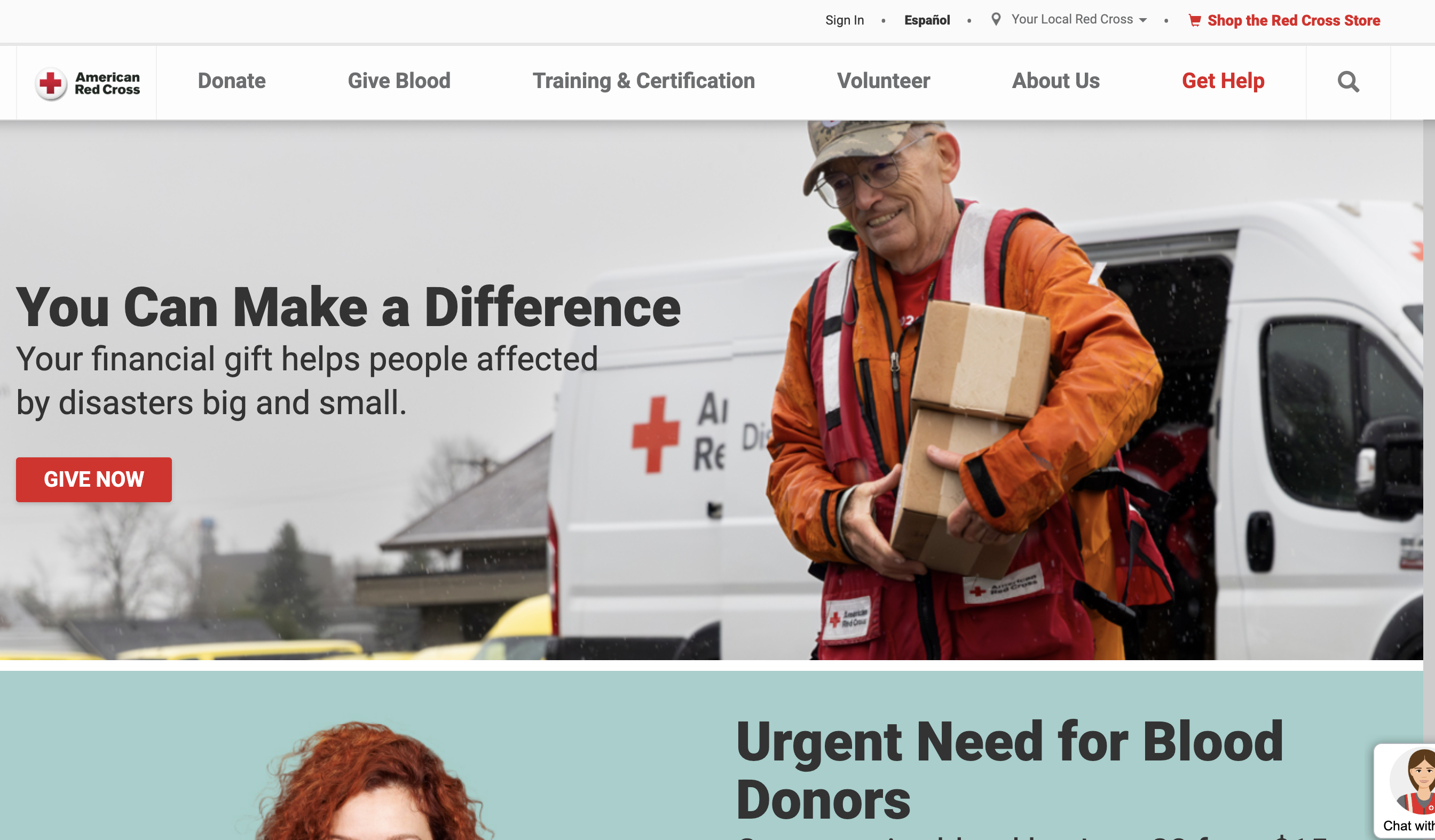
The Red Cross homepage runs on urgency. Active disaster updates, time-sensitive blood donation appeals, and matching-grant deadlines rotate through the top of the page, reflecting an organization whose work is genuinely tied to real-time events, not a static mission statement.
Multiple low-friction ways to act sit side by side: donate online, call a number, text a keyword to a short code, or book a blood donation appointment, each suited to a different visitor's context.
Takeaway: for organizations doing time-sensitive work, the homepage should reflect what's happening right now, not a fixed, evergreen pitch, and should offer the widest possible range of low-effort ways to act immediately.
10. Kiva
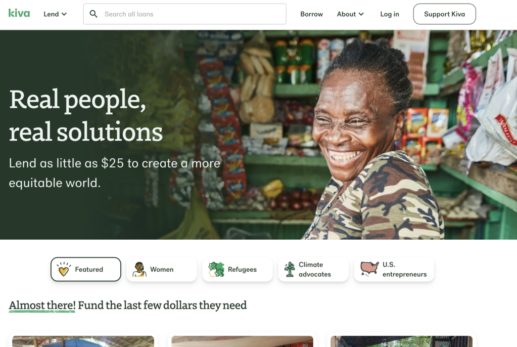
Kiva reframes the entire ask: instead of donating, visitors lend. The homepage features individual entrepreneurs with specific funding goals, a set dollar amount tied to a named person's business, and a $25 minimum that makes lending feel accessible rather than abstract.
Because it's a loan, not a donation, the site also explains repayment and impact in plain terms, then lets visitors browse by category (women, refugees, climate, and more) to find a borrower whose story actually resonates with them.
Takeaway: a peer-to-peer or transactional framing can lower the psychological barrier to a first contribution, especially for visitors who hesitate at "donate."
What these nonprofit website examples have in common
Looked at together, these 10 charity website examples don't share a visual style. Some lean playful, some lean urgent, some lean technical. What they share is a structural pattern:
- A clear primary action above the fold, but rarely just one (give once, give monthly, volunteer, advocate, shop)
- Specific, individual proof over vague mission statements: a named patient, a named entrepreneur, a tracked project
- Multiple entry points for people who aren't ready to donate yet: sign up, follow updates, find a local chapter
- A model or mechanism that's actually explained, not just implied: how the money gets used, how a loan works, how impact gets verified
None of this is about a particular design trend. It's about matching the site's structure to how the organization actually creates impact.
Bringing these lessons to your own nonprofit's site
Most nonprofit websites don't need a redesign that chases a specific aesthetic. They need a structure that reflects how the organization actually works: what it asks for, what it offers in return, and what proof it can show. That's a strategy question before it's a design one.
Our team builds nonprofit website design examples around exactly that kind of structure, mapping the donation flow, the proof points, and the secondary calls to action before a single page gets designed. If you're planning a refresh, let's talk about your project before any design work starts.