15 Best Law Firm Website Designs

Most law firm websites look the same. A stock photo of a courthouse, a paragraph about being "committed to justice," and a contact form buried three clicks deep. It is a formula that feels safe but rarely builds trust, and in a field where first impressions determine whether a potential client picks up the phone, safe is a liability.
The best law firm websites do something different. Before a visitor reads a single word, the design is already doing the work, communicating credibility, setting expectations, and making it easy for the right person to take the next step.
We reviewed dozens of law firm websites to find the ones that actually get this right. Whether you are a solo practitioner looking for inspiration or a growing firm planning a redesign, the 15 examples below show what exceptional legal web design looks like and, more importantly, why it works.
1. Hogan Lovells
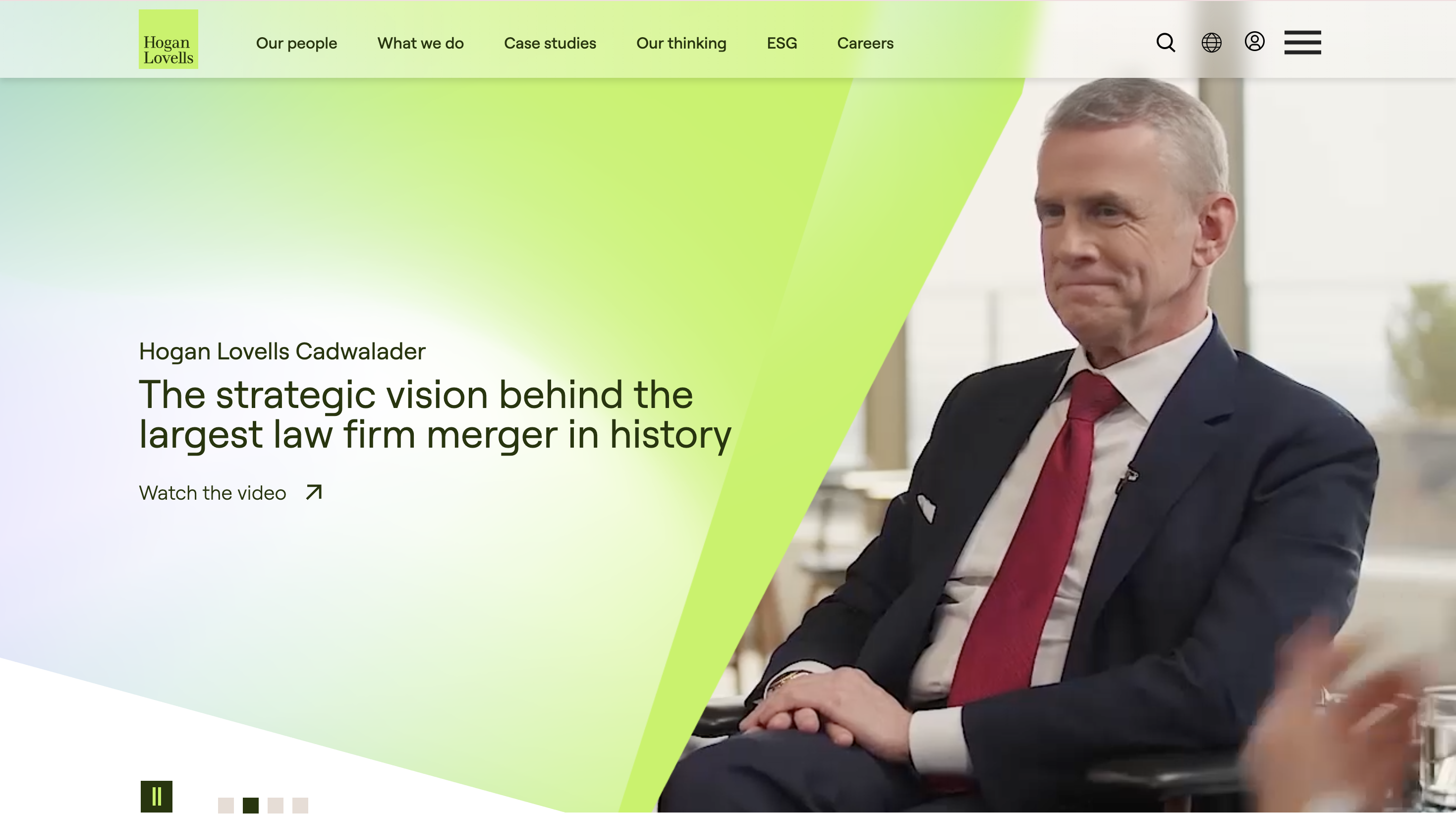
Hogan Lovells is frequently recognized as having one of the strongest law firm websites in the industry. It is easy to see why.
The homepage is built around three clear client-facing messages: Grow, Protect, Innovate. That framing is genuinely rare in the legal industry, where most firms lead with their own credentials rather than what they can do for the client. Each pillar is backed by real statistics, concrete examples, and detailed case studies that are featured prominently in the main navigation rather than buried in a news section.
The people search functionality is widely regarded as one of the best in the industry, with visual results, smart filters, and attorney profile pages that go well beyond a basic directory.
What works: Client-centric homepage framing, prominent case studies in the main navigation, and one of the strongest attorney directory experiences in BigLaw.
2. Kirkland & Ellis
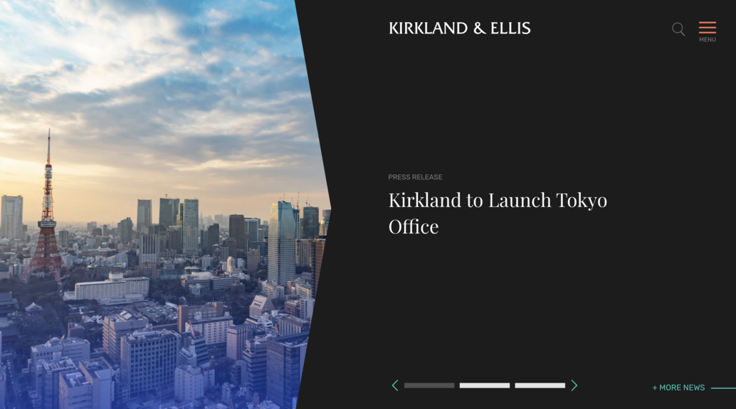
Kirkland & Ellis is one of the highest-revenue law firms in the world, and their website leads not with practice areas but with values. The design is crisp and monochromatic at its core, with clean sans-serif typography and confident use of white space throughout.
There are no loud colors or dramatic graphics. The overall feel is premium but purposeful, letting the substance of the firm take center stage rather than competing with it. Navigation is minimal and well thought out, with smart filtering on both the Services and Lawyers pages that makes it easy to find exactly what you are looking for.
The news section is actively maintained and surfaces recent deal announcements, which matters for a firm working on transactions at this scale. Fresh, relevant content signals an active and growing practice.
What works: Confident restraint in design, smart filtering across people and services, and a news section that reinforces activity and authority.
3. Sidley Austin
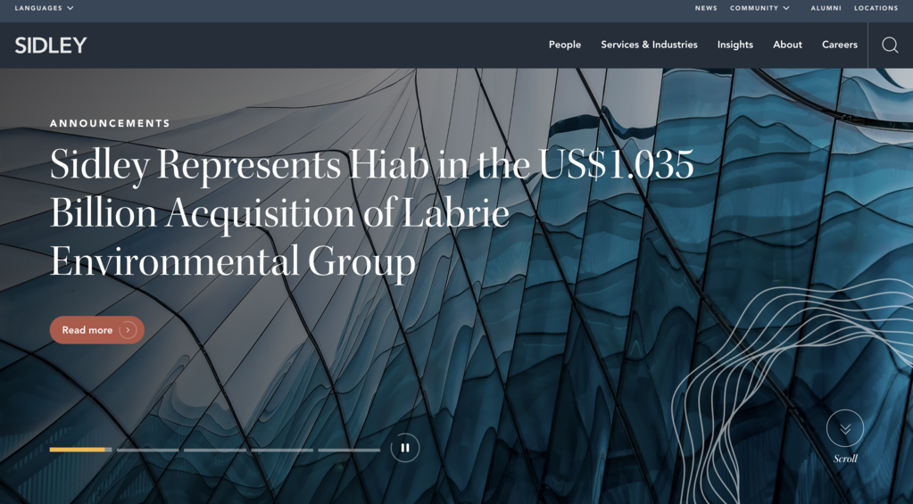
Sidley Austin operates across more than 70 countries and their website communicates that global scale without shouting about it. The design is understated and professional, anchored by a deep navy color palette that signals trust and authority in a way that feels earned rather than forced.
A large hero image featuring glass architecture sets a prestigious tone at the top of the page. Typography is elegant throughout, with a refined font pairing that gives the site an editorial weight. White space is generous and the layout is clean and easy to move through.
One small but effective detail is the language selector placed at the top of the page. It is a minor touch that communicates international reach immediately, before the visitor reads anything else.
What works: Navy and white palette used with restraint, editorial typography, and thoughtful details like the language selector that reinforce global positioning.
4. White & Case

White & Case handles some of the most complex cross-border legal work in the world and the website reflects that scope without feeling overwhelming. The homepage opens with a strong full-width hero and a clean, photographic aesthetic that feels professional without being generic.
The standout element is the navigation. Hovering over any top-level menu item reveals a mega-menu that surfaces featured content, highlighted case work, and relevant practice area links all within a single dropdown. For a firm covering wide range of practice areas across dozens of countries, this kind of layered filtering is essential and White & Case pulls it off without making it feel complicated.
Practice areas are organized by industry, practice, and region, giving visitors multiple ways to find what is relevant to them.
What works: Mega-menu navigation that handles enormous complexity without friction, and a precise grid and spacing system that suits a firm working on high-stakes global deals.
5. Jenner & Block
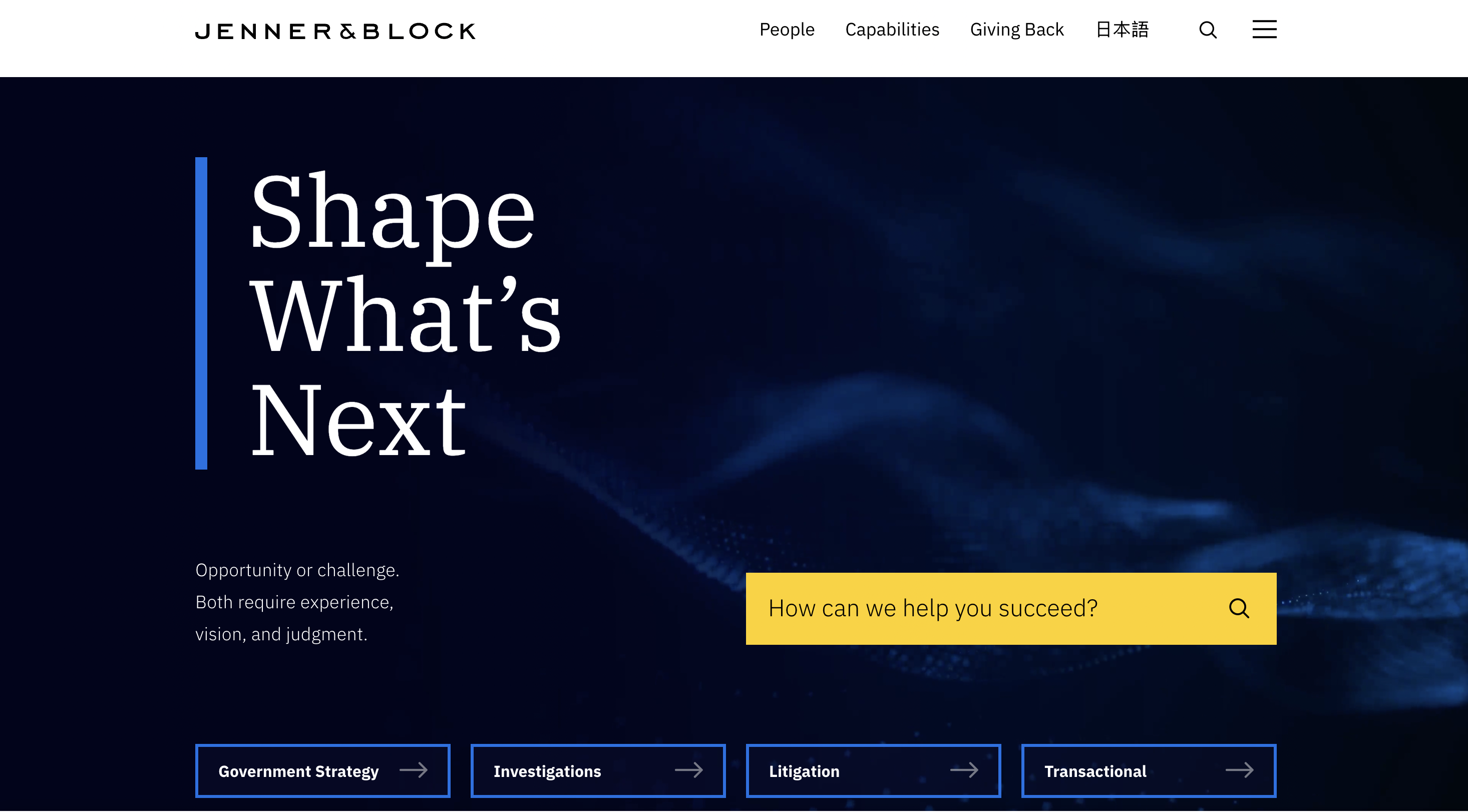
Jenner & Block is widely recognized as one of America's top litigation firms and the website reflects that reputation with quiet authority. The design is clean and direct with no gimmicks or flashy animations. The firm does not feel the need to sell you on anything. It simply shows you the work and lets the results speak.
Typography is clean and legible throughout, with a sans-serif type system that is easy to scan. Headlines are bold without being aggressive and body text sits at comfortable line lengths that make longer content easy to read.
The people directory is one of the most functional on this list. With more than 500 attorneys, the site makes it genuinely easy to find the right person through smart search and browsing. That kind of functional design decision matters to real visitors more than any visual flourish.
What works: Substance-first approach, clean and highly legible typography, and a people directory built for actual usability at scale.
6. Latham & Watkins

Latham & Watkins takes a fundamentally different approach from most firms on this list, and that is intentional. This is not a lead generation site. It is a content and thought leadership platform built for corporate clients and in-house counsel, and every design decision reflects that objective.
The homepage hero features a rotating editorial carousel highlighting major deal announcements, pro bono guides, and firm initiatives. A Financial Times quote recognizing the firm as Most Innovative Law Firm in North America 2025 is positioned as a full-width callout in the center of the page. For a firm of this caliber, third-party editorial validation is the most powerful trust signal available and they have given it the visual weight it deserves.
The Our Stories section links to innovation-focused content including LathamTech and AI Academy, positioning the firm as forward-thinking in a traditionally conservative industry.
What works: Editorial carousel that leads with credibility, strategic placement of third-party validation, and thought leadership content that reinforces authority with a sophisticated B2B audience.
7. Gibson Dunn
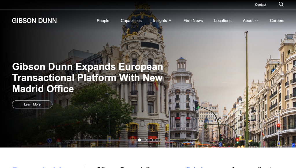
Gibson Dunn is among the strongest examples of what elite transactional and litigation firm web design looks like. The site is polished, confident, and substance-first throughout.
Case studies are featured prominently in the primary navigation rather than tucked into a blog or press release section. These are not quick win summaries. They are detailed, story-driven accounts of real client work, which is rare and effective. The attorney directory is well built with smart filtering and profile pages that communicate depth and expertise clearly.
The overall aesthetic is restrained and precise, with clean typography and a layout that lets the quality of the work carry the page rather than competing with it.
What works: Case studies in primary navigation, attorney profiles built for depth, and a restrained aesthetic that communicates elite positioning without trying too hard.
8. Clark Hill
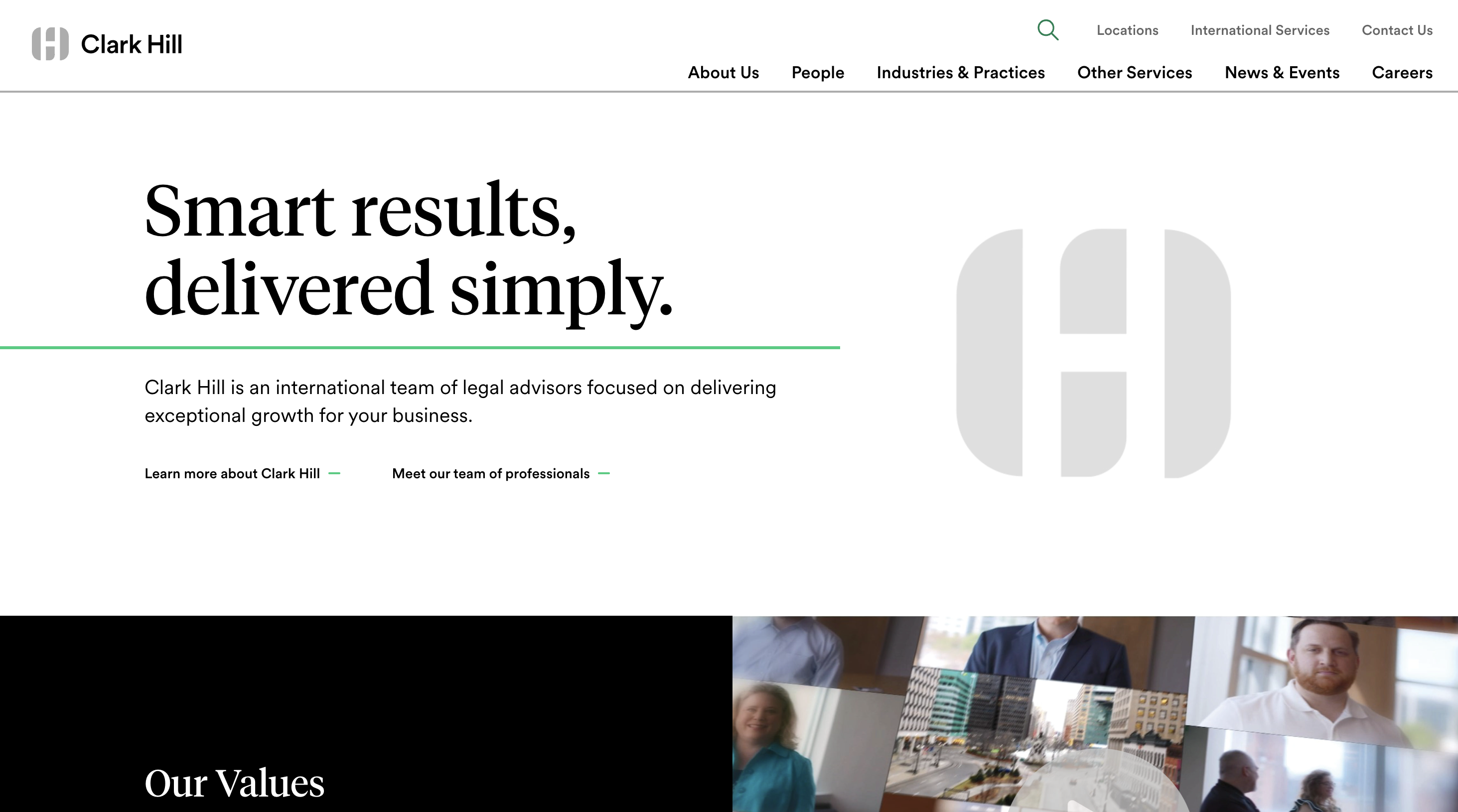
Clark Hill offers something most national firm websites do not: genuine personality. The tagline Smart results, delivered simply sets an approachable tone immediately, signaling a firm that wants to be seen as helpful rather than intimidating.
The homepage features a video hero using the firm's monogram logo animation, which adds movement without being distracting. A prominently placed search bar in the navigation is a genuinely useful addition for a firm with this many practice areas, and one that more firms should consider.
What sets Clark Hill apart from a design perspective is how they build identity throughout the site. A DNA page, a Clark Hill Voices podcast section, and a Transatlantic Services feature are all linked from the homepage. These are not just service pages. They are personality pieces that tell you what kind of firm this is before you read a word of the bio pages.
What works: Video hero that adds energy without distraction, navigation search bar for large practice area sets, and identity-building content that gives the firm a distinct voice.
9. Husch Blackwell
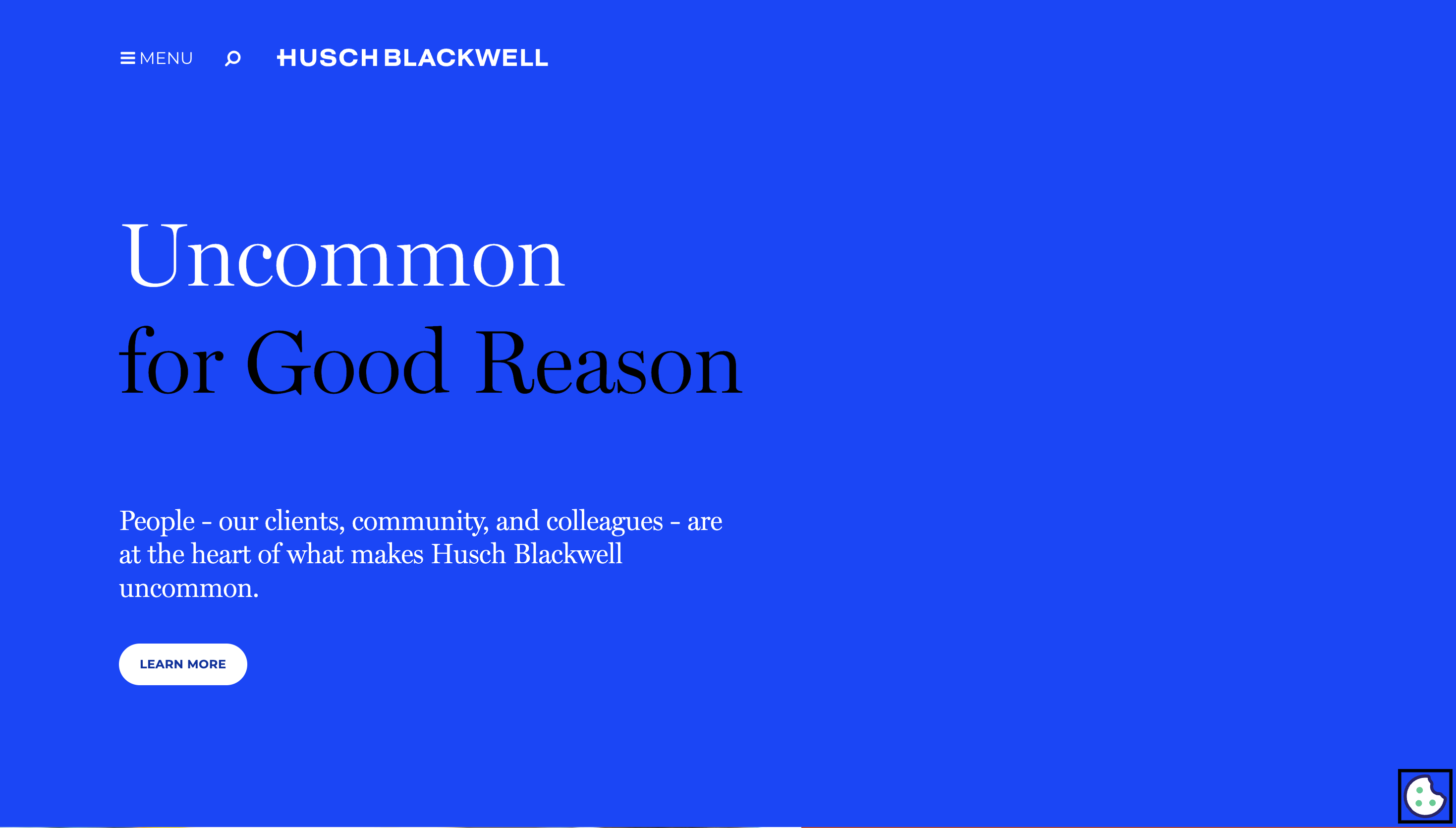
Husch Blackwell takes a noticeably warmer tone than most national firms and it shows throughout the site. Where many firms of similar size lean into corporate formality, Husch Blackwell feels approachable and human without sacrificing professionalism.
The homepage is well organized with clear pathways for different visitor types, making it easy for someone to quickly determine whether this firm handles their kind of matter and who the right attorney might be. Practice area pages are substantive and structured, giving visitors the kind of content depth that builds confidence before they ever make contact.
The overall color palette and typography choices reinforce that warmth, using tones that feel less austere than the typical navy and white combination without drifting into anything that undermines authority.
What works: Warm but professional tone that widens the approachability of the firm, clear visitor pathways from the homepage, and substantive practice area pages that build confidence.
10. Adams & Reese
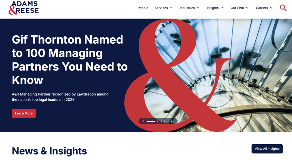
Adams & Reese has more energy than most regional firm websites and it is immediately noticeable. The navigation itself tells a story. Inside the main services dropdown there is a Featured Service section with a header image and a brief description. That kind of editorial treatment of a practice area is unusual and effective. It communicates deep industry expertise before a visitor has clicked anywhere.
The color scheme is warmer and more accessible than the standard corporate palette, and the overall layout has a visual dynamism that holds attention without sacrificing structure. The site balances personality with professionalism in a way that regional and mid-size firms in particular can learn from.
What works: Editorial treatment of practice areas inside the navigation, a warmer color palette that differentiates from standard BigLaw aesthetics, and a layout with enough energy to hold attention.
11. Crosby.ai
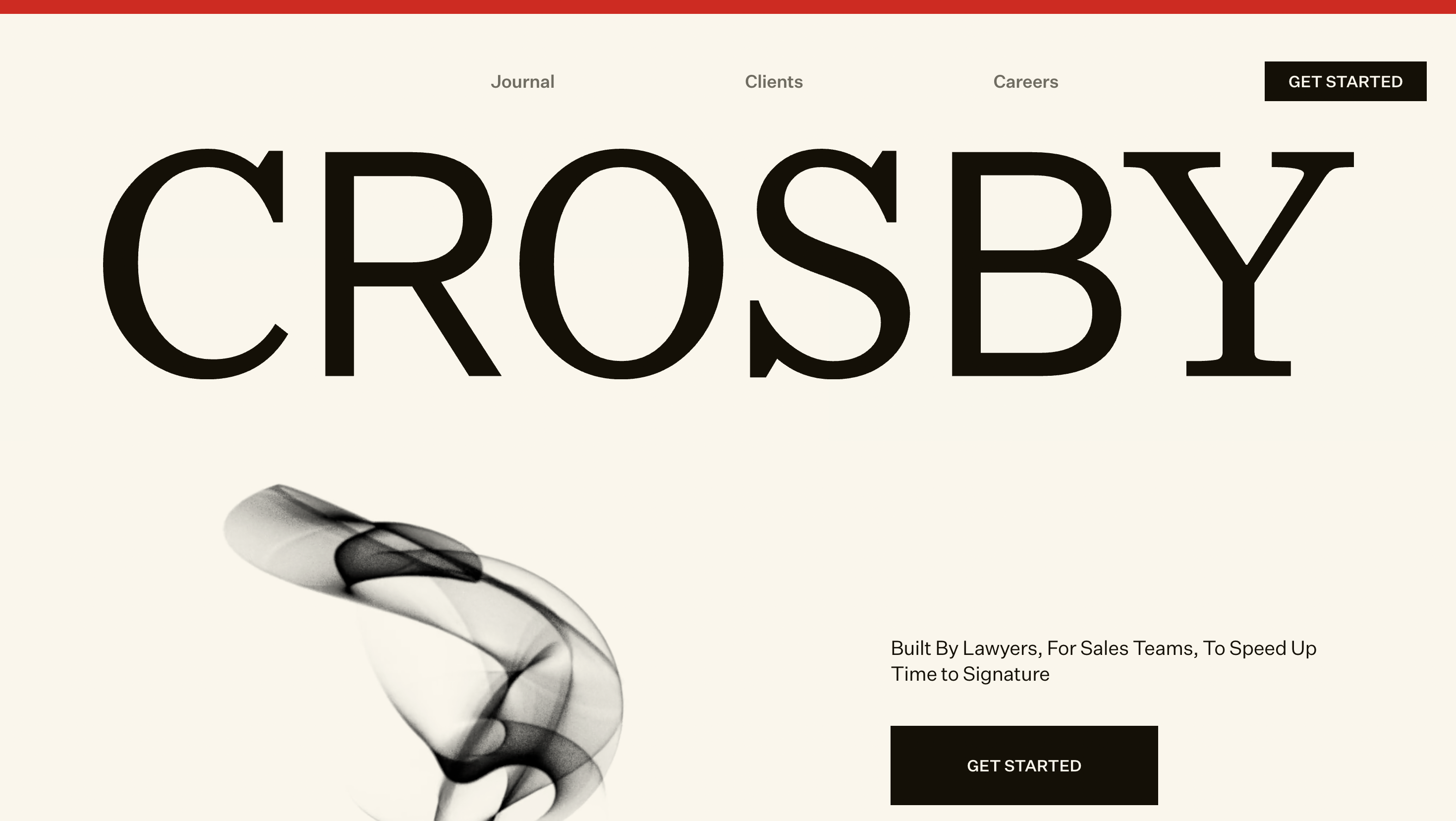
Crosby.ai breaks every conventional law firm website rule and does so deliberately. The site looks more like a funded SaaS startup than a law firm, and for their target audience, that is exactly the point.
The homepage opened with a bold announcement of a $60M Series B round front and center. The headline, The Agentic Law Firm Built for Execution, communicates a precise positioning immediately. This is a firm built for sales teams that need legal work done fast, and every design decision reinforces that.
The aesthetic is dark mode, minimal, and tech-forward. Client logos scroll in a ticker beneath the hero, building trust quickly. Navigation is stripped back to just three items: Journal, Clients, and Careers. That simplicity signals confidence.
For any firm with a specific niche and a clearly defined audience, Crosby.ai is one of the most instructive examples on this list. You do not have to follow the conventions of legal web design if your brand has a strong enough point of view.
What works: Bold, niche-specific positioning in the headline, dark mode aesthetic that signals tech-forward differentiation, and stripped-back navigation that communicates confidence.
12. Omar Ochoa Law Firm
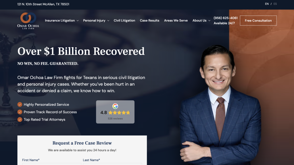
Omar Ochoa Law Firm is a Texas personal injury and insurance litigation practice and their website is a standout example of visually distinctive design in a competitive consumer-facing market. The site is intuitively organized and engages visitors from the first scroll, with eye-catching custom graphics and a bold visual identity that sets it apart from the sea of generic PI firm websites.
The site includes a bilingual toggle for English and Spanish, a smart detail for a Texas firm serving a diverse client base. Case results are prominently featured in the main navigation, not buried in a secondary page, making it easy for potential clients to immediately see what the firm has achieved. Practice area pages are detailed and well structured, covering everything from insurance litigation to catastrophic injury claims.
What works: Distinctive custom visual identity that avoids generic PI design tropes, bilingual functionality that reflects the firm's actual client base, and case results given prominent navigation placement.
13. Bird Marella
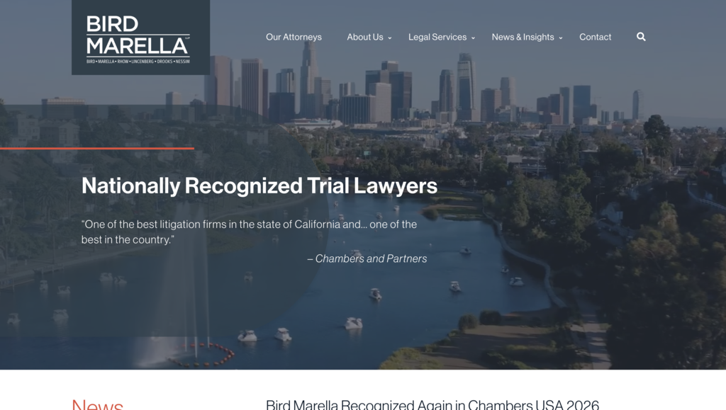
Bird Marella is a boutique litigation firm and their website is one of the cleanest on this list. The minimalist layout, refined typography, and generous white space reduce cognitive load immediately, letting visitors focus on the firm's positioning and expertise without distraction.
The site demonstrates that a smaller firm does not need complex navigation, large content libraries, or elaborate visual effects to communicate credibility. A clear and well-structured layout with strong typography does the job. The overall feel is confident and precise, which aligns perfectly with a firm known for high-stakes litigation work.
For small and boutique firms, Bird Marella is one of the most practical examples to learn from. It proves that restraint, done well, is its own form of authority.
What works: Minimalist layout that reduces cognitive load, refined typography that communicates precision, and a restrained approach that suits high-stakes boutique positioning.
14. Pitta & Baione LLP
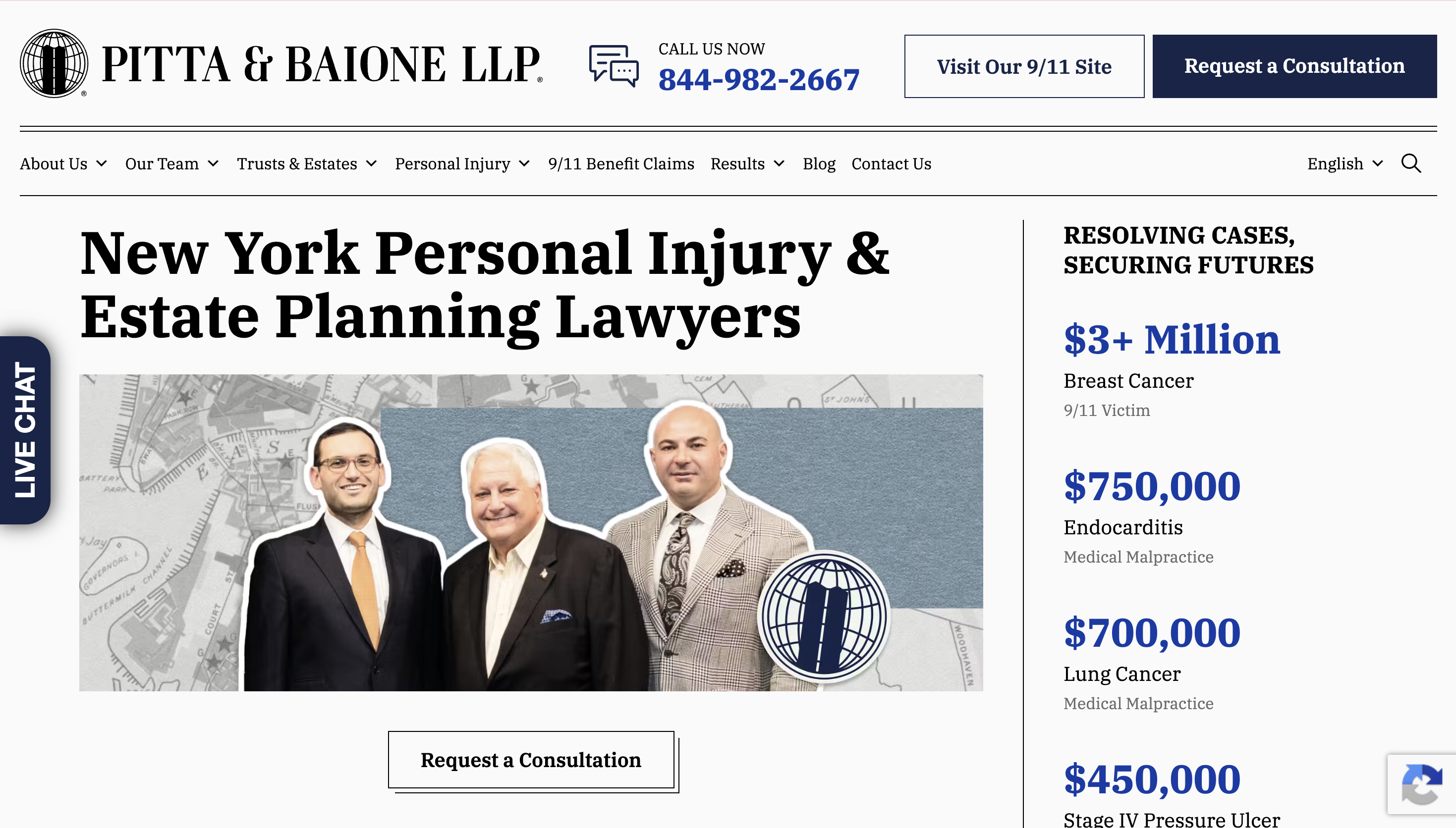
Pitta & Baione is a New York personal injury and estate planning firm and their website is one of the best examples of trust signal design done right for a consumer-facing practice.
The homepage opens with a bold headline and a live settlement ticker on the right side of the hero showing specific dollar amounts by case type. The Request a Consultation CTA sits directly below those numbers, placing proof of outcomes immediately before the conversion point. A persistent live chat widget follows visitors down the left side of every page, providing a low-friction way to make contact without relying on disruptive popups.
Further down the page, video testimonials, recent legal updates, and a detailed commitment statement build trust progressively as the visitor moves through the content. Every element has a purpose and nothing is placed without intention.
What works: Settlement results in the hero section itself rather than a separate page, persistent live chat that reduces friction on every page, and a clearly structured trust-building journey from top to bottom.
15. Dolman Law Group
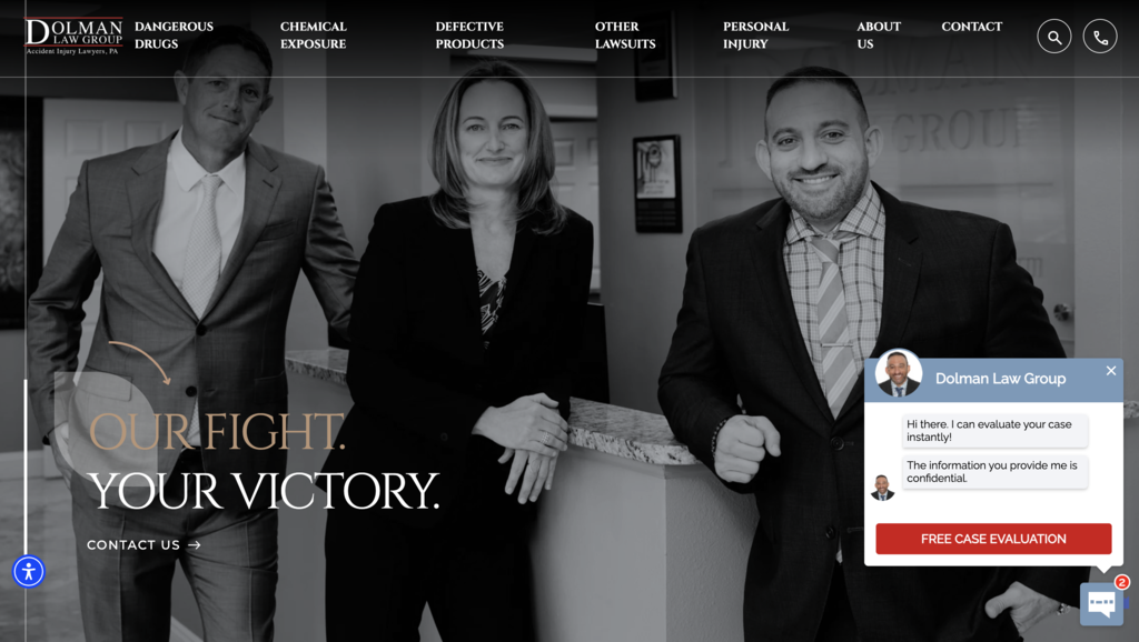
Dolman Law Group is a Florida personal injury and mass tort firm and their website is built around one clear principle: show the numbers first and let everything else follow.
The homepage opens with a cinematic hero backed by a high-contrast team photo. Directly below, a horizontal stat bar displays key figures including hundreds of millions recovered and tens of thousands of cases handled. A row of media logos including Forbes, Bloomberg, and Inc. sits immediately beneath, building authority before the visitor reads a single paragraph. Individual case result cards with specific dollar amounts and case types follow further down the page.
This layered approach to social proof, results first, then media validation, then individual case detail, creates a cumulative trust effect that is difficult to ignore. It is one of the most studied examples in legal web design for good reason.
What works: Layered social proof structure that builds trust progressively, media logos placed above the fold for immediate authority, and specific case result cards that make outcomes feel real and tangible.
Common design patterns across the best law firm websites
Looking across all 15 examples, a few consistent patterns emerge. These are not coincidences. They are deliberate design decisions that the best legal websites keep returning to because they work.
- Color palettes are intentional and restrained. Navy blue, white, and muted neutrals dominate the best law firm websites for a reason. These colors communicate trust, authority, and professionalism without demanding attention. The firms that deviate from this convention, like Crosby.ai with its dark mode aesthetic, do so with a clear strategic reason tied to their specific audience. Arbitrary color choices are rare among the strongest examples on this list.
- Typography does heavy lifting. Clean sans-serif typefaces are the standard across almost every site featured here. They signal modernity, improve readability, and hold up well across screen sizes. The firms that stand out typographically are the ones that commit fully to a system, pairing weights and sizes consistently rather than mixing styles across pages.
- Trust signals are placed where decisions are made. The strongest sites do not bury their proof. Case results, client testimonials, awards, and media mentions appear at or near the top of the page, close to the primary CTA. Pitta & Baione puts a live settlement ticker directly in the hero. Dolman Law Group places a stat bar displaying hundreds of millions recovered above the fold. Latham & Watkins positions a Financial Times quote as a full-width callout mid-page. The pattern is consistent: proof lives where it can influence a decision, not on a separate page that most visitors will never find.
- Navigation is built for the visitor, not the firm. The best sites organize content around how a potential client thinks, not how the firm is internally structured. That means filtering attorneys by practice area, surfacing relevant industries quickly, and reducing the number of clicks between a visitor landing on the homepage and finding the right person or practice. White & Case and Gibson Dunn are particularly strong examples of this done at scale.
- CTAs are persistent and friction-free. Across almost every site on this list, the path to contact is always visible. Whether through a persistent phone number in the navigation, a fixed consultation button, or a live chat widget that follows the visitor down the page, the best law firm websites never make someone search for how to get in touch.
- Mobile is treated as the primary experience. The firms that rank consistently well and convert at higher rates treat mobile as the default, not an afterthought. Fast load times, touch-friendly navigation, click-to-call buttons, and short intake forms that work on a small screen are standard across all 15 examples. This starts with the website development services behind the site, not just the design layer on top of it.
Final thoughts
The 15 law firm websites on this list have very little in common on the surface. Some are global BigLaw firms with hundreds of attorneys and decades of brand equity behind them. Others are boutique practices serving a narrow niche. Some lead with cinematic heroes and bold statistics. Others rely entirely on restraint and white space.
But underneath the visual differences, the same principles show up every time. Trust is established early. Navigation serves the visitor. The path to contact is never hidden. And the design, whether minimal or expressive, always reflects a clear point of view about who the firm is and who it is built for.
A law firm website is often the first and only impression a potential client gets before deciding whether to make contact. The firms that treat it that way, as a client acquisition tool rather than a digital brochure, are the ones that consistently stand out.
If you are thinking about what goes into building a site like the ones featured here, take a look at how we approach law firm web design.